Ben Nicholson remains one of the clearest routes into British modernism: a painter who began with still life and landscape, then pushed toward abstract reliefs, pared-back geometry and a visual language built on restraint. I am interested in him because the work is not just historically important; it shows how an artist can simplify without becoming empty. Here I look at how his style developed, why the reliefs matter, what the St Ives years changed, and how to read the work with a sharper eye.
The essentials at a glance
- Nicholson moved from traditional painting to abstraction in gradual steps, not through a sudden break.
- His 1933 reliefs sit at the centre of his reputation because they join painting and sculpture in one object.
- The St Ives years gave him a setting, a network and a slower rhythm that helped sharpen his visual language.
- For viewers and collectors, the most useful clues are surface, structure, date and condition, not size alone.
- His strongest works still reward slow looking because they rely on spacing, balance and tension between simple shapes.
How he moved from observation to abstraction
Born in Denham, Buckinghamshire in 1894, Nicholson came out of an artistic household and studied at the Slade before travelling widely in Europe and America. That background matters because his early work did not reject representation; it worked through it. He started with still lifes, then absorbed Post-Impressionism, Cubism and, for a period, a consciously naïve landscape style influenced by Alfred Wallis.
I read that shift as a very British form of modernism. Instead of chasing spectacle, he kept reducing the visible world until a cup, a table edge or a window frame could carry the composition. That economy is what gives the later work its strength: it feels disciplined rather than decorative, and exact without being cold.
Once that reduction is in place, the reliefs make sense as the next step rather than a detour. They are where his thinking about shape, depth and surface becomes unmistakable.
Why the reliefs changed everything
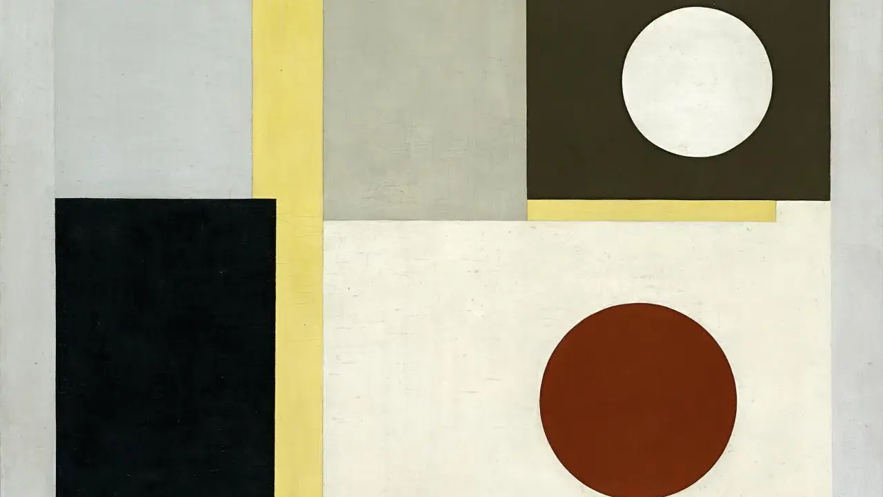
In 1933, Nicholson produced his first geometric and abstract reliefs, and that is the point where his reputation really locks into place. A relief is a work that sits between painting and sculpture: it is built from board, paint and shallow depth, so it occupies real space even when it still reads like a composition. That hybrid quality is the reason the works feel so modern. They do not merely describe space; they create it.
What I find most important is the way the reliefs force the viewer to notice the object as an object. Light falls across edges, shadows change with the room, and the image refuses to stay fixed in the way a flat canvas often does. The white reliefs in particular strip away anecdote and leave you with structure, interval and rhythm. In modernist terms, that is where the work becomes constructivist, meaning built from geometry and order before it is read as a picture.
- Edges tell you how controlled the work is.
- Shadows tell you how much the piece depends on real space.
- Colour restraint tells you whether Nicholson is reducing or overexplaining.
- Spacing tells you whether the composition is alive or merely tidy.
That structural clarity also explains why his later paintings, especially the mid-century still lifes, never feel like repetitions. They are variations on a precise set of problems, and that is where the next phase becomes worth separating out.
The main phases of his work and what to look for in each
When I look across Nicholson’s career, I find it easiest to read the work in distinct phases. The table below is a practical guide for viewing, collecting or just making sense of the shift from one period to another.
| Phase | What it looks like | Why it matters | What to notice first |
|---|---|---|---|
| Early still lifes and portraits | More traditional modelling, domestic objects, careful tonal control | Shows the technical base he never fully abandoned | Contour, shadow and the way objects are anchored in space |
| Naïve landscapes of the late 1920s | Simplified forms, flatter space, a quieter and more direct look | Bridges the gap between observation and abstraction | Compressed horizon lines and reduced detail |
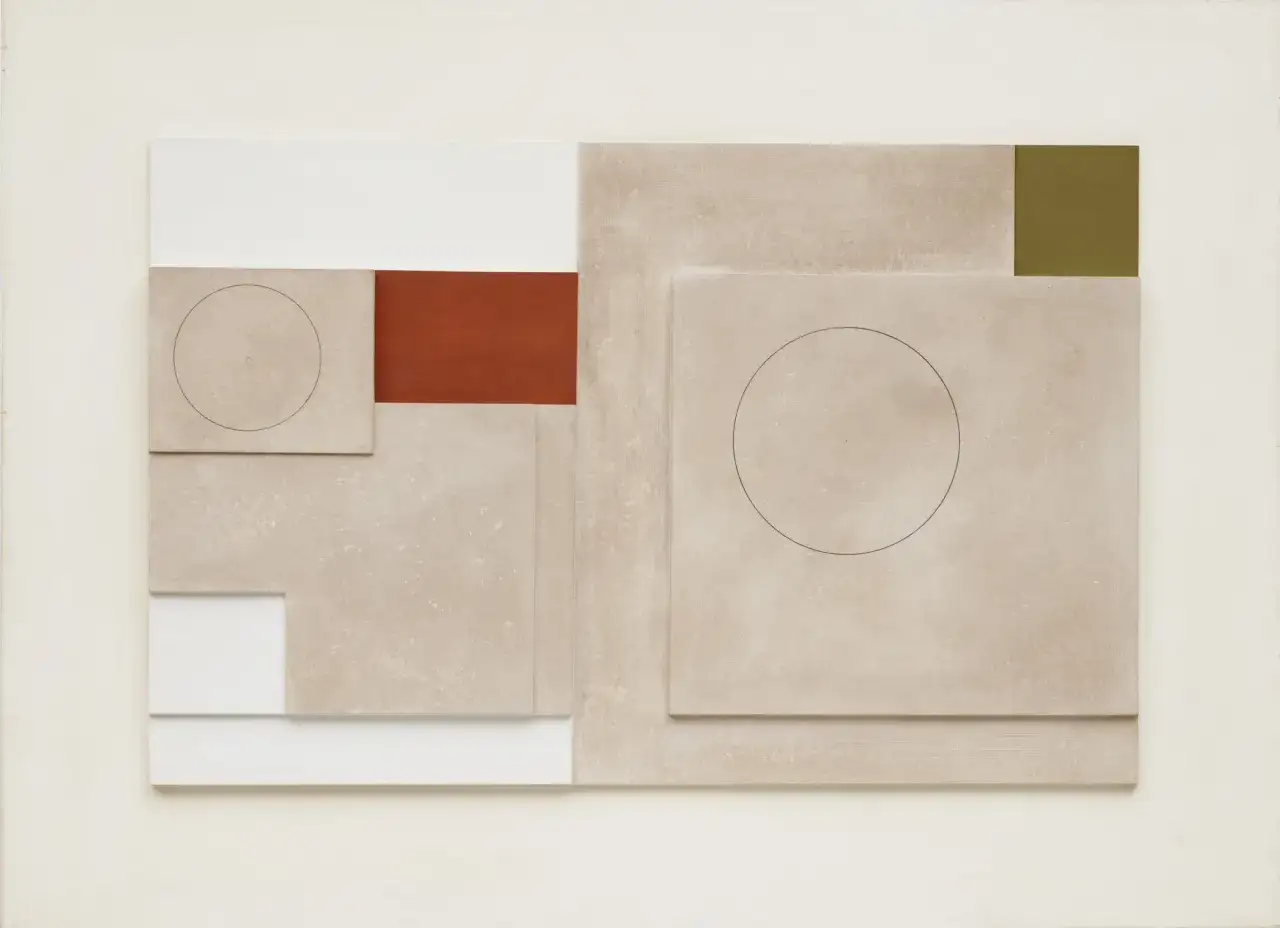
| Abstract reliefs and geometric work | Carved boards, circles, right angles, muted or white surfaces | His signature innovation and one of the key achievements of British modernism | How depth changes the reading of the image |
| St Ives still lifes and window views | Boats, tables, mugs and harbour fragments organised into semi-abstract balance | Shows how place becomes structure without turning into scenery | The rhythm between object, window and background |
| Late geometric compositions | Muted palettes, firmer blocks of colour, leaner and more distilled forms | Demonstrates refinement rather than decline | How little the image needs in order to hold together |
If I had to reduce the whole career to one rule, I would say this: look for the moment when representation becomes a scaffold rather than a destination. That is where Nicholson is most himself, and it is also the easiest way to understand why the St Ives period matters so much.
Why St Ives sharpened his vision
St Ives was not just a scenic backdrop. From 1939 onward, it became a working environment where Nicholson, Barbara Hepworth and other artists found a shared language of form, space and reduction. The town mattered because it offered distance from London, but also because it gathered the kind of people who could think seriously about modern art without turning it into fashion. For a painter like Nicholson, that combination was ideal.
The Cornish setting fed directly into the work. Windows, boats, harbour views and tabletop arrangements become recurring structures, but they are never simple documentary images. He uses them to test balance, proportion and depth. I think that is why his St Ives work still feels fresh: it does not sell the coast to you. It turns the coast into a set of formal decisions.
That context also helps explain his place in the wider St Ives School. He was not the only important figure there, but he was one of the people who made the area feel central to British abstraction rather than peripheral to it. After the war, touring exhibitions helped bring that work to a broader audience, and that broader recognition was not accidental; the art had the authority to hold it.
Seen this way, the legacy is not just historical. It is a useful model for anyone trying to understand how place, discipline and artistic community can tighten a style rather than dilute it.
What I would check in a Nicholson work today
In a gallery, museum or sale room, I would not start with the label or the asking price. I would start with the object itself.
- Is it a relief or a flat painting? That changes the whole reading of the work.
- Which phase does it belong to? A 1920s picture and a 1950s composition solve different problems.
- How strong is the surface condition? Reliefs are especially vulnerable at edges, joins and painted corners.
- Is there clear provenance or exhibition history? For serious modern British work, documentation matters.
- Does the composition still breathe? Nicholson’s best pieces are tight, but never overpacked.
For photographers, there is a parallel lesson here. He understood framing, negative space and tonal discipline with a seriousness that many image-makers still underestimate. The subject is rarely the whole story; the spacing around it is doing a lot of the work. In 2026, that remains the cleanest way to appreciate him in a museum, a private collection or the market: watch how surface, space and control hold together, because that is where the real value sits.