In galleries and museums, the strongest displays do not just present objects; they frame an argument. The real work behind curating meaning is deciding what enters the room, what stays outside it, and how sequence, spacing, and interpretation turn individual works into a readable story. That matters especially in contemporary art and photography, where visitors often decide very quickly whether an exhibition feels coherent, relevant, and worth their time.
The short version is that curation turns objects into a story visitors can follow
- Curation is editorial. It is less about decoration and more about choosing what should speak, and in what order.
- Meaning comes from context. The same work can feel celebratory, critical, or ambiguous depending on what surrounds it.
- Selection and arrangement are inseparable. A strong thesis still fails if the room layout, labels, or lighting work against it.
- UK museums are moving toward participation. Co-curation, accessibility, and clearer interpretation are now central rather than optional.
- Good exhibitions are memorable because they are precise. Visitors may not recall every label, but they remember the relationships the room made visible.
What curation means in galleries and museums
When I talk about curation in a museum context, I mean more than hanging art neatly. I mean a chain of decisions that starts with research and ends with the visitor’s interpretation. A curator may shape the thesis, but conservators, exhibition designers, registrars, and interpretation teams all change how that thesis lands in the room.
| Role | What it controls | Why it matters |
|---|---|---|
| Curator | Concept, selection, narrative | Decides what the exhibition is actually saying |
| Conservator | Condition, handling, display limits | Keeps the work safe enough to be shown at all |
| Exhibition designer | Flow, spacing, sightlines, light | Turns a concept into a physical experience |
| Interpreter | Labels, panels, accessibility, tone | Makes the argument legible to visitors |
Once that division of labour is clear, the next question is not whether the objects are good, but whether they are the right objects for the claim being made. That is where the selection process begins, and where many exhibitions quietly succeed or fail.
How I decide what deserves space in a show
I usually start by writing the exhibition in one sentence. If I cannot do that, I do not have a workable concept yet. From there, I test every possible object against a few practical filters: does it carry the thesis, does it add contrast, can it be shown safely, and will a non-specialist visitor understand why it is here?
| Question | What it controls | Red flag if unanswered |
|---|---|---|
| What is the one sentence the visitor should remember? | Thesis | The exhibition becomes a loose pile of good works |
| Who is this for? | Tone, density, language | The text assumes specialist knowledge everywhere |
| What evidence is essential? | Object selection | The same point appears three times and still feels vague |
| What cannot be shown? | Loans, rights, conservation, budget | The concept collapses late in the process |
I think of the objects in three groups. Anchor works carry the central idea. Supporting works expand or complicate it. Bridge works connect one section to the next. Anything else is either redundant or a distraction, no matter how strong it is on its own.
That is the part many people miss: not every impressive object belongs in every exhibition. Some works are brilliant but off-message, and once they enter the room they can pull attention away from the argument you are actually trying to make.
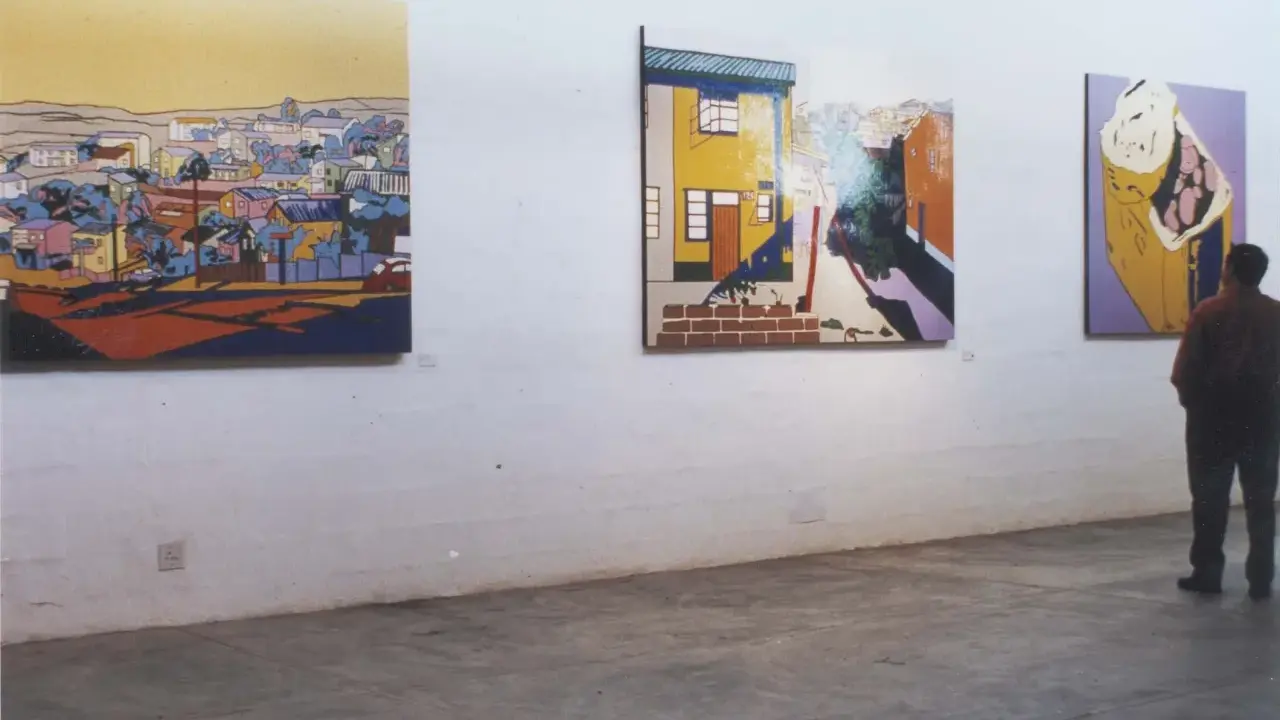
How sequence and spacing change the story
Once the selection is set, arrangement does the heavier interpretive work. Two exhibitions can use many of the same works and still mean something different because of sequence, density, sightlines, and the amount of text that accompanies each object.
| Display approach | Best used when | Main risk |
|---|---|---|
| Chronological | You want to show development, influence, or historical change | The room can become dutiful and predictable |
| Thematic | The subject cuts across periods or media | The argument can feel loose if there is no visual structure |
| Dialogic | You want works to speak to, challenge, or echo one another | It can turn clever very quickly if the links are weak |
| Collection-led | The institution wants to show depth of holdings | The display may feel like storage made public |
In one sightline, I usually want only three to five anchor works. More than that, and the eye loses hierarchy. A packed room makes a thesis look uncertain, even when the research behind it is strong.
Text matters just as much. My rule of thumb is simple: an introductory panel can usually carry around 100 to 150 words, while an object label often works best at roughly 60 to 80 words. Longer text only earns its place when the work is difficult, contested, or visually deceptive. If the label repeats what the viewer can already see, it is wasting the room’s attention.
Lighting, too, is part of the narrative. Brighter is not always better. I want the light to direct attention, preserve atmosphere, and protect the work without flattening it. In photography exhibitions, especially, the wrong light can make a carefully sequenced room feel clinical instead of expressive.
Why co-curation matters in the UK
British museums are being asked to do more than preserve and display. They are expected to explain provenance, include overlooked voices, and make space for audiences who do not already speak the language of art history. That is why co-curation, community consultation, and plain-English interpretation have moved from nice extras to serious curatorial tools.
At Tate, interpretation teams work closely with curators to translate specialist thinking into language visitors can use. The Museums Association has also pushed museums toward co-curation and participation, which reflects a broader shift in how meaning is built with audiences rather than simply delivered to them. In photography and contemporary art, this matters because context can completely change how a work is read.
There is a trade-off here. More voices can make an exhibition sharper and fairer, but it also makes the editing harder. The curatorial voice still has to stay disciplined; otherwise the room becomes a stack of good intentions instead of a clear argument.
For UK galleries and museums, the best results now come from balancing authority with openness: a strong thesis, a careful edit, and enough interpretive room for visitors to see themselves in the work without losing the curator’s point. That balance is where the next set of problems usually appears.
Common mistakes that weaken the message
Most weak exhibitions fail for the same few reasons, and none of them are mysterious. They usually come from editing too late, assuming the objects will carry the concept on their own, or treating interpretation as something to add after the hanging plan is finished.
- Too many objects - When every work competes for attention, the exhibition stops speaking with a voice.
- Labels that repeat the obvious - If the text only states title, date, and medium, it has not earned its space.
- Gimmicky contrasts - A surprise pairing only works when it reveals a real relation, not just a visual joke.
- Ignoring accessibility - Small type, dense copy, and confusing routes do not just inconvenience visitors; they change what the exhibition means to them.
- Forgetting the exit - The final work or final wall should leave the visitor with a residue, not a shrug.
The simplest fix is usually to cut more aggressively than feels comfortable. If one object, one label, or one section does not move the argument forward, I remove it and test whether the room becomes clearer. That discipline is often what separates a competent display from a memorable one.
What visitors remember when the curation works
When a museum or gallery exhibition works, visitors rarely remember every label. They remember the relationship between two works, the one object that changed their reading of the room, or the idea that suddenly made the rest of the display click into place. That is the real benchmark I use: not whether the room is busy or elegant, but whether it leaves a clean thought behind.- One clear idea stays in the visitor’s head.
- One visual decision feels inevitable in retrospect.
- One work gains force because of what sits beside it.
- One label does enough work to unlock the room.
That is the practical side of exhibition making in galleries and museums. Good curation does not talk louder than the art; it arranges the conditions for meaning to appear, then gets out of the way.