Hans Hartung sits at the point where gesture becomes structure. His canvases can look immediate, even improvised, yet they are built from a disciplined visual language shaped by exile, war, music, and a long obsession with line, speed, and balance. This article breaks down his life, the logic of his abstraction, the works that made him indispensable, and what to look for if you encounter his paintings in a museum or gallery today.
What matters most before you look closely
- Hartung’s life shaped the work: Leipzig beginnings, a move to France, wartime strain, and a lifelong attachment to music all fed the paintings.
- The style is recognisable: fast marks, scratched lines, repeated gestures, and a constant tension between control and accident.
- Many key works are coded rather than titled, so the date and serial number are part of the language, not just archive details.
- British audiences can find him in museum collections, especially through Tate and other UK institutions.
- Collectors should care about medium and condition: paintings usually sit at the top, with works on paper and prints offering a different entry point.
A life shaped by movement, music, and pressure
To understand the paintings, I start with the life. Born in Leipzig in 1904, he moved through a century defined by rupture, settled in France, and eventually built the core of his career there; that history matters because his art is never simply decorative abstraction. The Fondation Hartung-Bergman has also stressed his early fascination with lightning and music, and that combination feels completely right once you look at the work: it is visual, but it behaves like weather and rhythm at the same time.
What interests me most is that his biography does not explain the paintings in a neat, symbolic way. It explains their pressure. The line often feels urgent because the life behind it was urgent too, and the result is a body of work that carries memory without turning into illustration. That background is the reason Hartung still feels emotionally charged rather than merely formal, and it leads directly to the question of how the style actually works.
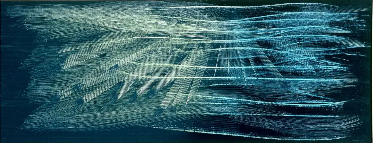
What makes his abstraction feel so alive
I would not describe Hartung’s abstraction as spontaneous in the casual sense. It is more accurate to say that he staged spontaneity inside a disciplined visual system. The marks may look tossed off, but they are usually organised through repetition, revision, contrast, and a careful sense of scale.
Two historical labels help here. Tachisme refers to a post-war European mode built around stain, gesture, and chance effects, while Art Informel is the broader category for that freer, anti-academic abstraction. Hartung belongs there, but the best paintings are not simply loose or expressive. They also feel exact, because the pressure of each line is measured against the field around it.
- Line gives the work its pulse. His strokes can be thin, jagged, brushed, or scratched, but they nearly always behave like notation rather than ornament.
- Surface matters as much as the mark. Layering, interruption, and visible correction keep the canvas active instead of polished.
- Tempo is crucial. Some works read like a burst; others feel slowed down and accumulated, but both depend on timing.
That mix of control and risk is why the work never settles into one formula. Once you see that, the famous paintings become much easier to place in the career as a whole.
The works that collectors and museums still return to
Many of his most discussed pieces are known by serial codes rather than poetic titles, and that is not a weakness. It pushes attention back onto the painting itself. I find that useful, because Hartung’s best works are less about naming a subject than about building a visual event.
| Work | Date | What to notice | Why it matters |
|---|---|---|---|
| Composition VI | 1952 | An early post-war balance of energy and restraint, with structure holding the surface in place. | A strong entry point if you want to see how his language stabilised without becoming static. |
| L10 | 1957 | Compressed linear movement and open breathing space. | Useful for seeing how a few marks can create real tension. |
| T1963-R6 | 1963 | More mature rhythm, with gesture becoming increasingly controlled. | Shows how the work evolves from raw motion into a more distilled visual grammar. |
| T 1964-H45 | 1964 | Large-scale density and a strong sense of internal pressure. | A good example of how he keeps abstraction alive without relying on any figurative anchor. |
| T 1966-H28 | 1966 | Broader handling and a more expansive surface rhythm. | Useful for understanding the technical range of the mid-1960s work. |
| T1982-E15 | 1982 | A late, distilled language with less visual clutter and more concentrated force. | Proves that the work did not flatten out in old age; it sharpened. |
If I had to choose one thing to learn from these works, it would be this: do not read the serial codes as bureaucratic labels. They are part of the discipline. The numbering keeps the focus on iteration, process, and variation, which is exactly where his art becomes most convincing.
How I read a Hartung canvas without forcing meaning
When I stand in front of one of these paintings, I avoid the most common mistake: looking for a hidden image too quickly. Abstraction like this is not empty, and it is not a puzzle with a single solution. It is a record of decisions, hesitations, and accelerations.
- Start wide: let the whole composition register before you inspect detail.
- Watch the line direction: repeated movements often reveal the painting’s structure more clearly than colour does.
- Check for revisions: scraped, layered, or interrupted areas often tell you more than the final visible mark.
- Use scale properly: small works can feel like notation, while larger ones can behave like atmosphere or weather.
- Read pressure, not symbolism: if a painting suggests storm, music, or force, treat that as a formal analogy rather than a literal subject.
The best Hartung paintings reward patience. They do not announce themselves with a narrative, but they hold attention because every mark seems to negotiate with the one before it. That makes the viewing experience active rather than passive, which is why the work still lands so well in modern gallery settings.
Why he still matters in the UK museum and market conversation
For a UK audience, Hartung is more than a European post-war name to file away. British collections already give him a visible foothold, and Tate’s holdings in particular show that he is not a fringe figure in the local art-historical story. That matters because collectors often follow museum seriousness: once a painter is securely placed in institutional collections, the market conversation becomes less about novelty and more about quality, date, and condition.
From a collecting point of view, I would separate his output into three practical categories. Original paintings sit at the top because they carry the full force of scale, surface, and revision. Works on paper can be excellent if the line is sharp and the paper is well preserved. Prints are the most accessible entry point, but they need a careful eye on editioning, state, and overall condition. In other words, the name matters, but the medium and the state of the object matter just as much.
There is also a broader reason his relevance has held up. In 2026, curatorial attention is still returning to his archive, his late work, and the role of music in his studio practice. That kind of renewed reading is healthy: it stops the artist from becoming a fixed historical icon and keeps the work open to fresh interpretation. For me, that is the real sign of lasting importance.
What I would keep in mind before judging one of these paintings too quickly
My practical advice is simple: do not judge one of his paintings from a thumbnail. Stand back first, then move in, and let the rhythm of the marks tell you how much control sits underneath the apparent speed. If the painting still holds together from both distances, you are probably looking at one of his strongest ideas in action.