The most useful Indianapolis Museum of Art photos are the ones that show the campus as a place, not just a building. Newfields combines galleries, sculpture, gardens, historic interiors, and contemporary installations, so the strongest images tell you what kind of experience you will actually have there. In this guide I focus on what people really want to see, which scenes photograph best, and where the practical limits matter if you want to take or use the images yourself.
What to know first before you choose an image
- Newfields is the current name of the wider campus, while the Indianapolis Museum of Art is the main museum building, so image results often mix both names.
- The best visuals usually combine architecture, gardens, sculpture, and gallery interiors rather than showing only one room.
- Casual visitor photos are generally allowed, but flash, tripods, monopods, selfie sticks, and drones are restricted.
- Organised shoots in The Garden need a permit and a digital photo pass, and you should plan ahead rather than turning up on the day.
- For publication or editorial use, the museum’s own collection and exhibition archive are more reliable than random image results.
- If you want the most flattering light, morning, late afternoon, and overcast skies each suit different parts of the campus.
What people are really looking for in these museum images
I read this query as mostly informational and inspirational, with a practical planning layer underneath. Most readers want to see what the place looks like, which parts are worth photographing, and whether the current name changes how they should search for it. That matters because image results are split between older IMA-era pictures and newer Newfields shots, and the difference affects captions, layout choices, and even what feels current.
In other words, the real question is not only “what does it look like?”, but “what should I expect if I visit, photograph, or feature it?” Once that is clear, the visual choices become much easier.
The scenes that make the strongest images
The campus gives you several very different visual languages, and that is why it photographs better than a single-purpose museum. If I were selecting images for a gallery guide, a culture feature, or a destination page, I would think in terms of scene types rather than just “museum photos”.
| Image type | What it communicates | Best use | Small caution |
|---|---|---|---|
| Main facade and entrance | Clear architectural identity, a sense of scale, and an immediate place marker | Hero images, travel features, opening banners | Avoid awkward crowds if you want the building to carry the frame |
| Fountain court and approach | Movement, symmetry, and the relationship between art and landscape | Editorial lead images, visitor guides, social previews | Works best when the water, paths, and building all read together |
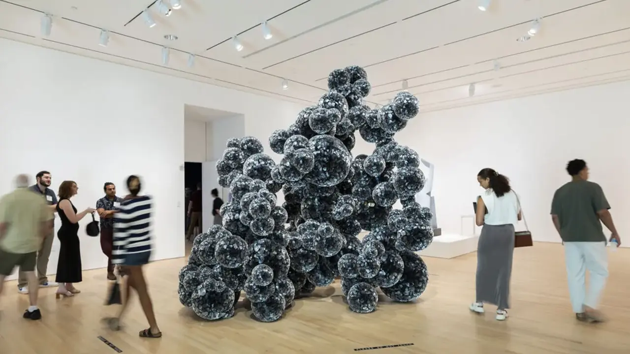
| IMA galleries | Curatorial depth and the museum’s interior atmosphere | Arts coverage, exhibition features, collection pieces | Temporary shows can date quickly, so check whether the display is current |
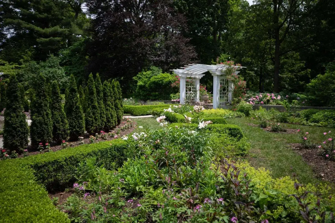
| Garden and sculpture park | The campus feels open, layered, and less formal than a city-centre museum | Lifestyle features, destination content, photography portfolios | Light changes fast outdoors, so the same spot can look very different across the day |
| Historic house interiors and grounds | Period detail, texture, and a more intimate story than the main galleries alone | Heritage pieces, long-form features, design articles | Some spaces have tighter rules or more limited access than exterior areas |
If you only need one frame, I would usually pick the fountain court or a broad exterior view, because those images tell the story at a glance. If you need a richer editorial set, add one interior, one garden scene, and one detail shot. That mix feels far more complete than three similar wide angles.
Those images look simple, but they only work if the rules behind them are clear, which is where many people get caught out.
How the photo rules change what you can capture
The biggest mistake is assuming that a beautiful public space automatically means unrestricted photography. Newfields’ current policy is more specific than that. Private, non-commercial photography is allowed in many visitor areas, but flash, tripods, monopods, selfie sticks, and drones are not permitted inside the Indianapolis Museum of Art and several other indoor spaces.
Casual visitor photos
If you are simply visiting and taking pictures for yourself or for a personal social post, the rules are relatively straightforward. You can photograph your experience, but not in a way that turns the visit into a commercial shoot. Temporary exhibitions and borrowed works are often off-limits unless the museum says otherwise, which is why I would never assume every gallery image is fair game.
One useful detail: a DSLR or mirrorless camera does not automatically make a visit commercial. The line is crossed when you bring the gear, setup, or intent of a shoot. A camera by itself is usually fine; a tripod, large bag, extra lenses, or lighting kit changes the situation immediately.
Read Also: Peter Fetterman - Why His Photography Vision Still Matters
Organised shoots and permits
If the aim is engagement photos, family portraits, or any planned session with clients, The Garden is the main approved setting and it requires a permit plus a digital photo pass. The current policy pages use slightly different advance-notice wording, so I would treat three days ahead as the safe planning window rather than trying to squeeze it in at the last minute. The digital photo pass fee is currently $50, and it covers two named photographers or videographers and up to ten people in one client group.
There is one more important restriction: scheduled shoots are not permitted inside the Indianapolis Museum of Art, Lilly House, or Elder Greenhouse. That distinction matters because the casual visitor can still take personal photos in the museum, but a formal shoot with clients is handled very differently. If you want a polished, publishable set, the outdoor campus is where the policy is most accommodating.
Once the rules are clear, the more interesting task is deciding which part of Newfields you want the image to represent.
Why the museum looks like several different places at once
This is what makes the site visually strong and, at times, slightly hard to summarise in a single image. The campus spans 152 acres and includes the IMA galleries, lush gardens, two historic homes, performance spaces, a nature preserve, and a sculpture park. That means one frame can read as a modern museum, another as a landscape project, and another as a historic estate. The range is useful, but it also means a generic museum shot rarely does the place justice.
The collection itself reinforces that variety. It runs from antiquity to the present day, so the galleries can move from older works to modern and contemporary rooms without losing coherence. Visually, that gives photographers a lot of texture to work with, but it also means the look of the museum can change from one visit to the next.
If you come across images of temporary installations, treat them as a snapshot of a specific moment rather than the permanent face of the institution. That is especially true for immersive or large-scale special exhibitions, which can be striking but do not define the entire campus. The visual identity here is broader than any single show.
That variety is also why image selection matters more than people expect.
How I would choose the right image for an article or social post
For editorial work, I tend to think in terms of job-to-be-done. A lead image has to introduce the place; a supporting image has to add depth; a detail shot has to make the reader pause. The right choice depends on what the page is trying to prove.
| Use case | Best image choice | Why it works | What to avoid |
|---|---|---|---|
| Travel feature | Wide exterior or fountain-court shot | It establishes the location immediately and looks inviting on a header | Tight crops that could be from almost any museum |
| Culture article | One gallery interior with a clear work of art | It shows the institution’s curatorial side, not just its architecture | Overly busy rooms where the art gets lost in the scene |
| Design or architecture piece | Facade details, glass lines, or the entrance sequence | It gives the reader a sense of the building’s structure and rhythm | Flat front-on shots with no depth or context |
| Landscape or sculpture article | Garden paths, outdoor works, and open lawn views | It shows the campus as an experience rather than a building visit | Images taken at harsh midday light, which can flatten the space |
| Social post or preview tile | One strong detail, such as signage, sculpture, or a cropped architectural line | It reads quickly on mobile and still feels specific | Generic crowd shots that do not say anything about the place |
If the piece needs to stay useful for months, I would avoid leaning on a temporary exhibition image as the hero visual. Evergreen content works better when the image points to the institution itself, not just to whatever happened to be on view that week. That is the simplest way to keep a visual article from ageing too quickly.
The last step is making sure the image you choose is current and usable, not just attractive.
The quickest way to avoid stale or unusable museum images
If I needed a reliable reference today, I would start with the museum’s own collection and past-exhibitions archive rather than a generic image search. Those official resources are updated continuously and are much better for checking what is actually on view, how the institution describes itself, and which works are documented with proper context. For a site focused on contemporary art and photography, that kind of accuracy matters more than a pretty but vague image.
For planning a visit, the current admission structure is also worth knowing. Right now, general admission is $23 for adults, $20 for seniors, $15 for youth aged 6 to 17, free for children five and under, and free for members. Access Pass holders pay $5 per family member, and First Thursdays use flexible pay-what-you-can entry, including $0. If you are deciding when to go just to shoot or gather reference photos, those details can make the difference between a spontaneous visit and a more deliberate one.
What I would prioritise is a balanced set: one broad campus shot, one gallery image, one outdoor sculpture frame, and one detail crop. That combination captures the place more honestly than a stack of similar photos, and it keeps the article useful even after the exhibitions change.