
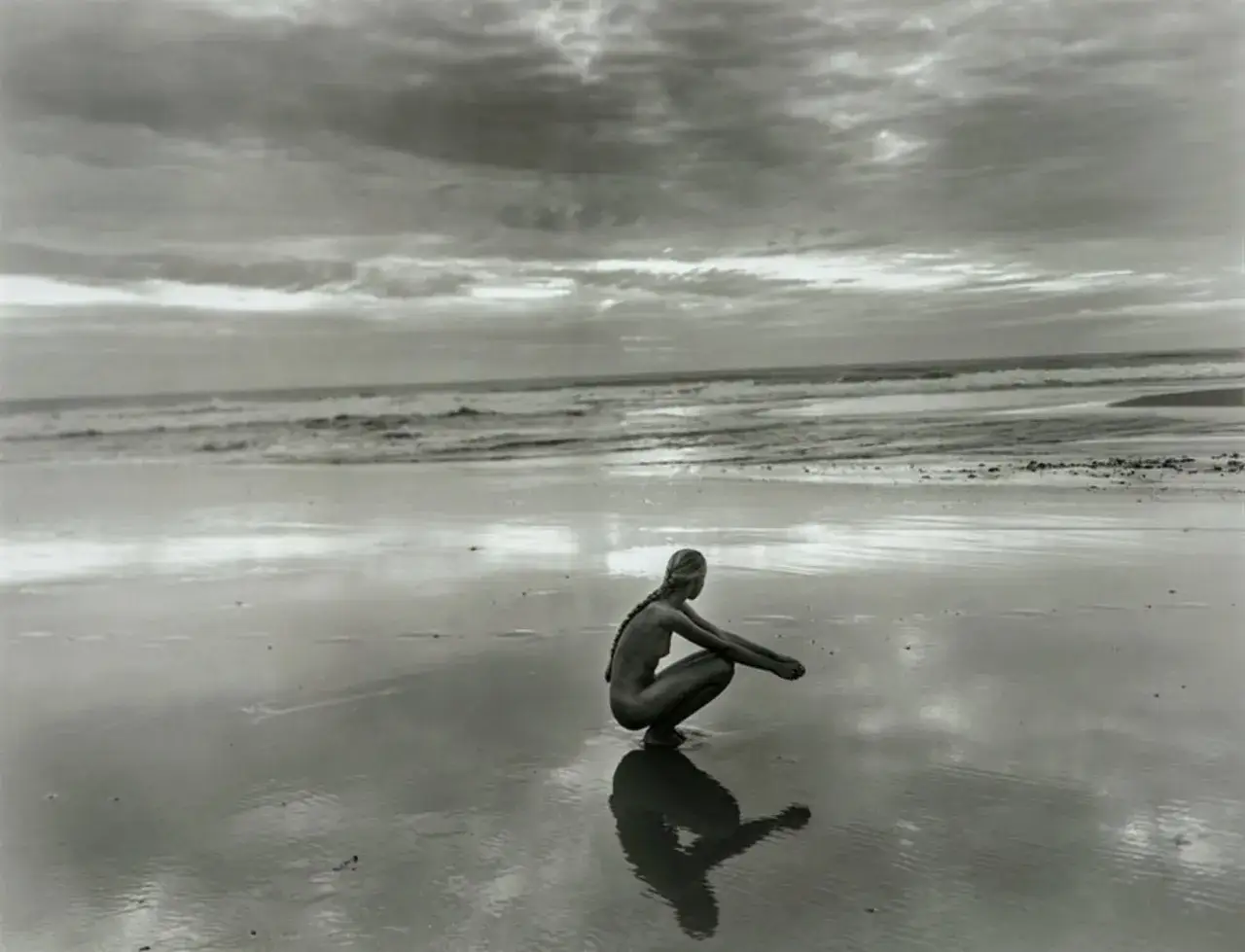
Jock Sturges' Fanny is best understood as a long-form photographic portrait rather than a single image. The series follows one subject across more than two decades, which is why it attracts both art-historical interest and ethical debate. In the pages below, I look at what the work is, how the pictures are built, why they still divide viewers, and what collectors should check before treating them as serious photographic objects.
Key facts worth knowing about the series
- It is a 23-year portrait project, not a one-off photograph.
- Steidl published the monograph in 2014, and the book is substantial enough to read as a project in its own right.
- The imagery mixes black-and-white and colour photographs, which changes the mood from frame to frame.
- Gallery listings commonly describe signed gelatin silver prints in editions of 40, so provenance matters.
- The debate around the work is about more than nudity; it also concerns time, consent, representation, and how we frame long-term artist-subject relationships.
What Fanny actually is
The most useful way to approach the project is to see it as an extended portrait built from repetition. Sturges photographed Fanny over 23 years, and the resulting body of work became a monograph, exhibition material, and a set of collectible prints. That scale is important: it turns the series from a single statement into a record of change, place, and rapport.
The naturist setting in Montalivet, France is not incidental. It shapes the images' social rules, the subject's ease in front of the camera, and the way viewers are asked to read the body. In other words, the work is not just about a person, but about a way of life and the visual language that grows out of it. Once you see that structure, the formal choices start to matter much more than the headline subject matter.How the sequence works as a photographic portrait
I think the strongest thing in the series is not any single frame but the accumulation of small visual decisions. Repetition lets Sturges track posture, confidence, light, and the effect of time without turning the images into a chronology chart.
| Formal device | What it does | Why it matters |
|---|---|---|
| Repeated setting | Keeps attention on the person rather than the scenery | Makes time visible without explanatory captions |
| Natural light | Softens contrast and reduces spectacle | Pulls the work away from fashion-style polish |
| Black-and-white and colour | Changes mood and distance from image to image | Colour feels immediate, while monochrome feels more reflective |
| Loose sequencing across years | Builds narrative without forcing a plot | Lets viewers assemble meaning for themselves |
That is why the series can feel intimate without becoming messy; the composition stays disciplined even when the subject is personal. The next question is how to look at that intimacy without reducing it to either innocence or provocation.
How to read the images without flattening them
The easiest mistake is to treat the work as either pure documentary or pure provocation. Neither reading is strong enough on its own. I read the photographs as a study of presence: how someone stands, looks away, relaxes, or claims space when the camera is not behaving like a spotlight.
That is why the body language matters as much as the setting. The images often feel matter-of-fact rather than theatrical, and that matter-of-factness is part of the point. Sturges is asking the viewer to notice light, texture, posture, and the quiet continuity between childhood and adulthood, not to hunt for a sensational reveal.
If you are comparing prints or reproductions, look first at tonal balance, cropping, and the amount of surrounding space. Those details tell you whether the image is being presented as a personal encounter, a formal portrait, or a market object. That tension between intimacy and scrutiny is also why the series continues to divide opinion.
Why the series remains controversial
The controversy never sat only on the surface. It comes from the intersection of nudity, a young subject, the long timespan of the project, and the fact that viewers bring different moral frameworks to the same photograph.
| Reading lens | What supporters emphasise | What critics question |
|---|---|---|
| Naturist context | Nudity as normal, non-performative, and part of daily life | Whether private life should be presented so openly in public |
| Long-form portraiture | Growth, trust, and the accumulation of time | Power imbalance, especially in the early years of the project |
| Art-historical value | Continuity, composition, and documentary patience | Whether aesthetic quality can ever neutralise discomfort |
| Viewer responsibility | Disciplined looking, not voyeurism | The risk of consuming the image too quickly or too simplistically |
I do not think it helps to pretend the discomfort is accidental; it is part of the work's reception, and it has to be named honestly. What matters is whether the viewer is willing to separate analysis from reflex, which is difficult but necessary in serious photography. That same seriousness matters when the conversation shifts from interpretation to ownership.
What collectors should check before buying a print
For collectors, the question is less about the headline controversy and more about documentation. A print's value depends on edition, signature, condition, and provenance, not just on whether the image is recognisable.
| What to verify | Why it matters | Typical detail |
|---|---|---|
| Edition number | Confirms the print's place in the edition | Examples often appear as 7/40 or similar |
| Signature and inscriptions | Supports authenticity | Signed, titled, dated, and numbered on the verso |
| Medium | Affects tone and market value | Gelatin silver print is common in listings |
| Size and condition | Influence display impact and resale potential | Some listed works measure 20 x 16 in. (50.8 x 40.6 cm) |
| Provenance | Protects against uncertainty | Gallery invoices, labels, and catalogue references |
If you are buying the monograph rather than a print, the same discipline applies: check the publisher, binding, and page count. Steidl's 200-page edition, with 139 black-and-white photographs and 31 colour photographs, is the version most readers and collectors still treat as the reference point. In a market as image-driven as photography, the difference between a collectible object and a decorative book is usually in the details. Those details also help explain why the series still matters beyond the market.
Why the work still matters in Sturges' wider legacy
The lasting value of Fanny is that it sits at the intersection of portraiture, time-based art, and the ethics of looking. Sturges was never interested in one-off shock value; the project rewards patience, and patience is still the rarest thing in photography.
For me, that is why the series endures in conversations about famous photographic artworks. It is technically disciplined, emotionally complicated, and impossible to summarise cleanly, which is exactly why it keeps returning to galleries, bookshelves, and collector discussions. If you want the most honest reading, start with the sequence itself, then move to the book and the print data. Once you do that, the work becomes less about a single controversial label and more about how photography records change, trust, and the passage of years.