Keith Haring’s barking dog is one of the clearest examples of how a simple image can carry real artistic force. It sits between street art, social commentary, and graphic design, which is why it still feels current in 2026. Here I break down what the motif means, where it appears, and how to read it without flattening it into decoration.
What matters most about Haring’s barking dog
- It is a recurring symbol in Haring’s visual language, not just a single drawing.
- The dog works as both a warning sign and a call for attention.
- Some versions are often linked to Anubis, which adds a mythic layer.
- The motif appears in drawings, posters, prints, and design editions.
- Its power comes from clarity: you understand it fast, but you do not exhaust it fast.
Why the barking dog became one of Haring’s most recognisable signs
What makes this image land so quickly is its structure. Haring reduced the dog to a bold outline, a tense posture, and an open mouth that seems to push sound into the air. That is classic Haring: a symbol that reads like a word, but still feels alive.
In street-art terms, this is close to a tag, meaning a repeated marker that builds identity across different works. Tate describes the barking dog as one of Haring’s most famous tags, and that is the right way to think about it. The image is not trying to behave like a traditional animal study; it behaves like part of a larger alphabet of signs alongside the radiant baby, flying saucers, dancers, and chained figures.
The dog also benefits from being physically simple. It can survive at subway scale, on paper, on a poster, or as a neon object without losing its shape. That flexibility is one reason the motif became so durable, and it leads naturally to the question of what the image is actually saying.
What the image is really saying
I would not read Haring’s barking dog as a literal portrait of a dog. It works more like a visual alarm. The bark interrupts the image field, which gives the motif urgency even when the drawing is minimal.
The upright, human-like version is often linked to Anubis, the Egyptian god associated with the afterlife. That association matters because it makes the figure feel like a guardian or threshold marker rather than a friendly pet. The dog is watching, signalling, and warning at the same time. In Haring’s hands, that is powerful because it keeps the image open: it can suggest protection, danger, protest, or simply the need to pay attention.
That openness is one reason the motif fits his wider practice so well. Haring’s work often fused playfulness with social urgency, and the barking dog sits right inside that tension. It can look playful from a distance, then suddenly feel serious once you register the context. That tension becomes even clearer when you compare the different versions people actually encounter.
How the dog changes across prints, posters, and editions
The motif is easier to understand when you see how much it changes with medium. A small print, a museum poster, and a design-object version all keep the same visual core, but each one alters the mood.
| Version | What stands out | Why it matters |
|---|---|---|
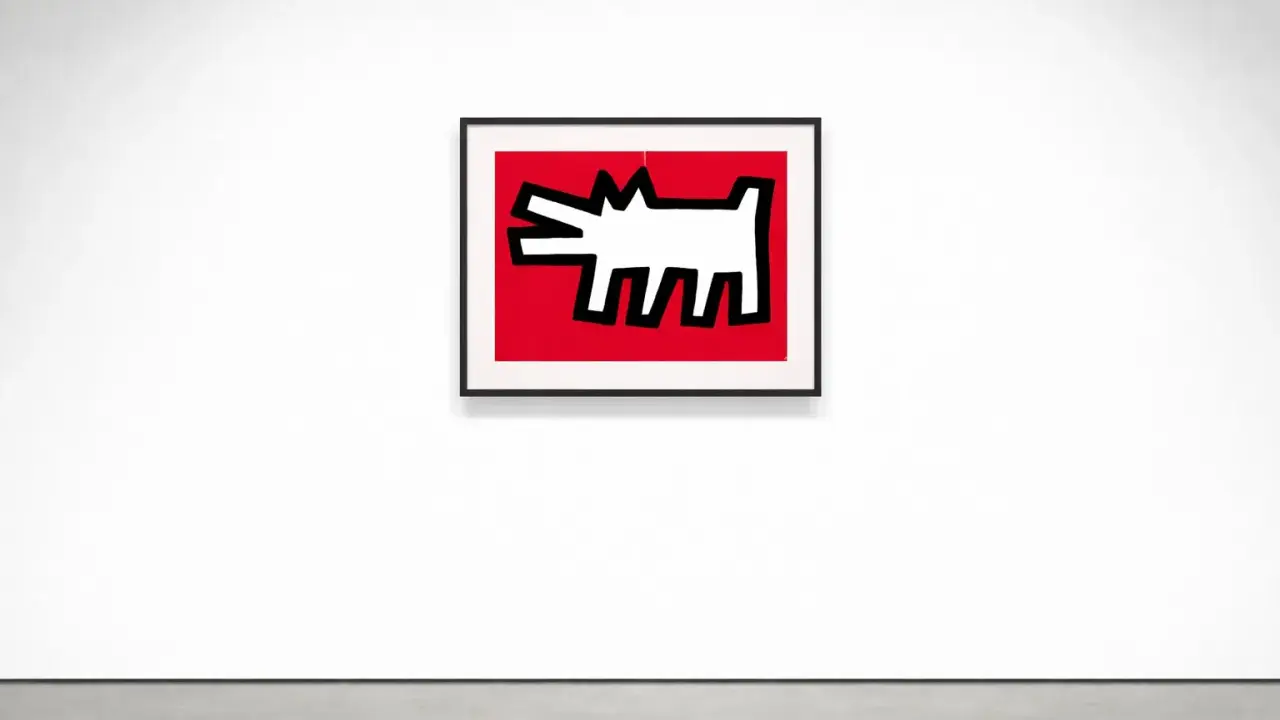
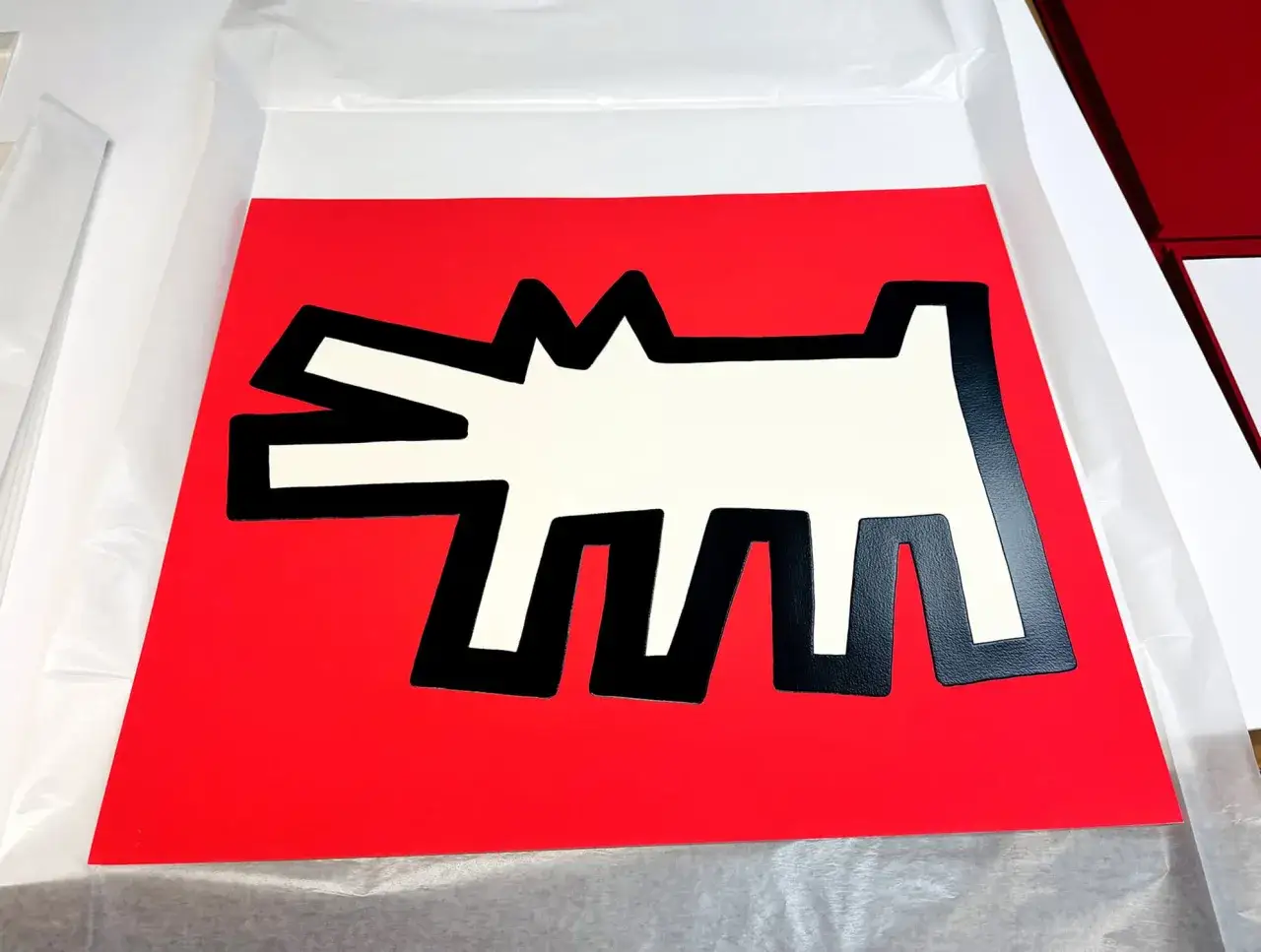
| Untitled, 1984 mini print | 35.6 x 28 cm, printed on 250 gsm matt art paper; the image feels direct and stripped back. | This is the cleanest entry point if you want to see the dog as a pure symbol rather than part of a crowded scene. |
| Dog on Black exhibition poster | 70 x 50 cm, on 300 gsm fine art paper; the dog sits inside a denser field of Haring’s other tags. | This version shows how the motif works inside Haring’s broader visual system, not in isolation. |
| Neon and design editions | The dog is translated into a brighter, more domestic object language. | This is where the image crosses from museum icon to contemporary interior object, which says a lot about its market life. |
That range is important in the UK market. It means the barking dog can exist as a serious art-historical image, a collectible print, and a design-led object without losing recognisability. MoMA Design Store’s neon version is a good example of how far the motif has travelled: the image remains legible, but its setting changes from gallery wall to everyday space.
How to read the motif without overthinking it
People sometimes miss Haring because they assume the simplicity is the whole story. It is not. The trick is to read the image in layers rather than stopping at the first impression.
- Start with posture. The dog’s stance usually tells you whether the image feels alert, confrontational, or ceremonial.
- Look at the mouth and linework. The bark is not just a sound cue; it is a graphic interruption.
- Check the surrounding symbols. If babies, dancers, monsters, or chained figures appear, the dog is probably part of a wider social field.
- Consider the medium. Chalk on black paper feels urgent and temporary; a print feels more resolved; a neon edition feels more design-led.
- Avoid calling it cute too quickly. The image is more charged than that, even when it looks playful.
I think this is where many first-time viewers go wrong. They see a memorable mascot and stop there. The better reading is to treat the dog as a compressed statement: an image that can carry warning, energy, and commentary all at once. Once you read it that way, the final question is why it still resonates so strongly now.
Why the barking dog still feels contemporary in 2026
The answer is that Haring built an image that travels extremely well without becoming empty. In 2026, that matters more than ever. We live with a flood of instantly legible symbols, but very few of them still carry the mix of play, activism, and tension that Haring achieved.
For UK viewers, the motif also feels familiar in a practical sense. It turns up in exhibition contexts, museum shops, prints, and design objects, which keeps it visible outside the narrow circle of specialist art audiences. That visibility can be a strength, but it also creates a risk: over-merchandising can flatten the work into branding. The original power of the image comes from the fact that it was never just branding. It was a visual language with social pressure behind it.
That is why I would read the barking dog as more than a famous motif. It is a compact example of Haring’s method: make the image clear enough to hit immediately, then leave enough tension inside it that the viewer has to keep thinking. If you encounter it in a print, a poster, or a gallery context, look first at the context, then at the surrounding symbols, and finally at the sense of movement. That is usually where the work opens up.