Contemporary museum imagery works best when it shows both the art and the logic of the space around it. The best museum of contemporary art denver photos usually mix architecture, installation views, and small details that explain scale, light, and mood in a single glance. I’m focusing here on what those images really tell you, which angles are worth looking for, and how to plan a visit if you want strong shots without running into avoidable restrictions.
What matters most in these images
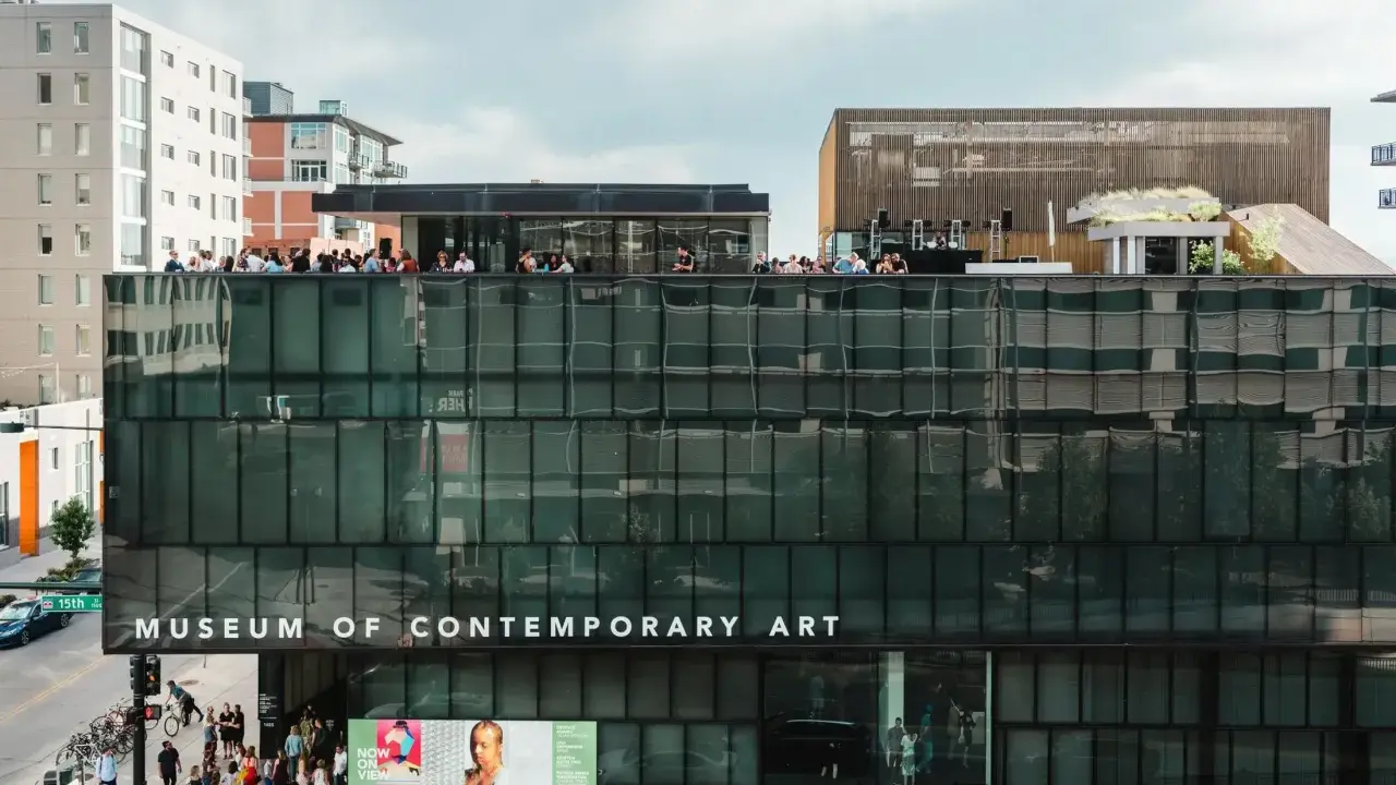
- MCA Denver is as much an architectural subject as an art venue, so the building itself matters in the photo set.
- Online images often show rotating exhibitions, which means they are better read as atmosphere and scale references than fixed previews.
- Personal, non-commercial photography is generally allowed unless a specific gallery says otherwise.
- Flash photography and tripods are not permitted, so simple handheld shooting works best.
- The most practical visiting window is Tuesday to Friday from noon to 7 pm, or Saturday and Sunday from 10 am to 5 pm; Monday is closed.
- Current admission includes a $14 adult ticket, a $5 after-5 pm option on Tuesday to Thursday, and free entry for teens 13 to 18 and children under 12.
Why these photos matter more than a standard museum gallery set
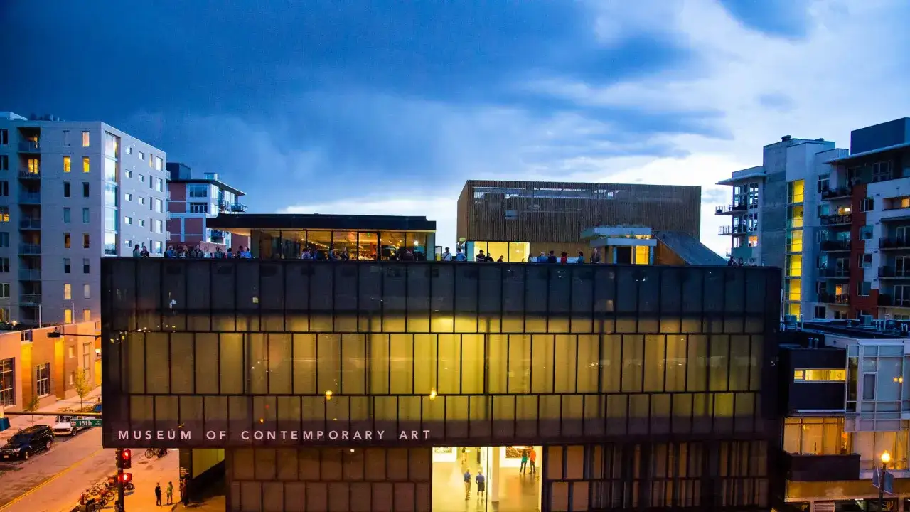
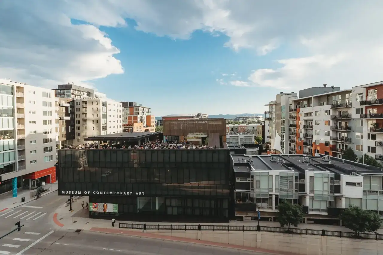
When I look at museum photos, I’m not just checking whether the art looks good. I’m checking how the museum handles circulation, distance, and light. MCA Denver is useful in that sense because the David Adjaye-designed building and the rotating exhibitions create a visual language that changes from one show to the next, so the best images do more than document objects on walls.
The strongest frames usually show how the museum behaves in space: how the architecture frames the block, how a work sits inside a room, and how much breathing space the exhibition leaves around the viewer. That is why a good image set feels informative instead of decorative. It tells you whether you are looking at a place for quick impressions, slow looking, or a longer, more deliberate art visit.
| Photo type | What it shows | What I read from it |
|---|---|---|
| Exterior street view | The building on its corner and its relationship to the block | How visible, urban, and architecturally assertive the museum feels |
| Wide gallery shot | The exhibition layout and room scale | Whether the show feels immersive, sparse, or tightly curated |
| Detail image | Material texture, labels, surfaces, and close-up work | How much the exhibition rewards slow looking |
| People-in-space frame | Visitors in relation to the architecture and art | How crowded the experience feels and how large the rooms actually are |
That distinction matters because a glossy close-up can be misleading. It may look polished while hiding the scale of the room or the density of the installation. If you want the images to be genuinely useful, read them as evidence of spatial experience, not just as promotion. That becomes clearer once you know which parts of the museum usually photograph well.
The most photogenic parts of the museum
There are three reliable subjects here: the exterior corner, the exhibition spaces, and the in-between public areas. The street-level view is strong because the building reads as a contemporary object, not a decorative backdrop; it gives you shape, shadow, and a clear sense of arrival. Inside, the best frames usually come from showing how a work sits in relation to wall height, floor space, and neighboring pieces rather than isolating the artwork too tightly.
The street corner view
The museum’s location on the northwest corner of 15th and Delgany is useful if you want a clear establishing shot. I would use this angle to show the building as part of the city, not as a detached object. That works especially well when the weather is clean, the pavement is dry, and you can let the geometry of the facade do the work.
The galleries
Inside the galleries, the best photographs are usually the ones that respect the installation logic. Contemporary shows often rely on scale, spacing, and sequence, so a wide frame usually tells you more than a tight crop. If a room is packed with objects, I would look for one balanced composition that shows density and one quieter detail that reveals material or process.
Read Also: Museum Imagery - Make Your Photos Stand Out
The everyday spaces
I would not ignore the lobby, stair landings, signage, and café area. Those transitional spaces often tell you more about the museum’s tone than a single hero image. A museum that looks alive in these in-between zones usually photographs better overall, because the pictures show movement, not just art objects frozen in isolation.
Once you know where the strongest frames are, the next issue is how to take them without disturbing the visit for everyone else.
How I would photograph the museum respectfully
According to MCA Denver, personal, non-commercial photography is generally allowed unless a specific gallery says otherwise, but flash photography and tripods are not permitted. That changes the way I approach the space: I move more slowly, keep my kit simple, and treat each room as something to read first and photograph second.
- Use available light and a steady handheld stance rather than trying to force a bright exposure.
- Take one wide frame before moving to details, because the wide shot gives later images context.
- Check wall labels and posted notices before lifting the camera. Some exhibitions simply do not want photographs.
- Avoid standing in the center of the room for too long. A museum photo session should never block the flow of visitors.
- If reflections are heavy, shift your angle before you edit. In contemporary museum spaces, a small move often solves the problem faster than post-processing.
- When people are in frame, think about consent and composition together. A candid crowd shot can work, but only if it is genuinely respectful and useful.
The biggest mistake I see is over-shooting the obvious. A handful of deliberate frames usually tells the story better than twenty similar files, and it leaves you more time to actually look at the art. That practical discipline matters even more when you plan the visit itself.
When to visit for the best light and the least friction
If your goal is useful photos rather than just proof that you went, timing matters. The museum is currently listed as closed on Monday, open Tuesday to Friday from noon to 7 pm, and open Saturday and Sunday from 10 am to 5 pm. For a calmer visit, I would usually aim for the first hour after opening on a weekend or the early part of a weekday afternoon; for exterior shots, later daylight often gives cleaner building contrast.
| Visit detail | Why it matters for photo planning |
|---|---|
| Monday closed; Tuesday to Friday noon to 7 pm; Saturday and Sunday 10 am to 5 pm | Helps you choose quieter windows and avoid a wasted trip |
| Adults $14; $5 after 5 pm Tuesday to Thursday; students $11; 65+ $11; teens 13 to 18 free; children under 12 free | Useful if you are deciding between a quick stop and a longer visit |
| Public parking in the garage at 1900 16th St | Makes it easier to plan an exterior shoot without circling the block |
| Guided tours on Friday and Saturday from 1 to 2 pm | Good if you want context that improves how you frame the exhibition |
| Free digital guide on Bloomberg Connects | Useful for captions, artist notes, and a better read on what you are photographing |
If I were planning the visit from scratch, I would pair the digital guide with the tour schedule and then choose the quietest entry window I could manage. That gives the photos more context, and it usually makes the museum feel less rushed.
The details that make a photo set worth keeping
A useful museum photo set does three things: it tells you where you were, what kind of art you saw, and how the museum felt to move through. For MCA Denver, that usually means one exterior frame, one wide interior frame, one detail, and one image that captures the relationship between people and space. Everything else is optional.
- Keep one image that shows the entrance or street corner, because it anchors the visit in place.
- Keep one frame that shows scale, because scale is one of the most important things a museum photo can communicate.
- Keep one detail that reveals the material character of the exhibition.
- Keep one candid moment only if it adds genuine atmosphere and does not violate the museum’s rules.
- Delete duplicates and over-exposed frames quickly so the final set stays readable.
That is the real value of MCA Denver imagery: it helps you read the museum before you get there and remember it after you leave. I would always start with the photos, verify the rules, and then use the building, the exhibition, and the visit rhythm together to turn a simple gallery stop into a much better visual experience.