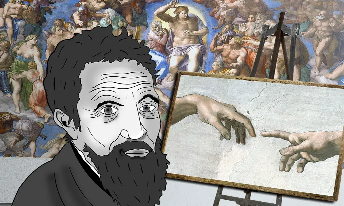
A Michelangelo drawing is rarely a simple preliminary mark on the way to a finished image. I read these sheets as working laboratories: places where anatomy, theology, movement, and composition are still being argued over in chalk. This article breaks down the main kinds of drawings he made, how to read them on the page, and which details matter most if you want to understand the artist rather than just admire the name.
Michelangelo’s drawings show invention, revision, and finish at once
- They are not secondary material. Many sheets are central evidence of how he built major frescoes, sculptures, and architectural projects.
- Different sheet types do different jobs. Figure studies, compositional sketches, cartoons, and presentation drawings should not be read in the same way.
- Technique matters. Black chalk, red chalk, and occasional white chalk accents change both the look and the function of the sheet.
- Corrections are valuable. Visible changes, repeated limbs, and erased lines often tell you more than the cleanest contour.
- Rarity shapes what you see. The finest sheets are fragile, so museums often show them in rotations or high-quality facsimiles.
Why these drawings matter more than simple preparatory work
Michelangelo used drawing as a thinking tool, not just a drafting stage. The Metropolitan Museum of Art once brought together 133 of his drawings in a major exhibition, which is a useful reminder of how limited the surviving corpus is and how rarely the sheets can be shown without risking damage. That scarcity matters because the drawings are often the clearest record of how he tested an idea before committing it to plaster, marble, or architecture.
For me, the key point is that these are not dead ends. A sheet can be a study for the Sistine Chapel, a model for a sculptural pose, or a more personal meditation on faith and mortality. In other words, the drawing is often the place where Michelangelo’s public ambition and private concentration meet. Once you see that, it becomes easier to understand why the next question is not “What does the sheet look like?” but “What kind of sheet is this?”
The main kinds of sheets and what each one does
Michelangelo worked in a small but expressive range of media, especially black chalk and red chalk, sometimes with white chalk accents or ink. Red chalk can give firmer edges and a slightly more resolved surface, while black chalk often feels broader and more immediate; he could make either medium feel unusually exact. The distinction matters, because the same artist used drawing for radically different purposes.
| Type of sheet | What it was for | What it looks like | Why it matters |
|---|---|---|---|
| Compositional study | Testing where figures, gestures, and movement should sit in the final work | Overlaps, repeated poses, several ideas sharing one sheet | Shows how he built order out of uncertainty |
| Figure or anatomical study | Working out the body in motion before it entered a fresco or sculpture | Isolated limbs, torsos, backs, or hands, often revisited several times | Reveals how seriously he treated anatomy as structure, not decoration |
| Cartoon | A full-scale transfer drawing for painting or fresco | Bolder contour, larger scale, a more direct bridge to the wall | Shows the point where drawing becomes the architecture of the final image |
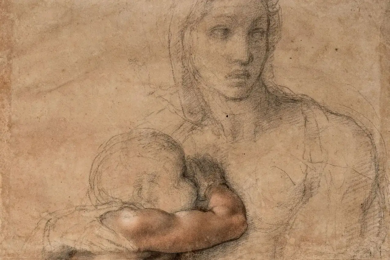
| Presentation drawing | A highly finished gift for a friend or patron | Dense finish, controlled surfaces, polished chalk work | These sheets behave more like autonomous works of art than workshop notes |
| Architectural study | Testing buildings, chapels, domes, and spatial rhythm | Plans, elevations, corrections, and notations of proportion | Confirms that Michelangelo thought as much like a designer as a painter |
Royal Collection Trust describes the presentation drawings as intimate, highly finished gifts made for Michelangelo’s closest friends, and that is exactly how I would separate them from the more workmanlike studies. Once you make that distinction, the rest of the corpus becomes much easier to read.
How to read a sheet without over-interpreting it
The biggest mistake is to treat every line as equally final. Michelangelo often worked by testing a form, revising it, and then tightening the result, so the best drawings preserve stages of thought rather than a single polished answer. I usually read them in this order:
- Start with the purpose. Ask whether the page looks like a compositional rehearsal, a figure study, or a finished gift.
- Track the corrections. Visible changes are not noise; they are evidence of decision-making.
- Look for pentimenti. These are the traces of earlier ideas left visible under or beside the final lines.
- Check the body language. Michelangelo cared deeply about weight, twist, tension, and the mechanics of the torso, shoulders, and hands.
- Read the verso. The reverse side often holds a second idea, a later adjustment, or a completely different stage of the project.
That reading method is especially helpful with his late drawings, where the line can feel severe but the thinking behind it is remarkably fluid. You start to see not just what he chose, but what he rejected and refined on the way there.
Five drawings that show the range of his draftsmanship
It is easier to understand Michelangelo’s draughtsmanship when you place different sheets side by side. A few examples show how wide the range really is.
- Studies for the Libyan Sibyl. This kind of sheet breaks the body into parts and tests them separately, which tells you that Michelangelo was not improvising a monumental figure all at once. He was engineering it.
- Studies for the Last Judgment. Here the figures become increasingly specific, with repeated versions of limbs, torsos, and gestures. The point is not redundancy; it is pressure-testing a difficult composition until it can survive on the wall.
- A Children’s Bacchanal. This is one of the most revealing presentation drawings because the finish is so high. It shows that a drawing could be a gift, a philosophical image, and a finished artwork at the same time.
- Christ on the Cross with the Virgin, St John and St Mary Magdalene. Repeated crucifixion imagery in Michelangelo’s late work often reads like meditation as much as design. The drawing feels devotional, but it is also structurally disciplined.
- Architectural studies for major Roman projects. These sheets matter because they prove his drawing was not confined to the human body. He used the same mental precision to think through domes, chapels, and civic space.
What unites these examples is not style alone, but intensity of purpose. Each one answers a different question, and each one leaves behind a different kind of evidence.
What to look for when you stand in front of one
If I had only a minute with a Michelangelo sheet, I would ignore the signature aura first and look for three things: scale, correction, and finish. Scale tells you whether the artist is thinking of a body, a wall, or a building. Correction tells you how he solved problems. Finish tells you whether the page was meant to remain private or to travel into the world as a gift, a model, or a collectible work.
That also means the catalogue entry matters. In Renaissance drawing, the distinction between by Michelangelo, school of Michelangelo, and after Michelangelo changes the whole reading of the object. A sheet can be important even when it is not autograph, but the category determines whether you are looking at the artist’s own thought process or the afterlife of his style.
That is why originals matter so much. Reproductions can show the image, but they flatten the pressure of chalk, the density of cross-hatching, and the quiet evidence of revision. In a museum setting, those surfaces are the difference between seeing a picture and seeing a mind at work.
A quick way to read Michelangelo on paper in the first minute
When you encounter one of these sheets, begin with the whole before the detail: ask what problem the artist is solving, then look for the line of thought that solves it. If the drawing is heavily revised, that usually means it is closer to the creative engine than to the final display; if it is highly finished, it may be a presentation sheet meant to stand on its own.
That small shift in reading changes everything. Instead of treating Michelangelo’s drawings as preliminary leftovers, you start to see them as some of the most concentrated works in Renaissance art: exact, restless, and far more revealing than a finished surface alone.