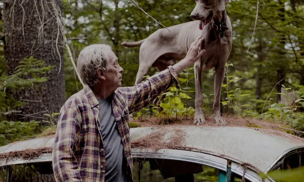
William Wegman’s most famous photographs are easy to recognise once you know the pattern: spare black-and-white concept pieces, deadpan staging, and the Weimaraner portraits that turned Man Ray into an art-world celebrity. What makes the work worth more than a quick smile is the discipline underneath it; Wegman uses humour, scale, and composition to build images that stay sharp long after the first glance. In this article I focus on the photographs people remember first, why they matter, and how to read them without flattening them into a novelty act.
The core story behind Wegman’s signature images
- His reputation comes from two bodies of work: early conceptual black-and-white photographs and later dog portraits, especially Man Ray.
- The black-and-white images matter because they establish the artist’s visual grammar: repetition, small shifts, and dry humour.
- The large-format Polaroids from 1978 onward made Wegman instantly recognisable to a wider audience.
- Later colour works keep the same intelligence but add stronger staging, cleaner surfaces, and more explicit art-history references.
- If you only have time for a quick first look, start with the conceptual pieces, then compare them with one Man Ray Polaroid and one late colour print.
Why Wegman’s best-known photos still feel serious
I would split Wegman’s career into two visual languages that never quite stop talking to each other. The first is conceptual and spare; the second is more famous, more theatrical, and more obviously linked to the dogs. What keeps both from feeling thin is that they operate like well-built propositions: a proposition is a simple idea tested under clear conditions. In Wegman’s case, the joke lands, but the structure does the lasting work.
That matters for anyone trying to understand his reputation in 2026. The public may remember the dogs first, but the artist’s authority rests on the earlier photographs just as much as on the later portraits. The early work gives the later work its confidence, and the later work gives the early experiments a broader afterlife. The first images worth knowing show that foundation most clearly, so that is where I start.
The black-and-white photographs that established the grammar
In the early 1970s, Wegman made a run of black-and-white photographs that are funny without being casual. They look simple because the setups are simple, but the timing is exact. This is where you see his taste for deadpan, meaning humour delivered with a flat, almost expressionless surface, and for serial logic, meaning the same idea repeated with tiny changes so the viewer notices difference rather than plot.
| Work | Year | Why it matters |
|---|---|---|
| Reading Two Books | 1971 | Turns a simple act into a staged double take and shows how early Wegman could make a small premise feel complete. |
| Photo Under Water | 1971 | Makes the camera’s own limitations part of the idea, which is a key conceptual move in his early work. |
| For a Moment... | 1971 | Uses stillness and pause as the subject, not just as a way of making the picture. |
| Shaking Hands | 1972 | Turns a social gesture into something formal, odd, and slightly theatrical. |
| He Took Two Pictures_One Came Out | 1972 | Builds failure into the artwork itself, which is why it still feels smart rather than merely playful. |
| Stormy Night | 1972 | Uses a repeated structure to create rhythm, so the viewer reads the image as a sequence of tiny shifts. |
| Before/On/After: Permutations I | 1972 | The clearest early example of Wegman’s conceptual thinking, and a work that treats perception itself as the subject. |
What these photographs have in common is not style alone. They teach you how Wegman thinks: start with a rule, push it one step too far, then stop before the image explains itself. That habit is the bridge to the dog portraits, where the rule becomes easier to see and easier to misread.
The Man Ray Polaroids that made him instantly recognisable
In 1978, Polaroid invited Wegman to work with a large-format camera, and the resulting 24 x 20 inch photographs of Man Ray pushed his work into a new level of visibility. The scale is part of the point: the dog’s body, gaze, and posture have enough room to become compositional elements rather than cute details. These are the images that made Wegman easy to identify at a glance.
Man Ray is the centre of the story, but not because the pictures are sentimental. Wegman treats the dog as a collaborator with presence, timing, and attitude, and that is why the best portraits hold up beyond novelty. When the image works, it feels balanced between portrait, performance, and mild absurdity. When it misses, it can slide into simple illustration. The famous ones avoid that trap.
The public image of Wegman was largely set by these photographs, but the real achievement is that they never look like a single trick repeated on autopilot. The dog remains constant, yet the emotional temperature shifts from image to image. That is one reason the work stayed alive after Man Ray, rather than ending with him.
The later colour photographs that turned the dogs into tableaux
Wegman’s later colour pictures are often where new viewers first feel the work shift from clever to quietly ambitious. The dogs are still the centre, but the surrounding space becomes a stage set, and the furniture, props, and backdrops carry as much visual weight as the animal. A tableau is a staged composition that reads like a still from a play, and that is the right way to think about these images.
| Work | Year | What to notice |
|---|---|---|
| Fey Ray | 1979 | A clear transition from the Man Ray era into a broader, more controlled colour vocabulary. |
| Lawn Chair | 1988 | Uses an everyday object as a stage marker, which makes the composition feel both domestic and absurd. |
| Eerie Chair | 1989 | Shows how a single prop can set the mood without crowding the image. |
| Contact | 2014 | A late pigment print with a cleaner surface and a stronger sense of calm control. |
| The Letter | 2014 | Suggests a small narrative without over-explaining it, which is one of Wegman’s best habits. |
| Ocean View | 2015 | Opens the frame up and lets background and figure work together more evenly. |
| Eames Low | 2015 | Pushes the design reference more clearly, so the image reads as both photograph and art-object. |
What changed across the decades is not just colour. The later prints often feel more architectural, more open, and more self-aware about design history. I would not call them less funny; I would call them better at hiding the joke inside a formal composition. The next step is not more titles, but knowing how to read the prints properly.
The fastest way to read a Wegman print well in 2026
If I were standing in front of one of these works with only a minute to look, I would check three things first: the setup, the print type, and the distance between humour and control. The setup tells you whether the image is a conceptual test, a portrait, or a tableau; the print type tells you how much weight the image was meant to carry; and the distance between humour and control tells you whether the piece is merely amusing or actually complete.
When I look at the medium, I keep the differences simple: silver gelatin tends to feel crisp and restrained, Polaroid gives you scale and immediacy, and pigment print usually means a more controlled archival colour surface. The format changes the mood more than casual viewers expect.
- Start with the early black-and-white works if you want the logic of the practice.
- Move to one Man Ray Polaroid to understand the public image of the artist.
- Compare it with a late colour print such as Contact or Ocean View to see how the language matured.
- Ignore the temptation to separate “serious” from “funny”; Wegman depends on both at once.
That is the route I would recommend in a gallery or museum. Once you see how the pictures are built, the famous dog portraits stop looking like a single joke and start reading as a sustained, carefully edited body of work. The best Wegman images reward that shift in attention, and that is exactly why they remain part of the contemporary photography conversation.