The story of 1950s pop art is less about a finished style and more about a change in artistic attention: painters and collagists began treating magazines, ads, packaging, film, and domestic interiors as serious subject matter. In Britain especially, the movement grew out of post-war culture, and that gives it a sharper, more analytical edge than the glossy image many people now associate with Pop. This article breaks down the defining traits, the key figures, and the works that made the early movement matter.
The early Pop Art decade was defined by mass media, irony, and a small London network that changed modern art
- In Britain, Pop grew from post-war reconstruction, advertising, and the arrival of American-style consumer imagery.
- Richard Hamilton and Eduardo Paolozzi are the two names that matter most for the movement’s early shape.
- The look is built from collage, appropriation, repetition, flat colour, and a deliberate mix of glamour and critique.
- The American branch became more famous later, but its roots overlap with the late 1950s and early 1960s.
- The early works make the most sense when you see them as responses to media saturation, not just decorative images.
How the movement emerged from post-war Britain
In the UK, Pop did not arrive as a neat manifesto. It grew out of conversations among artists, critics, and architects who were trying to make sense of a new visual world filled with magazines, consumer goods, cinema, television, and imported imagery from the United States. I think the cleanest way to read the period is as the moment when high art stopped pretending that billboards, cars, and glossy interiors were beneath it.
The Independent Group, meeting in London in the early 1950s, mattered because it treated popular culture as something to analyse rather than dismiss. Their discussions fed directly into This Is Tomorrow, the landmark Whitechapel Gallery exhibition in 1956 that brought art, design, architecture, and everyday imagery into the same space. That is why the British origin story feels less like a style launch and more like an experiment in how to look at modern life.
What makes this important is the attitude behind it. The early artists were fascinated by mass culture, but they were rarely naïve about it. They could admire its energy and still be critical of its promises, which is exactly why the work still feels intelligent rather than merely nostalgic. Once you see that context, the next question is what, exactly, the artists borrowed from the new visual world around them.
The visual language that defined the early work
The early movement developed a recognisable set of visual habits, even before it hardened into a fully public style. In practical terms, that language included cut-and-paste composition, commercial imagery, bold simplification, and a preference for signs over deep illusion. Appropriation, in art terms, means borrowing an existing image and changing its context so the meaning shifts; that idea sits at the centre of the movement.
- Collage and montage turned fragments of ads, comics, and photographs into new compositions.
- Flat colour and hard edges pushed the work closer to graphic design than to traditional painting.
- Repetition and seriality gave ordinary objects the feel of mass production.
- Humour and irony kept the images from becoming simple celebrations of consumer life.
- Found imagery let artists work with the visual language people already recognised from daily life.
One thing I would stress is that the 1950s version is often more handmade and experimental than people expect. The works can look rough, witty, or strangely provisional because they were testing a visual grammar that had not yet settled. That matters because later Pop is often remembered for its polish, while the first wave is much more uncertain, and therefore more revealing. That vocabulary was shared, but the names attached to it matter just as much.
The British figures you need to know
If I had to reduce the early British story to a short list, I would start with Eduardo Paolozzi and Richard Hamilton. Paolozzi’s Bunk! collages, made from 1947 to 1952, are often treated as proto-Pop because they draw directly from American magazines, consumer goods, pin-up culture, and machine imagery. They are valuable not because they look like later Pop prints, but because they show the raw material before it had become a polished style.
Hamilton is the other indispensable name. His 1956 collage Just what is it that makes today's homes so different, so appealing? is often treated as the emblematic British Pop image because it condenses the whole argument into one room: bodybuilding, appliances, glamour, abundance, and advertising all crowd together. It is compact, slightly absurd, and very sharp. That combination is exactly why it matters.Lawrence Alloway belongs in the conversation too, even though he is better known as a critic than as a maker of images. He helped frame the idea that popular culture could be serious artistic material, and that intellectual move was crucial. The Smithsons also matter, especially Alison and Peter Smithson, because their work linked art to housing, design, and everyday modern life rather than to a sealed-off gallery ideal.
| Figure | Why they matter | What to look for |
|---|---|---|
| Eduardo Paolozzi | His early collages pulled consumer imagery into art before the movement had a settled name. | Magazine clippings, machines, pin-up figures, and a tense mix of attraction and critique. |
| Richard Hamilton | He gave British Pop one of its defining images in 1956 and clarified its visual logic. | Domestic abundance, media overload, clean composition, and a cool, ironic tone. |
| Lawrence Alloway | He helped articulate the idea that mass culture belonged in serious art discourse. | The critical framework behind the movement rather than a single signature style. |
| Alison and Peter Smithson | Their design thinking linked architecture, ordinary life, and the visual language of the street. | Everyday modernity, housing, and the crossover between design and fine art. |
What unites these figures is not a single look but a shared refusal to keep art isolated from ordinary visual culture. If you are trying to understand why British Pop feels so different from later American Pop, this is the place to start. The Atlantic crossing changed the scale and polish of Pop, which is where the American branch becomes impossible to ignore.
How American artists changed the conversation
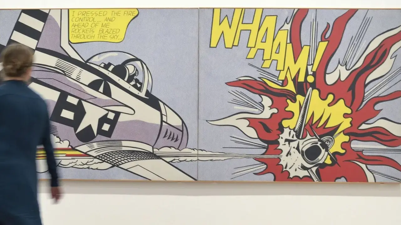
By the late 1950s and early 1960s, the American branch made the movement more widely recognisable, but it did not invent the basic idea from nothing. Artists such as Jasper Johns and Robert Rauschenberg were already testing the boundary between everyday imagery and fine art, and later names like Andy Warhol, Roy Lichtenstein, James Rosenquist, Tom Wesselmann, and Claes Oldenburg pushed the visual language into bolder territory.
The shift is easy to describe but important to understand. British work is often more analytical, collage-based, and sceptical; American work tends to be larger, cleaner, more iconic, and more openly tied to celebrity, packaging, and repetition. That does not make one version more authentic than the other. It simply means the movement adapted to different cultural conditions.
| Strand | Main impulse | Typical look | What it tells you |
|---|---|---|---|
| British Pop | To analyse the flood of modern images and the new consumer landscape | Collage, wit, domestic scenes, and a more provisional feel | Pop began as a critical conversation, not just a celebration |
| American Pop | To amplify consumer imagery into a bold, public visual language | Big icons, clean outlines, repetition, and strong commercial clarity | Pop became a mass-circulation style that could live in galleries and on posters at the same time |
For readers in the UK, the key point is simple: if you are looking strictly at the 1950s, Britain is where the movement’s first decisive language comes together. The American version makes the style internationally famous, but the early British experiments supply much of the logic that came later. To read the movement well, you need a few guardrails, especially if you are comparing early British work with later iconography.
What the first wave still teaches us about images and attention
The most common mistake is to treat Pop as if it only means bright colour and consumer branding. That is too shallow. The early work is really about how images move through modern life, how they seduce us, and how quickly they become ordinary. If I am standing in front of a Pop work with someone, I usually ask them to look at the source image first, then the alteration, then the tone.
- Check the source and ask where the image came from: ad, comic, magazine, photograph, or film still.
- Check the tone and decide whether the artist is celebrating, mocking, or doing both at once.
- Check the medium because collage, paint, and screen print each change how the image behaves.
- Check the date since a 1956 collage belongs to a different phase of the movement than a later commercial silkscreen.
That last point matters more than people think. Early Pop is often more experimental, less polished, and more intellectually alert than the later iconography that made the movement famous. For collectors, curators, and viewers alike, that distinction is not cosmetic; it changes how you read the work and what you expect from it. The first wave may be smaller in scale, but it is where the movement learned how to speak.
If you want the shortest working rule, keep this one in mind: the earliest Pop artists were not just copying popular culture, they were deciding what it meant to make art after popular culture had become impossible to ignore. That is why the movement still feels current, and why the British 1950s phase remains the most revealing place to begin.