Pattern is one of the fastest ways to give an artwork structure, rhythm, and a sense of intention. The most useful examples of pattern are the ones that show repetition doing real work: they guide the eye, change scale, and make a surface feel deliberate rather than random. In this piece, I look at pattern through art styles and concepts, with practical examples from painting, textiles, photography, and contemporary visual culture in the UK.
Key things to know before you read the examples
- Pattern is usually built from repeated visual units such as shapes, lines, colours, or motifs.
- The strongest repeats do more than decorate; they create rhythm, movement, and visual hierarchy.
- Geometric, organic, optical, and allover patterns each produce a different emotional effect.
- British art and design offer some of the clearest references, from William Morris to Bridget Riley.
- Photography uses pattern differently: as composition, structure, and sometimes disruption.
- A good pattern usually includes one rule and one controlled variation.
What pattern means in visual art
In visual art, pattern is not just something repeated. It is a repeat with intent: a motif, shape, line, texture, or colour sequence that creates a recognisable structure. Tate's educational material treats pattern as a principle built on repetition, and that is a useful starting point because it keeps the idea practical rather than abstract.
What matters is the effect. If the eye can sense the underlying rule before it fully explains it, the pattern is doing its job. That is why pattern sits so close to rhythm, order, and even expectation; it trains the viewer to look for the next unit, then rewards them when the surface shifts slightly. Once that is clear, the examples become much easier to read.
Clear examples across art and design
The quickest way to understand pattern is to look at specific forms. These are the examples I reach for when I want to show how repetition works in practice, because each one produces a different visual temperature.
| Example | What it looks like | Why it works | Typical use |
|---|---|---|---|
| Stripes | Parallel bands that may be equal, alternating, or warped | They create direction, movement, and a strong sense of rhythm | Op Art, textiles, banners, painting |
| Polka dots | Repeated circles on a regular field | They feel playful, but the strict spacing gives them discipline | Fashion, installation, pop-inflected painting |
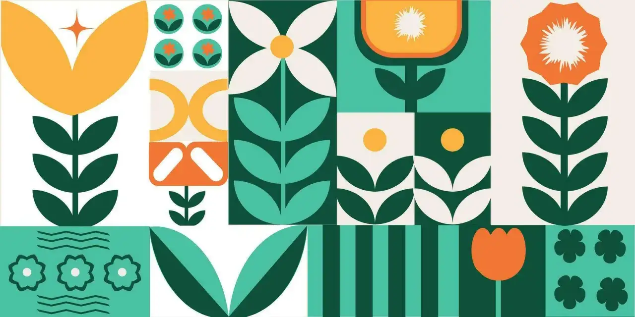
| Florals and vines | Leaves, petals, stems, and blossoms that repeat across a surface | They soften hard edges and make a surface feel organic | Wallpaper, ceramics, illustration |
| Checks and tartans | Crossing bands that form squares or rectangles | They combine order with identity, history, and material culture | Tailoring, woven cloth, heritage design |
| Grids and tessellations | Interlocking shapes arranged with mathematical precision | They create density and a surface that feels complete from edge to edge | Tilework, abstraction, architecture |
| Zigzags and chevrons | Sharp, directional repeats that angle up and down | They energise a composition and keep the eye moving | Murals, posters, contemporary prints |
| Allover repeats | Motifs spread evenly with no clear focal point | They turn the whole surface into one field of attention | Wallpaper, pattern painting, textile design |
| Optical patterns | High-contrast repeats that seem to vibrate or shift | They activate perception rather than just decoration | Op Art, experimental painting, graphic design |
The important part is not the motif itself. A simple stripe or dot can be more powerful than a complicated design if the scale, spacing, and contrast are right. From here, the next question is how different art styles use the same logic for very different ends.
How major art styles use pattern differently
Arts and crafts and textile design
British design history gives pattern a strong, practical foundation. William Morris is the obvious reference point: repeated leaves, flowers, and stems build atmosphere rather than spectacle, and the hand-made feel stops the repeat from going dead. In that kind of work, pattern is not filler; it is the whole surface intelligence of the piece.
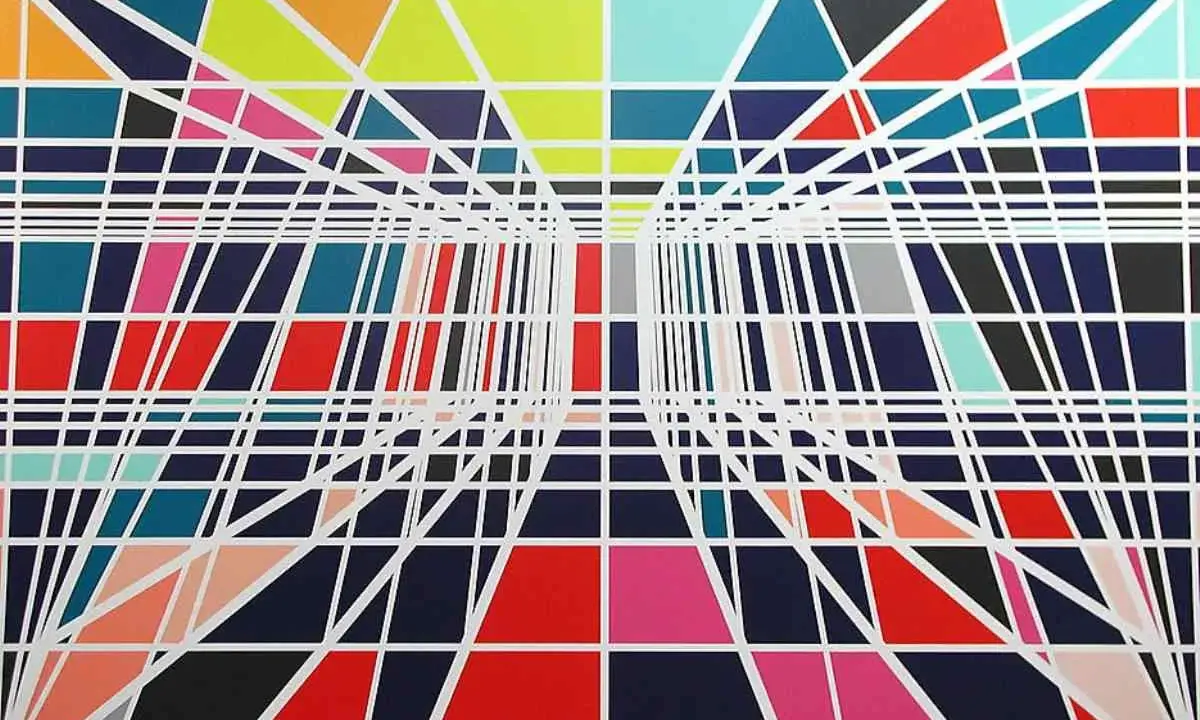
Op art and visual pressure
With Bridget Riley, pattern becomes an engine for perception. Her stripes, curves, and alternating bands do not sit quietly on the surface; they make the viewer feel the work as movement, tension, and optical vibration. This is one of the clearest British examples of pattern becoming an event rather than a decoration.
Contemporary painting and installation
Contemporary pattern work often borrows from fashion, archives, or popular culture and then pushes those references into a more conceptual space. As Artsy recently highlighted, artists are still drawing on houndstooth, polka dots, animal print, ikat, tie-dye, florals, and batik, but the point is rarely nostalgia. More often, pattern is used to talk about identity, memory, mass culture, or the tension between surface pleasure and deeper meaning.
Read Also: The Future of Art - Hybrid, Immersive, & AI-Assisted
Photography and architectural repetition
Photography handles pattern differently again. Repeated windows, railings, roof lines, tiled floors, staircases, and shadows can all become pattern if the frame is tight enough and the repetition is strong enough. In this medium, I usually look for one disruption: a broken window, a missing tile, a figure in motion, or a slight shift in angle. That small interruption is often what stops the image from feeling mechanical.
Those differences matter because pattern changes meaning depending on medium, scale, and context. The same repeat can feel domestic in one setting, severe in another, and almost hypnotic somewhere else.
How to read or make a pattern that holds attention
When I evaluate a pattern, I usually ask the same five questions. They work whether I am looking at a print, a painting, a textile, or a photograph.
- What is the unit? Identify the repeated shape, mark, or motif first.
- What is the repeat rule? Decide whether the pattern is exact, mirrored, alternating, mirrored with variation, or intentionally irregular.
- How large is the unit? Small repeats feel dense and intimate; large ones feel more theatrical and architectural.
- Where is the variation? One controlled interruption is often enough to keep the eye engaged.
- What does the pattern do to the subject? Sometimes it supports the subject; sometimes it replaces the subject entirely.
A useful test is simple: if you remove the variation and nothing meaningful changes, the pattern may be too thin. If you remove the repeat and the work loses its structure, then the pattern is probably doing real work. That leads directly to the main failure mode: decorative surfaces that have plenty of activity but very little meaning.
Where pattern starts to feel decorative rather than alive
Decoration is not a problem by itself. In art, decoration can be expressive, historical, or even radical. The issue appears when pattern is used only to create busyness, because then the eye has no hierarchy to follow and the surface stops evolving.
| Common problem | What it looks like | Better move |
|---|---|---|
| Too many motifs at once | The surface feels crowded and unfocused | Choose one dominant repeat and let the others support it |
| Flat sameness | Every unit looks identical and the eye quickly loses interest | Vary scale, spacing, or colour intensity |
| No link to context | The pattern feels pasted on rather than built in | Connect the repeat to subject matter, material, or place |
| Over-perfect symmetry | The work looks controlled but slightly lifeless | Allow one irregularity or hand-made wobble |
| Pattern without tension | It reads as wallpaper, not as an image with stakes | Add contrast, interruption, or a clearer point of view |
The fix is usually simpler than people expect: reduce the number of competing ideas and make the repeat carry more of the composition. When the structure is clear, pattern stops feeling like surface decoration and starts feeling like a visual argument.
The strongest pattern work gives the viewer a rule and a surprise
If I had to reduce the subject to one practical lesson, it would be this: the best pattern gives you a rule to follow and then breaks that rule just enough to stay memorable. That is why a good repeat is never only about filling space. It is about directing attention, shaping mood, and making the viewer aware of how they are looking.
The examples of pattern above are useful because they show the same principle across very different mediums: a repeat can soothe, energise, unsettle, or completely reframe the subject. The most durable ones are rarely the busiest. They are the ones that feel considered, slightly human, and precise enough to reward a second look.