Andy Warhol printmaking is best understood as a collision between machine logic and artistic intent. He used screenprinting to repeat familiar images, soup cans, celebrities, flowers, electric chairs, while changing colour, registration, and scale just enough to keep each print alive. That mix of repetition and variation is what still makes the work feel immediate, and it is exactly what I unpack here: the techniques, the major series, and how to read the prints without flattening them into Pop-art clichés.
Warhol turned screenprinting into a system for repetition with deliberate variation
- He treated printmaking as a core part of his practice, not a side technique.
- Factory Additions, founded in 1967, let him publish themed portfolios at scale.
- His most revealing series include Marilyn, Flowers, Sunset, Electric Chair, and Birmingham Race Riot.
- Colour shifts, off-register layers, and trial proofs are essential to how the works read.
- For viewers and collectors, edition size, publisher, printer, and condition matter more than a quick title check.
Why screenprinting suited Warhol so well
I see screenprinting as the medium that made Warhol’s logic click. It is a stencil process, with ink pushed through a mesh screen, so the method already carries a built-in logic of reproduction. That fit his interest in consumer culture, where the same image turns up again and again until it starts to feel like a fact rather than a picture.
He did not use the medium as a neat technical shortcut. He used it to make repetition part of the meaning. Before the famous pop icons, he was already working commercially, and he later moved beyond the collaborative printshop model that was common in the United States in the 1960s by setting up Factory Additions, his own print-publishing operation. The result was not just a body of prints, but a system for turning images into editions. MoMA notes that he ultimately made nearly 800 printed images on paper, with about half issued in traditional editions, which is a good reminder that printmaking was central rather than peripheral.
That context matters, because once you see printmaking as his structural language, the famous works stop looking like isolated icons and start looking like variations on a method.
How he built the images
Warhol’s process was deceptively simple on the surface and surprisingly open-ended in practice. He often began with a photograph from advertising, journalism, or publicity, then translated it into a silkscreen image and printed it across multiple sheets. The technical variables were where the art lived: colour, alignment, pressure, and the number of screens all changed the feel of the final work.
| Technique | What Warhol did | Why it mattered |
|---|---|---|
| Photographic source image | He worked from magazine photographs, publicity stills, and news images. | The image already belonged to public culture, so the print felt instantly familiar. |
| Multiple screens | He separated image and colour into different screens, sometimes one screen per colour area. | This let him control variation sheet by sheet instead of aiming for a single fixed result. |
| Off-register printing | He allowed layers to misalign slightly from one pass to the next. | Those small shifts make the prints feel unstable, alive, and visibly made. |
| Editions and proofs | He issued portfolios, trial proofs, and unique variants rather than treating every print as identical. | That complicates the idea that editioned prints are mechanically uniform. |
In practical terms, the thing to watch is not whether a Warhol print is perfectly consistent. It often is not supposed to be. The image is built to hold both control and accident, and that tension is what makes the medium feel so right for him. Once that is clear, the individual series become much easier to read.
His best-known print series and what they reveal
The major series are useful because they show that Warhol was not repeating the same trick. He was testing what screenprinting could do to glamour, violence, decoration, and public memory. Some works feel glossy and seductive, others dry and unsettling, and the medium changes tone very quickly.
| Work | Date | What to notice | Why it matters |
|---|---|---|---|
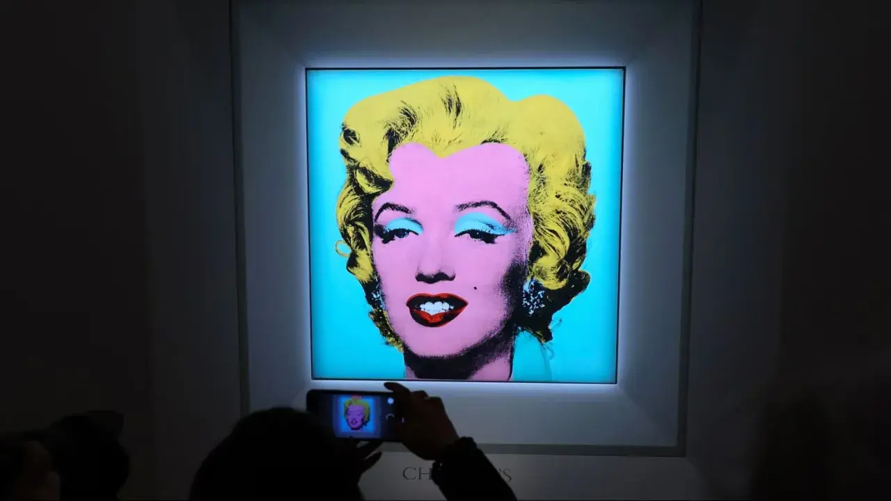
| Marilyn Monroe | 1967 | A portfolio of ten screenprints, each built from five screens, with colour and registration shifting from sheet to sheet. | Celebrity becomes a reproducible surface, but the slight differences stop the image from becoming dead. |
| Flowers | 1970 | Warhol used a hibiscus image from a commercial magazine and created ten distinct reproductions with changing colours. | It shows how easily he could turn a decorative motif into something both cheerful and mechanically detached. |
| Sunset | 1972 | Three screens generated background bands, the sun, and a dot pattern, with 632 unique screenprints made through different colour combinations and registration. | This is Warhol at scale, using a highly organised process to produce many related but not identical works. |
| Electric Chair | 1971 | A set of ten colour screenprints intended to be shown together. | The repetition feels chilling rather than decorative, which is exactly why the series still lands with force. |
| Birmingham Race Riot | 1964 | An appropriated news photograph rendered with deadpan distance. | It proves that Warhol’s print language could hold social violence, not just celebrity and consumer culture. |
Sunset is especially revealing because 472 of the prints were used in the Hotel Marquette, while 160 were assembled into forty portfolios of four prints. That split shows how Warhol could make a work serve architecture, collecting, and serial experiment all at once.
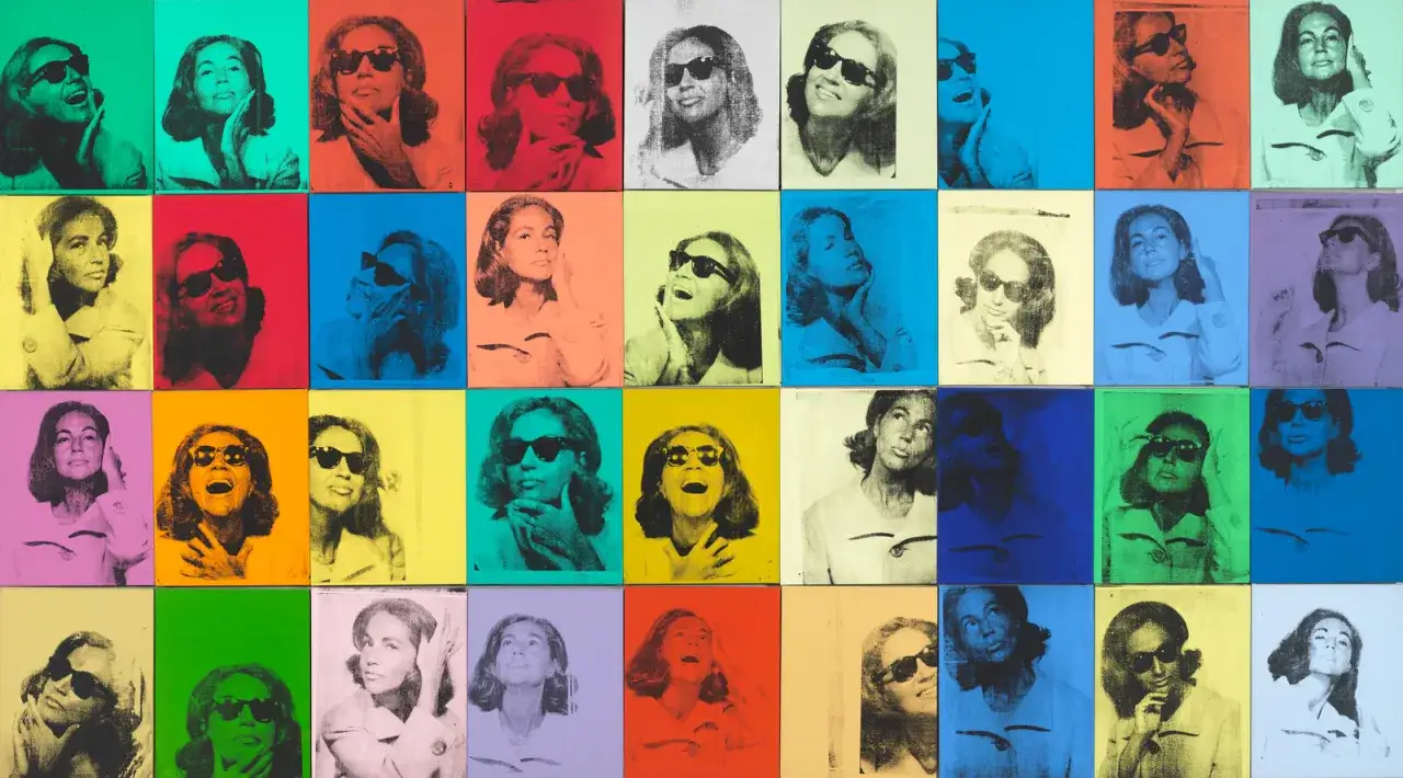
What these examples share is not a single subject but a single attitude toward images. Marilyn turns fame into a system of colour shifts, Flowers pushes advertising logic into near-abstraction, and Sunset shows how a commission can become a controlled laboratory of variation. The Whitney points out that Birmingham Race Riot is unusually political for Warhol, which is exactly why it matters: it reveals how carefully he could balance cool presentation with moral unease.
If you want the shortest possible reading of the series, it is this: Warhol did not use printmaking to make images smaller or cheaper. He used it to make them circulate, and circulation was part of the content.
Why repetition is the point, not the flaw
I think many people still mistake repetition in Warhol for laziness or distance, and that reading misses the point. The repeated image is not there because he could not think of another subject; it is there because repetition changes how meaning behaves. A soup can seen once is an object, but a wall of soup cans becomes a system. The same is true for Marilyn, flowers, or chairs. The subject starts to feel less like a portrait of something specific and more like an image culture under pressure.
That is why small differences matter so much. A slightly shifted red, a blur in a cheek, or a colour band that lands a millimetre out of line can change the emotional temperature of the whole sheet. Warhol understood that seriality and variation are not opposites. In his hands, they feed each other. He was also unusually experimental, issuing trial proofs and unique variants, which is one reason the print record is richer than people expect.
For me, this is the point where Warhol becomes more than a Pop icon. He becomes an artist who understood that mechanical reproduction does not have to erase authorship. It can expose it in a different way.
How to read a Warhol print today
If I were assessing a Warhol print, I would focus on five practical things before anything else.
- Check the edition details. Edition size, publisher, printer, and whether the work is a portfolio print or a proof tell you a lot about how the object was made and positioned.
- Look at the image source. Is it drawn from advertising, a magazine photograph, a news image, or a studio portrait? The source often explains the emotional register of the print.
- Inspect registration and colour. Slight misalignment is not automatically a flaw. In Warhol, it can be a deliberate part of the work’s visual rhythm.
- Read the paper and condition. Browning, fading, trimming, and restoration can all affect both appearance and value.
- Separate original prints from later reproductions. Warhol’s imagery has been heavily reprinted in books, décor, and merchandising, so the medium and production details matter.
For collectors, the safest rule is simple: documentation matters as much as image recognition. A famous motif does not automatically make a strong print, and a quieter edition can be more interesting if it has the right source, printer, and condition. In market terms, the best examples usually combine clean provenance, crisp impressions, and a subject that belongs to Warhol’s core visual language.
That practical lens is useful because it stops the work from becoming pure nostalgia. You start seeing the object as an edition, not just an image on a wall.
What his printmaking changed for everyone else
Warhol helped push printmaking from a supporting craft into a primary language of contemporary art. He showed that an editioned print could be conceptually sharp, commercially aware, and visually iconic at the same time. He also made it acceptable, even desirable, for an artwork to feel manufactured without losing status. That is a big shift, and it still shapes how artists think about photography, reproduction, and repetition.
Just as importantly, he changed how viewers learn to look. With Warhol, you do not get full reward from a quick glance. The first read gives you the logo, star, or object. The second read gives you the colour drift, the pressure of the process, the distance between identical images, and the unease sitting inside the glamour. That layered response is why his prints still hold up in museums and why they keep circulating in conversations about contemporary art, photography, and the market.
If I had to reduce the whole story to one line, it would be this: Warhol did not use printmaking to copy painting, he used it to make reproduction itself the subject. That is why the prints still feel modern, and why the strongest ones reward close looking rather than quick recognition.