Erin Hanson art is easiest to understand when you separate the image from the label and look at the decisions underneath it: colour, surface, scale, and light. Her paintings are not just pretty landscapes; they are a deliberate contemporary reinterpretation of Impressionism that trades tight detail for forceful brushwork and luminous colour. In the sections below, I break down the style, the concepts behind it, and the practical things that matter if you are looking at the work as a viewer, collector, or market watcher.
The core idea behind her style and why it resonates now
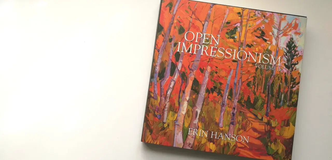
- Erin Hanson’s signature language is Open Impressionism, a contemporary take on landscape painting built from broad, separated brushstrokes.
- Her work is usually painted in the studio from outdoor reference material, not painted directly on location.
- The strongest visual cues are dawn and sunset light, vivid natural colour, and a surface that stays visibly physical.
- From a viewing distance, the images resolve quickly; up close, they become more abstract and textural.
- For buyers, the market is tiered: originals sit at the top end, with textured replicas and prints offering lower entry points.
- For UK collectors, the final cost should also include shipping, insurance, import VAT, and framing.
What open impressionism actually means
Open Impressionism is Hanson’s own way of extending Impressionist ideas into a more direct, contemporary register. The “open” part matters: the brushwork is wider, looser, and more visibly placed than the small broken marks many people associate with French Impressionism. Instead of layering and smoothing the surface, she tends to lay strokes side by side so the paint keeps its edge and energy.
That choice changes the entire reading of the painting. The surface feels less polished and more immediate, which gives the work a strong presence in a room. It also explains why her landscapes can look almost abstract up close, then suddenly click into coherence from a few feet away. I think that shift is one of the main reasons the style feels modern rather than nostalgic.
Another key point is technique. Hanson works with a deliberately limited palette, often keeping the number of pigments low, which helps the colour stay clean instead of turning muddy. She also builds with impasto, meaning the paint is applied thickly enough to create a raised, tactile surface. Once you know that, the paintings stop feeling like simple “colourful landscapes” and start reading as carefully engineered compositions. That technical base is what leads naturally into the stronger emotional effect.
Why the paintings feel contemporary rather than nostalgic
Hanson’s subject matter may be rooted in mountains, vineyards, canyons, and flowering fields, but the paintings are not trying to imitate nineteenth-century Impressionism. The contemporary feeling comes from three things: scale, saturation, and clarity of intent. She is not chasing atmosphere for its own sake; she is building a highly controlled image that still preserves spontaneity.
Her scenes are usually organised around big shapes and strong directional movement. A ridge line, a path of light, or a band of colour often does more compositional work than a fine network of detail would. That keeps the image legible in a digital feed, in a gallery, and in a home interior, which is one reason the work travels well beyond a traditional landscape audience.
There is also a conceptual difference in how the viewer is supposed to look. These paintings reward distance first and inspection second. Many viewers instinctively move closer because the brushwork is so physical, then step back because the image opens up again. That back-and-forth is not an accident; it is part of the concept. In practical terms, it means the work is built for slow looking, not just for a quick decorative scan.
How her work differs from classic Impressionism
The easiest way to understand Hanson’s place in art history is to compare her method with the older Impressionist model. She clearly borrows from that tradition, especially in her attention to outdoor light, but she changes the mechanics enough that the result feels distinct. The table below keeps the comparison simple.
| Feature | Classic Impressionism | Hanson’s approach | Why it matters |
|---|---|---|---|
| Brushwork | Small, broken strokes | Wide, separated, more assertive strokes | The surface reads stronger from a distance and more sculpturally up close |
| Colour | Naturalistic but luminous | Highly saturated, often more symbolic than literal | The paintings aim for emotional intensity, not just visual record |
| Surface | Often lighter and more atmospheric | Thicker impasto with visible ridges of paint | The object itself feels important, not only the image |
| Process | Often tied to direct outdoor painting | Built in the studio from reference material gathered outdoors | Allows tighter control over composition and colour |
| Overall effect | Fleeting, observational, atmospheric | Direct, vivid, and slightly more declarative | The work lands well in contemporary interiors and collections |
That comparison also shows why the paintings can sit between categories. They are not expressionism in the strict historical sense, but they borrow some of its freedom with colour. They are not academic landscape painting either, because the surface is too active and the colour too bold. The result is a hybrid language that feels recognisable without being trapped by tradition.
What to look for before buying one of these paintings
If you are evaluating the work as a collector, I would focus on four things: scale, surface, format, and long-term placement. Scale matters because Hanson’s compositions often depend on broad movement. Smaller works can be intimate and strong, but the larger paintings tend to show the full logic of the brushwork and the colour relationships more clearly.
Surface matters because the tactile quality is part of the value. An image reproduced flatly can suggest the painting, but it does not fully replace the physical ridges and directional strokes that make the original memorable. Format matters because the market is layered. On her current portfolio pages, originals sit in the five-figure range and can go substantially higher for very large works, while textured replicas and prints provide more accessible entry points. Prices are shown in US dollars, so a UK buyer should budget beyond the listed amount.
| Format | Typical current position | What you are paying for | Best fit |
|---|---|---|---|
| Original oil painting | From roughly $5,200 to well over $100,000 on current listings | Unique surface, one-of-one authorship, strongest collector value | Serious collectors and long-term buyers |
| Textured replica | Usually starting around $1,000 to $2,500 | A tactile version that echoes the original’s surface energy | Buyers who want presence without original pricing |
| Usually starting around $345 to $410 | The image itself at the most accessible entry point | First-time buyers, gifting, or room-scale decor |
For a UK collector, the practical extras are easy to underestimate. Shipping a stretched canvas, insuring it properly, and framing it well can change the final budget more than people expect. If the work is large, those costs matter enough that I would treat them as part of the artwork price, not as an afterthought. That becomes especially important when the painting is meant to anchor a room rather than sit quietly on a wall.
Why her landscapes travel beyond the American West
Hanson is strongly associated with Western terrain, but the appeal of the work is broader than its geography. The real subject is not a specific state or park; it is the emotional charge of light moving across land. That is a universal visual language, which is why the paintings remain legible in London, Manchester, Edinburgh, or anywhere else a collector wants colour with structure.
The best examples also avoid one common problem in decorative landscape painting: they do not depend on a single scenic trick. Even when the subject is a vineyard, a coastline, or a forest edge, the composition carries the piece. The colour is not decoration pasted on top; it is doing the compositional work. That is a subtle but important distinction, because it keeps the work from feeling generic.
There is another reason the imagery travels well: it balances optimism with restraint. The palettes are bright, but they are not sugary. The brushwork is expressive, but it is not chaotic. In market terms, that combination broadens the audience without flattening the identity of the work. I would call that one of the stronger commercial qualities of the style.
What matters most when you see the work in person
The single biggest difference between seeing Hanson’s paintings online and seeing them on a wall is the behaviour of the surface. In person, the paint ridges catch light differently as you move, which makes the image feel active rather than fixed. That physical shift is easy to miss in photographs, but it is central to the experience of the work.
If I were standing in front of one of these pieces, I would check how quickly the composition resolves at three distances: close, mid-range, and across the room. A strong painting should hold together at all three. Close up, I want energy and control in the brushwork. From mid-range, I want the colour relationships to make sense. From across the room, I want the whole thing to land immediately without losing tension.
That is also the most useful filter for deciding whether the work fits your space. A painting with this much colour and texture needs room to breathe. If it is squeezed into a wall with too much visual noise around it, the effect drops. If it has space and light, the work can do exactly what it is meant to do: pull the eye in, then reward a second look. That, more than any label, is what gives Hanson’s painting language its staying power.