This guide breaks down easy pop art examples, what makes them work, and how to build your own without turning the piece into a cluttered pastiche. I focus on simple motifs, bold colour choices, and the small technical decisions that make a beginner work look intentional. In 2026, the style still feels fresh because its visual language maps neatly onto screens, ads, packaging, and social imagery.
What matters most before you start
- Choose a subject that reads instantly, such as a can, portrait, comic panel, or label.
- Keep the palette tight, usually 2-4 colours plus black or white.
- Use flat colour, hard edges, and one graphic device such as repetition or dots.
- Leave out unnecessary shading and background clutter.
- A basic UK starter setup usually costs about £10-£35.
What makes a pop art example feel easy
Pop art depends on readability. Tate describes the movement as emerging in Britain and America in the 1950s, and that origin explains why everyday imagery still works so well. The best beginner pieces borrow from things people already recognise, then simplify them until the image feels crisp, graphic, and a little bold.
| Design choice | Keep it easy by... | Avoid... | Why it works |
|---|---|---|---|
| Subject | Using a can, face, sneaker, or label | Choosing a scene with too many moving parts | The image stays instantly legible |
| Colour | Limiting yourself to 2-4 colours | Mixing lots of tones and subtle gradients | Bold contrast does the heavy lifting |
| Line | Using a clear dark outline | Soft sketch lines that disappear in the fill | The form reads like a poster or comic frame |
| Texture | Adding dots, blocks, or flat fills sparingly | Layering every possible effect at once | The result feels deliberate, not overworked |
Once those choices are under control, the subject list becomes much easier to narrow down. That is where the most useful examples start to appear.
Simple subjects that turn into strong pop art quickly
If I were helping someone make their first Pop piece, I would start with subjects that already carry a graphic identity. These options need very little invention; the style comes from the treatment, not from a complicated concept.
A soup can or other packaged product
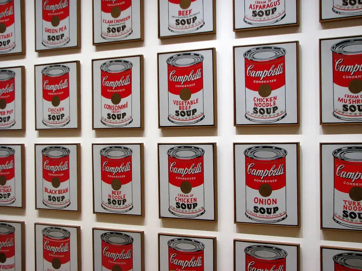
A can is almost unbeatable as a starter subject. It has a clean silhouette, a label, and an obvious link to consumer culture. MoMA’s discussion of Warhol’s Campbell’s Soup Cans shows why repetition matters: once you place the object in a grid, it starts to feel like a brand image rather than a still life. For a UK version, a tea tin, biscuit tin, or cereal box works just as well.
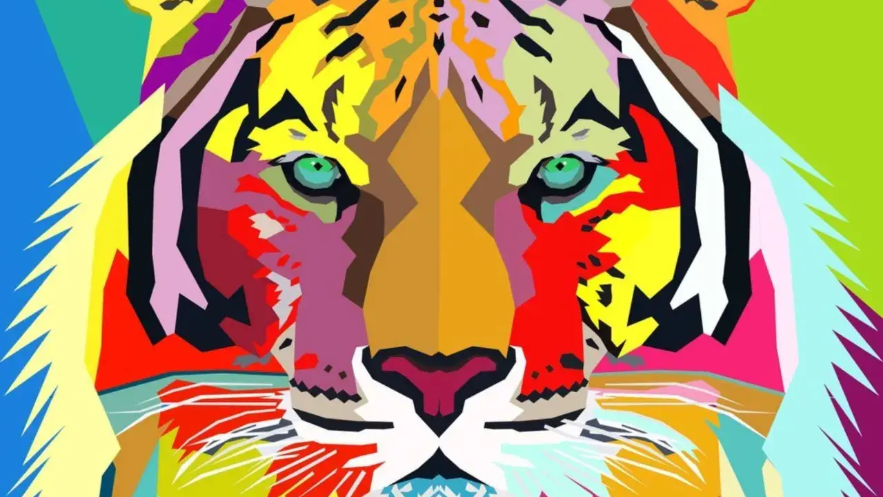
A comic face with a speech bubble
This is the fastest route to Lichtenstein-like energy. Use one face, one emotional expression, one speech bubble, and a black outline. Add Ben-Day dots only in one small area; they are the tiny printed dots used to imitate commercial printing, not decoration you need everywhere.
A repeated portrait or celebrity head
Warhol made repetition famous, but the trick works with any face, including your own. Repeat the same cropped portrait four times and change only the background colour or lip colour. The image instantly becomes Pop because it reads as a series, not a single illustration.
A lipstick, sneaker, phone, or handbag
These objects are easy because their shape is familiar and their surfaces are already flat. I like them for digital work and classroom exercises, because you can simplify them into two or three blocks without losing the subject.
A magazine collage or newspaper front page
This is where British Pop still feels relevant. Richard Hamilton’s collage-based approach showed that Pop can be built from cut-outs, headlines, and consumer fragments, not only painted objects. It is especially useful if you want a more editorial look for a gallery blog, poster, or contemporary art project.
Read Also: Gradients in Art - Beyond Decoration: Master Subtle Transitions
A mug, lamp, or packet with a colour split
This is the easiest way to create a Pop look without relying on famous imagery. Pick one ordinary object, divide it into two or three colour fields, and keep the background plain. The result reads as modern and graphic rather than decorative.
The shape is only half the job; the faster way to improve the result is to control the palette and structure before you start painting.
How I would build one from scratch
The style is simple on paper, but it only works when the decisions are disciplined. My process is almost always the same:
- Choose one reference with a clear silhouette.
- Crop away anything that does not support the main shape.
- Limit the palette to 2-4 colours and reserve black for outlines.
- Fill large areas first, then add one Pop device: repetition, dots, or a speech bubble.
- Stop before the piece starts to look illustrative in a general sense.
If I need extra polish, I keep the background to one flat colour or a clean repeated pattern. That is usually enough to make the image feel finished without losing the directness that makes Pop art effective.
What usually goes wrong when people keep adding detail
The main failure mode is over-explaining the image. Once that happens, the work stops reading as Pop and starts looking like a generic illustration with bright colours.
| Common mistake | Why it hurts the piece | Practical fix |
|---|---|---|
| Too many colours | The eye has no clear hierarchy | Reduce the palette to three or four tones |
| Heavy shading everywhere | The image loses its flat, printed feel | Use blocks of colour instead of blending |
| Busy backgrounds | The subject no longer dominates | Keep the background solid or very simple |
| Random typography | Text feels pasted on rather than integrated | Use one short word, label, or bubble only if it serves the image |
| Dots everywhere | The effect turns decorative instead of structural | Use dots in one area, not across the whole surface |
I would rather see a simple, forceful can than a busy picture that tries to prove how clever it is. Pop art rewards editing more than accumulation, and that is the part many beginners underestimate.
A UK starter setup that keeps costs low
You do not need a specialist print studio to test this style. In the UK, a basic setup can stay very modest if you focus on a single piece rather than a full edition.
| Budget | What to buy | Best for | Typical total |
|---|---|---|---|
| Under £15 | A4 cartridge paper, a black marker, coloured pencils or fibre-tip pens, and a printed reference | Sketches, poster tests, and classroom exercises | £8-£15 |
| £15-£35 | Acrylic paints, a few flat brushes, masking tape, palette paper, and a canvas board | One finished hand-painted piece with strong colour blocks | £15-£35 |
| £35-£80 | Acrylics, heavier paper, a brayer or foam roller, and basic ink or screenprint supplies | Print-like surfaces and small repeated runs | £35-£80 |
If you are working digitally, the cost drops further because the main investment is time, not materials. That makes digital Pop a smart choice when you want to test colour combinations quickly before committing to paint or print.
The smartest first pieces to make when you want the style to land
If I had to choose only three starting points, I would choose these:
- A single product can or tin, because the shape is obvious and the label does most of the visual work.
- A cropped portrait, because it gives you strong contrast, skin tones, and room for repetition.
- A four-panel repeat, because the grid immediately creates a Pop-language without needing a complicated subject.
The cleanest first result usually comes from one object, one palette, and one graphic device. If that combination works, you can add irony, collage, or more layered references later, but you do not need any of that to make a convincing Pop piece now.