Modern abstraction rewards close looking. The strongest works replace literal description with shape, colour, rhythm, scale, and surface, and that shift is what makes modern abstract art such a durable part of the modern era. In this article I break down the visual traits that define the style, the movements behind it, and the examples that show why it matters beyond the gallery wall.
What matters most when reading modern abstraction
- It does not try to copy visible reality; it builds meaning through form, colour, line, and texture.
- The modern period produced several distinct languages, including geometric abstraction, gestural painting, colour field work, and Minimalism.
- Artists such as Kandinsky, Mondrian, Pollock, Rothko, Frankenthaler, and Hepworth show how broad the field really is.
- Strong work usually feels internally balanced, even when it looks loose, spare, or spontaneous.
- Reading the surface, scale, and material is more useful than hunting for a hidden subject.
What gives the style its visual authority
Tate’s basic definition is still the cleanest starting point: abstraction does not aim at an accurate depiction of the visible world, but instead works with shape, colour, form, and mark-making. That sounds simple, yet it opens a very wide field. A painting can feel quiet or aggressive, ordered or unstable, luminous or severe, and still belong to the same family.
What usually separates a strong abstract work from a decorative one is internal logic. The composition may be balanced through symmetry, tension, repetition, or contrast, but something in it has to hold. I tend to look first at whether the artist is controlling the surface deliberately. A loose brushstroke is only convincing when it sits inside a clear visual structure.
There are also a few recurring traits that keep appearing across the modern period: reduced imagery, flattened space, visible process, and a willingness to let colour carry the emotional load. In other words, the painting is not hiding its method. It is using the method as part of the meaning. Once that becomes visible, the main movements are much easier to separate.
The movements that shaped the modern visual language
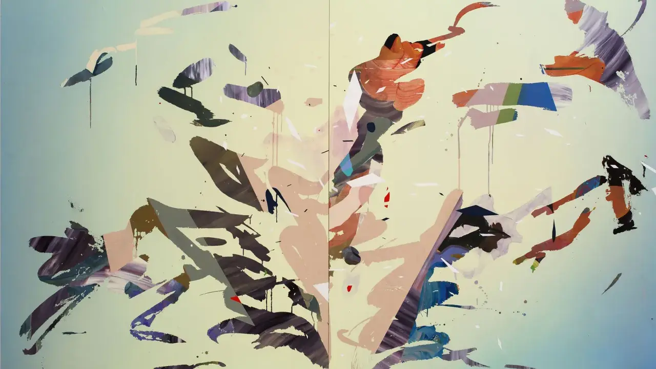
The modern era did not produce one single abstract style. It produced several, and they solve different problems. MoMA’s overview of Abstract Expressionism captures one especially important shift: the canvas became a place for scale, gesture, and personal conviction, not just design. That change sits beside other approaches that were far more controlled.
| Movement | What you usually see | Why it matters |
|---|---|---|
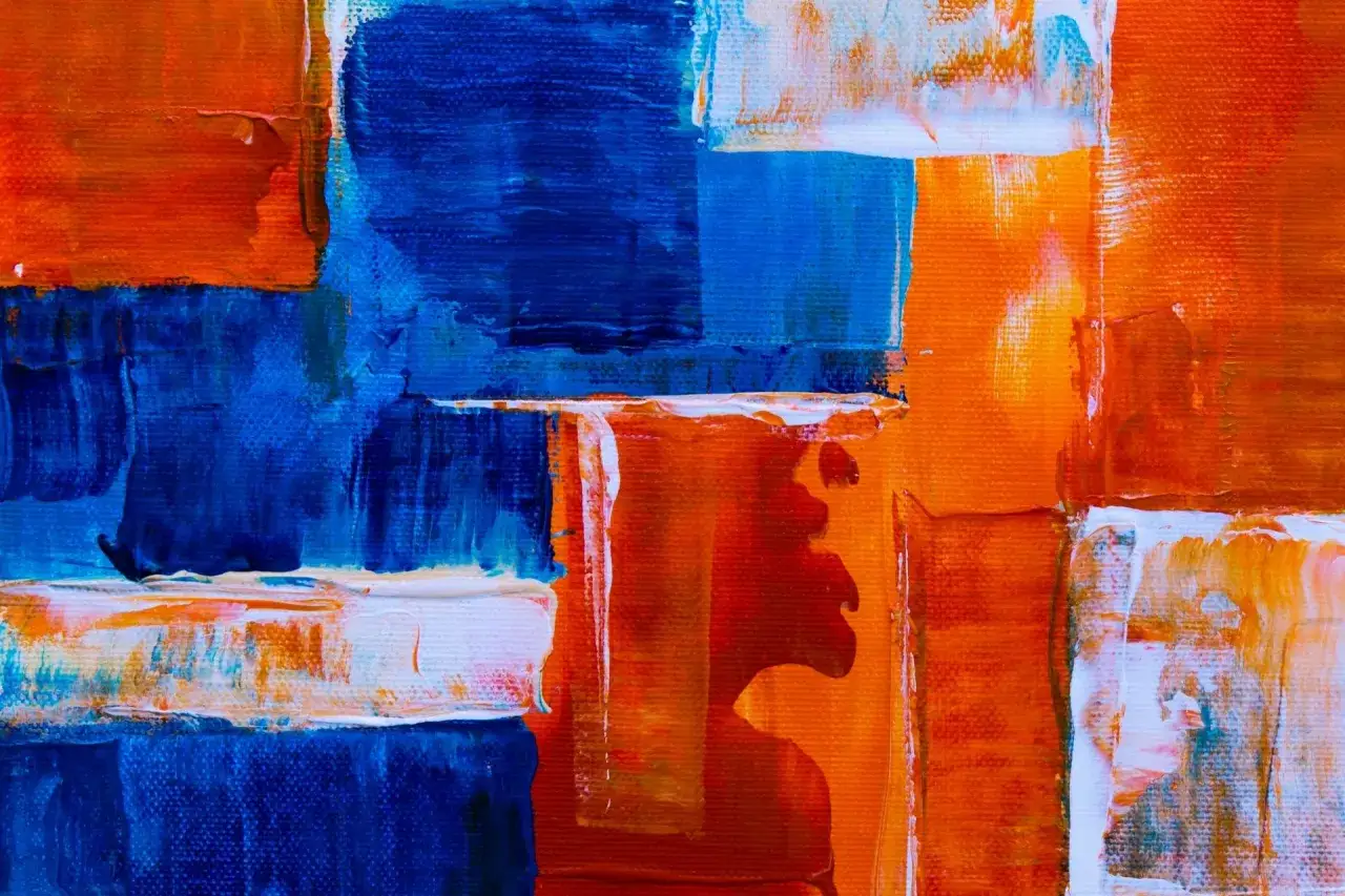
| Geometric abstraction | Grids, hard edges, measured spacing, limited palettes | Shows that restraint can still feel charged and precise |
| Abstract Expressionism | Large canvases, energetic brushwork, drips, visible movement | Makes the act of painting feel immediate and physical |
| Colour field painting | Broad zones of colour with little obvious drawing | Treats colour as atmosphere rather than decoration |
| Minimalism | Reduction, repetition, industrial clarity, fewer gestures | Pushes abstraction toward objecthood and spatial awareness |
| Early modern abstraction | Fragmented form, simplification, shifting viewpoints | Shows how representation slowly gave way to pure structure |
What matters here is not memorising labels. It is recognising that each movement asks the viewer to pay attention to a different kind of intelligence: geometry, gesture, atmosphere, or reduction. Once you can name the language, the examples stop looking interchangeable and start looking purposeful.
Artists and works that make the ideas concrete
The best way to understand the field is to look at specific artists rather than broad theory. The differences are sharp once you start comparing them directly.
- Wassily Kandinsky turned colour and line into a kind of visual music. His work matters because it proves that abstraction can feel expressive without leaning on recognisable objects.
- Piet Mondrian reduced painting to grid, primary colour, and balance. The lesson here is that austerity does not have to feel cold; it can feel disciplined and alive.
- Kazimir Malevich pushed reduction further still. His work is important because it treats form as an idea, not just an image.
- Jackson Pollock made the surface itself the event. The drips and skeins are not random flourishes; they are evidence of movement, pace, and decision.
- Mark Rothko used colour to create emotional weather. His paintings are powerful because they work slowly, almost bodily, rather than through narrative.
- Helen Frankenthaler brought stain and fluidity into abstraction. Her work shows how colour can soak into the support and become part of the structure, not just sit on top of it.
- Barbara Hepworth and Ben Nicholson give the British side of the story real weight. Their work is more architectural and tactile, which is useful to remember if you think abstraction must always be explosive or gestural.
That list is deliberately mixed. It includes painters, sculptural thinking, gesture, geometry, and quiet reduction, because the modern period was never a single mood. The range is wider than many viewers expect, and that range is exactly what makes the field worth studying.
How to read a painting without inventing a hidden subject
I usually start with distance. Stand back 2-3 metres and let the whole composition register before moving in. At that range, you can see whether the work is built around balance, conflict, rhythm, or repetition. Then move closer and check what the surface is actually doing.
- Look for the main structural idea first: grid, gesture, banding, field, repetition, or fragmentation.
- Notice how colour behaves. Is it atmospheric, harsh, restrained, saturated, or deliberately broken?
- Check the edges. Hard edges create a very different feeling from soft transitions or stained passages.
- Read the surface. Thick paint, thin wash, raw canvas, and layered marks all carry different kinds of evidence.
- Ask what the work does to your pace. Does it make you scan, settle, tense up, or slow down?
The common mistake is to ask “what is it?” too early. A better question is “how is it working?” Strong abstraction usually rewards that order. It is also worth resisting the idea that loose mark-making means lack of control. In practice, the hardest thing to do is often to make a spare image feel complete.
That reading habit becomes especially useful if you are trying to buy, hang, or live with a work rather than simply admire it in passing.
What to look for if you want to live with or collect it
In the UK, where gallery light and domestic light can differ a lot, I always think about how a piece behaves in more than one setting. A work that looks exact under cool daylight but collapses in a warmer room is usually less stable than it first appears.
| What to check | Why it matters | What a good sign looks like |
|---|---|---|
| Scale | Size changes whether the work dominates, anchors, or recedes | The piece feels proportionate to the room, not just large enough |
| Palette | Colour changes the mood instantly | The palette holds together in daylight and evening light |
| Surface and material | Paint, paper, textile, and print methods affect depth and durability | The surface still rewards close looking, not just far viewing |
| Context and provenance | Knowing where the work sits in the artist’s practice builds trust | The documentation is clear and the object feels historically grounded |
| Unique work or edition | These are different kinds of purchase and should be judged differently | You know whether you are buying a one-off, a print, or a study |
I would also watch for pieces that are only attractive because they match a sofa or wall colour. That is a weak reason to buy abstraction. The stronger question is whether the work still feels convincing when the room changes, the light shifts, and the novelty wears off. If it does, the piece probably has more structural intelligence than surface appeal.
That practical filter is also what keeps the style from feeling dated. It is not just decoration with a modern label.
Why the language still feels current now
What keeps abstraction current is its flexibility. It can carry ideas about memory, landscape, architecture, data, psychology, and process without needing a literal story. It can also move between museum walls, commercial galleries, and private interiors without losing its identity, which is one reason the style still appears so often in contemporary curatorial and collecting conversations.
I think the deeper reason is that good abstraction asks the viewer to do something very human: to notice relationships before conclusions. You are not being handed a subject in the usual sense. You are being asked to read tension, rhythm, scale, and restraint. That is a demanding brief, but it is also why the best works stay open after the first glance.
If I had to compress the whole subject into one rule, it would be this: the strongest abstract work does not ask you to solve a puzzle; it asks you to notice how the parts hold together. Once that clicks, the language stops feeling vague and starts feeling exact.