The essential facts behind Hokusai's Fuji cycle
- Hokusai made the series in his seventies; it began as 36 views and was expanded to 46 prints after strong commercial demand.
- It is a woodblock-print project, so the series is built from repeatable impressions rather than one-off paintings.
- The Great Wave and Red Fuji are the best-known images, but the full set ranges from storms and labour to calm, almost meditative scenes.
- Imported Prussian blue helped define the series' visual identity and its long afterlife.
- For collectors and museums, impression quality, paper condition and provenance matter as much as the image itself.
What the series actually is
The series is an ukiyo-e woodblock project, not a single masterpiece isolated from its context. Hokusai and his publisher turned Mount Fuji into a repeated subject, and the initial commercial success led to ten additional designs, which is why the set is usually discussed as 46 prints even though the title kept its original numbering. That distinction matters, because the work is built on variation: the mountain stays constant, while everything around it changes.
I read it less as a scenic inventory than as a disciplined study of viewpoint. Sometimes Fuji sits in the distance as a quiet anchor; sometimes it presses into the composition; sometimes it is almost swallowed by weather, labour or travel. The mountain is the fixed point, but the human world around it is always moving, and that tension is what gives the cycle its force. Once you see it as a sequence rather than a poster, the famous images start making much more sense, which is where the technical choices become important.
Why it changed landscape printmaking
One reason the series still feels fresh is that Hokusai used colour and composition with unusual confidence. The newly introduced Prussian blue, imported through Dutch trade, gave sky and water a depth that older pigments could not sustain, and it helped the prints survive visually in a way that feels startlingly modern. The colour was not just decorative; it sharpened contrast, stabilised the palette and made the mountain stand out against changeable weather.
Just as important is the way Hokusai handled perspective. He could crop aggressively, push the mountain to the edge, or turn a scene into a geometric problem where waves, paths, roofs and human figures all lead the eye in different directions. That is why the series helped establish landscape as a serious print genre rather than a background setting. I think that formal audacity is the real engine of the work, and it is easiest to see when you compare the most famous sheets with the quieter ones.
The prints I would start with
If someone only knows the headline image, I usually point them to a small group of prints that show the range of the whole cycle. They are famous for different reasons, and together they explain why the series became canonical instead of merely popular.
| What to look for | Why it matters | |
|---|---|---|
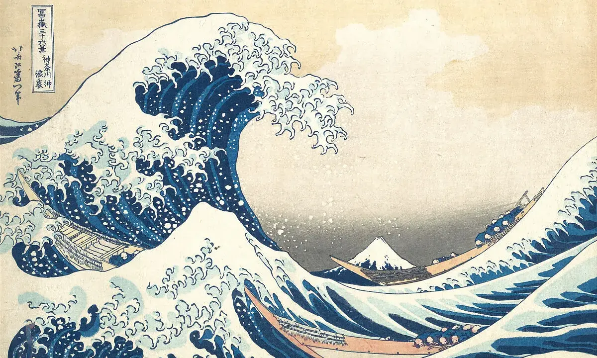
| Under the Wave off Kanagawa | A towering wave dominates the foreground while Fuji shrinks into the distance. | This is the image most people recognise, but the real achievement is the reversal of scale. The mountain is tiny, the sea is overwhelming, and the whole composition feels tense without becoming chaotic. |
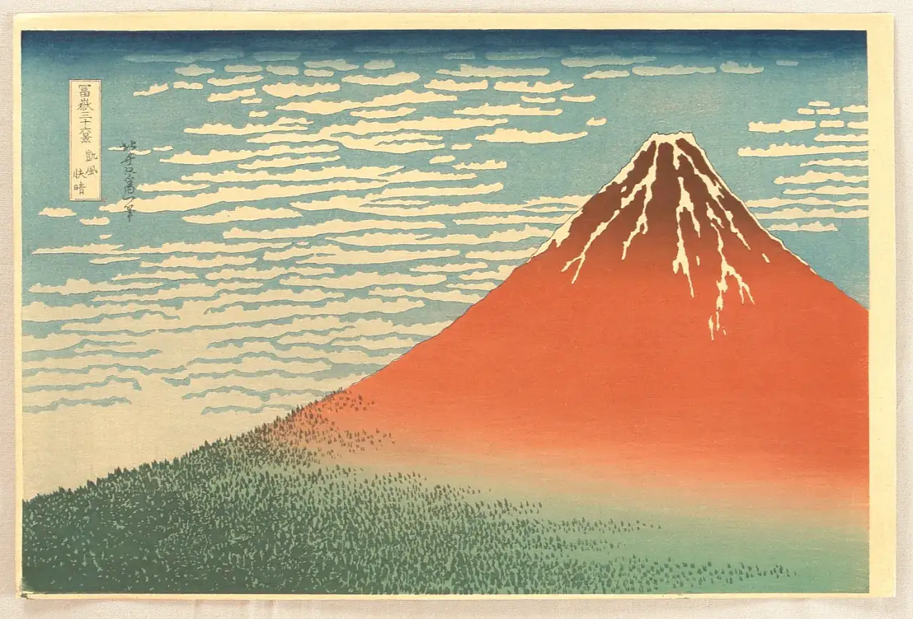
| South Wind, Clear Sky or Red Fuji | The mountain glows red under clear light rather than sitting in a dramatic storm. | It shows that the series is not built only on spectacle. Hokusai can make stillness, heat and atmosphere feel as charged as danger. |
| Storm below Mount Fuji | Lightning cuts through dark weather while Fuji remains steady above the clouds. | This sheet is all about contrast between permanence and transience. The mountain feels monumental because the storm is so unstable around it. |
| Kajikazawa in Kai Province | A fisherman works on a rocky riverbank, with the mountain folded into the distance. | It turns everyday labour into a precise visual structure. The scene is not grand in the obvious sense, but it is one of the best examples of Hokusai’s compositional intelligence. |
| Mishima Pass in Kai Province | Travellers move through a wintry mountain landscape with Fuji placed far away. | It broadens the series into travel and endurance. The mountain is not a postcard backdrop; it is part of lived geography. |
These are not just the “best hits”. They map the range of the cycle, from violence to stillness, from labour to weather, from near to far. That range is what you miss when you know only The Great Wave, and it leads directly to the bigger question of how to read the full set.
How to read the whole sequence
The easiest mistake is to treat the cycle as a pile of separate souvenirs. It makes more sense to read it as a controlled experiment in repetition, where each print asks a slightly different question about the same mountain. If I were teaching it to a first-time viewer, I would tell them to watch for five things.
- Distance - Fuji can be almost out of sight or dominate the image, and that shift changes the mood immediately.
- Weather - clear skies, snow, rain and lightning are not decorative extras; they do most of the storytelling.
- Human scale - workers, travellers, fishers and boat crews keep the mountain from becoming a pure symbol.
- Composition - Hokusai uses diagonals, triangles and sharp cropping to keep the eye moving.
- Impression variation - because these are woodblock prints, later impressions can look softer or less saturated than earlier ones.
That last point matters more than many viewers expect. A woodblock print is not a fixed digital file; block wear, pigment shifts and paper condition all change what the sheet feels like in person. For that reason, two impressions of the same design can have noticeably different energy. Once you start reading the sequence this way, the work stops looking like a set of famous pictures and starts looking like an argument about how images work at all.
Why it still matters to museums and collectors in 2026
The current appeal is not just academic. In London, Dulwich Picture Gallery is showing the complete set in late 2026 and early 2027, and that kind of display matters because it restores the serial logic that reproductions flatten. Seeing the prints together makes one thing obvious very quickly: the series is strongest when you experience the variations in sequence, not when you encounter them as isolated icons.For collectors, the market is shaped by far more than subject matter. A famous image can still be a mediocre impression, and a strong impression can outclass a tired one by a wide margin. The details that matter most are straightforward:
- Condition - foxing, tears, trimming and restoration can change both value and display quality.
- Impression strength - crisp linework and rich colour usually signal a better impression.
- Provenance - clear ownership history supports confidence in authenticity and desirability.
- Edition and state - later pulls may differ in sharpness and pigment from earlier ones, even when the design is identical.
That is why the series still sits at the intersection of scholarship, collecting and public taste. The Great Wave remains the headline, but the broader cycle is what gives it depth, and that broader cycle is exactly what museums and serious collectors continue to value.
What the series teaches a first-time viewer
If I were standing in front of these prints with someone seeing them for the first time, I would ask them to compare three things: how close Fuji sits to the foreground, how much of the image is controlled by weather, and how much space is given to human activity. Those three questions reveal more than memorising the titles ever will. They also show why the series feels so coherent despite its variety.
- Look for repetition with variation, not repetition for its own sake.
- Compare one storm scene and one calm scene to see how much emotional range Hokusai built into a single subject.
- Prefer side-by-side viewing when possible, because the sequence is where the work’s logic becomes clearest.
That is the real value of the series: Hokusai turns a single mountain into a visual system for thinking about place, weather, labour and time. Once you see it that way, the work feels less like one famous image and more like one of the most intelligent image cycles ever made.