The images that changed fashion’s tone
- His best-known photographs are defined by black-and-white mood, minimal styling, and a documentary-like sense of presence.
- The 1990 British Vogue cover with Naomi Campbell, Linda Evangelista, Tatjana Patitz, Christy Turlington, and Cindy Crawford is one of the defining images of the supermodel era.
- Earlier covers, including the 1988 image of Michaela Bercu in a couture sweater and jeans, helped break the old rules of fashion polish.
- What makes the work memorable is not glamour alone, but the balance between character, movement, and simplicity.
- For collectors and editors, the image’s fame matters, but print quality, edition, condition, and provenance matter even more.
The photographs that made his name
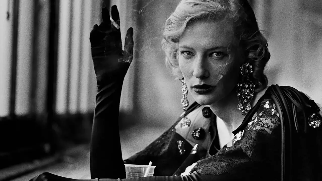
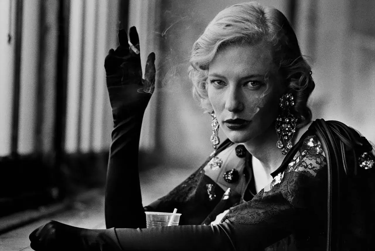
When I think about Peter Lindbergh’s most recognisable images, I do not think first of couture. I think of faces, posture, air, and the kind of light that makes a picture feel unforced. His fame was built on a small group of photographs that changed how fashion could look: less staged, less glossy, and far more human.
| Photograph or series | Why it became famous | What to notice |
|---|---|---|
| The 1988 cover with Michaela Bercu | It disrupted the old fashion formula by pairing a couture top with jeans, making luxury feel unexpectedly ordinary. | The casual stance, the visible texture of the clothes, and the sense that elegance can survive outside the studio. |
| The beach image with six models in white shirts | It helped establish the new supermodel mood before the term became overused. | The group energy, the wind, and the simplicity of white against an open background. |
| The January 1990 British Vogue cover | Naomi Campbell, Linda Evangelista, Tatjana Patitz, Christy Turlington, and Cindy Crawford became the visual shorthand for an era. | The direct gaze, the shared presence, and the way the street setting makes the models feel larger than the page. |
| Kate Moss portraits from the early 1990s | They captured a different kind of beauty: slimmer, younger-looking, and more fragile than the dominant supermodel ideal. | The unforced expression and the way Lindbergh lets personality sit above polish. |
| Portraits of Linda Evangelista, Cindy Crawford, Tatjana Patitz, and others | They proved that he could make each sitter feel individual rather than interchangeable. | The spacing, the body language, and the refusal to over-direct the face. |
That table only works because the pictures share a common discipline. Even when the subjects are glamorous, the framing is plain enough to let the person hold the image. That contrast between simplicity and authority is what leads directly into his supermodel work.
Why the supermodel era changed through his lens
Lindbergh did not invent the supermodel, but he gave the phenomenon a visual grammar. In many fashion photographs, the clothes dominate the person. In his best work, it is the other way round: the model becomes the event. I read that as a quiet but decisive shift in fashion history.
What made the era click was not just the casting, though the casting was excellent. It was the way he allowed different kinds of presence to coexist in the same visual language.
- Naomi Campbell often reads as power in motion, not static beauty.
- Cindy Crawford brings athletic confidence and a sense of ease.
- Linda Evangelista gives him transformation, attitude, and sharp graphic lines.
- Christy Turlington adds calm structure and balance.
- Tatjana Patitz brings mystery, quietness, and a more inward energy.
- Kate Moss shifts the conversation towards vulnerability and understated cool.
That range matters. A lesser photographer might have flattened those women into one glossy type. Lindbergh let them stay different, and that is part of why the images still feel alive. Once you see how he handled identity, the mechanics of the image become much easier to read.
How to read a Lindbergh photograph
If you strip away the fame of the subject, a Lindbergh photograph still works because the construction is disciplined. The images are not chaotic, but they are not over-controlled either. They live in the productive space between editorial precision and something that feels close to a snapshot.
When I analyse one of his pictures, I usually check five things first.
- Light - it is often natural, flat, or quietly directional rather than theatrical.
- Framing - he likes enough space for the body to matter, but close enough for the face to carry the frame.
- Styling - the wardrobe is frequently pared back: white shirts, coats, denim, or minimal layering.
- Expression - the sitter rarely looks over-posed; the strength comes from attention, not stiffness.
- Texture - skin, hair, fabric, and background are allowed to remain visible instead of being smoothed into abstraction.
The result is what I would call glamour with friction. It is polished, but not sealed. That is why the images feel more like portraits than advertisements, and why they still hold up when the fashion context is removed. From there, the next question is less about style and more about legacy.
Why these photographs still matter in 2026
In 2026, Lindbergh’s work still matters because it solves a problem that many contemporary fashion images still struggle with: how to be memorable without becoming noisy. A lot of photography can look impressive for a season and then disappear. His best frames keep working because they have authorial control, not just visual polish.
That matters in three different ways. First, his influence is still visible in editorial photography that wants to feel human rather than hyper-manufactured. Second, his images sit comfortably between fashion history and fine art, which is why museums and serious exhibitions continue to take them seriously. Third, the market rewards recognisable authorship, but only when the physical print has the right qualities behind it.
If I were looking at a Lindbergh print with a collector’s eye, I would care about three things before anything else: whether it is an authorised print, whether the edition is clearly documented, and whether the condition supports the image rather than distracting from it. Online reproduction can make a photograph famous; it does not automatically make it collectable. In this field, the object still matters.
That is also where his legacy becomes practical rather than merely historical. The photographs are famous, yes, but they are also a working reference point for how to balance narrative, restraint, and visual identity without overcomplicating the frame. The last thing I would check, then, is whether the image still feels strong when all the prestige is removed.
What I would check before calling a Lindbergh image essential
My rule of thumb is simple: a truly essential Lindbergh photograph should still feel coherent if you imagine it without the brand, the magazine masthead, or the celebrity name. If it collapses without those labels, the image is probably more famous than it is durable.
- Does the photograph work as a portrait, not just a fashion layout?
- Does the light create mood without doing all the work?
- Does the sitter look recognisable as a person, not only as an icon?
- Does the composition stay strong when you imagine it printed large?
- Does the picture still reward a second look after the first hit of recognition?
If the answer is yes, you are probably looking at one of the photographs that defines Lindbergh’s legacy: direct, disciplined, and still alive decades later. That is why his best-known images remain such useful reference points for anyone who wants to understand fashion photography as an art form rather than just a style exercise.