Three things to know before reading Haring through a queer lens
- Haring’s queer identity is not an add-on to the work; it shapes his imagery, scale and sense of public urgency.
- The clearest examples are his erotic early canvases, the Once Upon a Time... mural, and the AIDS-era posters Silence = Death and Ignorance = Fear, Silence = Death.
- His strength is clarity: he turns private experience into images that can travel through the street, the museum and the protest poster.
- For UK readers, Tate’s framing of Haring as a socially engaged artist is especially useful because it matches how the work actually behaves in public space.
Why Haring’s queer vision still matters
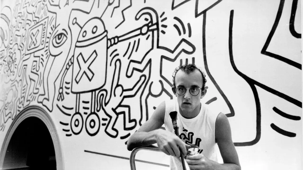
What matters most to me is that Haring did not treat queer identity as a coded subtext for insiders. He worked in the open, from subway walls to posters to murals, and that openness mattered in 1980s New York, where gay liberation and the AIDS crisis were unfolding at the same time. In other words, the work is not “about” queerness in a detached sense; it is shaped by the lived pressure of being visible.
That is why his art still lands so quickly. The figures are simple enough to read at speed, but the meaning is not simple at all: pleasure sits beside danger, community beside loss, and celebration beside protest. Once you see that tension, the famous images start making more sense. And that leads straight to the visual language he built to hold it all together.
The visual language of desire, pleasure and fear
Haring’s visual language is built for speed, repetition and public space. He uses thick outlines, compact bodies, looping limbs and symbols that can be read in a second, but those symbols are doing more than decoration. They can carry sex, alarm, humour and mourning at the same time, which is exactly why the work avoids the stiffness that sinks a lot of activist art.
I also think he made a decisive choice not to sentimentalise queer experience. Instead of hiding bodies, he multiplies them. Instead of treating desire as shameful, he makes it rhythmic, kinetic and social. That matters because queer visibility in Haring is never just personal confession; it is a claim on public space. The images do not whisper. They announce themselves, and that leads straight to the works where this becomes impossible to miss.
Famous works that make the theme impossible to miss
The strongest way to understand Haring’s queer imagery is to look at the works where it becomes unavoidable. These are the images that compress sex, activism, grief and community into forms that still feel legible decades later.
| Work | Year | What stands out | Why it matters |
|---|---|---|---|
| Untitled | 1982 | An early canvas charged with erotic energy, cartoon grammar and explicit bodily imagery. | It shows that sexuality is central from the start, not something added later by AIDS-era politics. |
| Once Upon a Time... | 1989 | A mural painted in the bathroom of New York’s LGBT Centre, later turned into a sanctuary. | It works as both memorial and celebration, linking queer pleasure to the losses caused by AIDS. |
| Silence = Death | 1989 | A stark canvas built around the pink triangle and figures covering their eyes and ears. | One of his clearest statements on stigma, persecution and the political cost of silence. |
| Ignorance = Fear, Silence = Death | 1989 | A poster, 61 x 110 cm, designed to hit hard and travel fast. | It shows how Haring translated queer and AIDS politics into public graphics with instant impact. |
If I had to add a fifth reference point, I would point to The Ten Commandments. It pushes the same taboo-breaking into religion and morality, showing that Haring’s queerness was never isolated from his broader attack on hypocrisy. But the four works above do the heaviest lifting.
What links them is not just style. It is Haring’s refusal to separate intimacy from public life. That refusal becomes even sharper once AIDS enters the picture.
Why AIDS activism changed the meaning of his art
The AIDS crisis did not simply add urgency to Haring’s work; it changed the way the work functions. His images became public warnings, memorials and tools of education at a time when silence had very real consequences. An archival note describes Once Upon a Time... as a memorial to the casualties of AIDS and to the loss of a time when sexual freedom could still feel like joyful celebration. That framing is crucial, because it shows how mourning and desire remain linked in the same image.
The pink triangle in Silence = Death does even more heavy lifting. It recalls Nazi persecution of gay men and reclaims that symbol as a sign of pride and resistance. The poster logic is blunt by design: cover your eyes and ears, and you become part of the problem. Haring understood that a polite message would not be enough. He needed graphics that could travel, stick and be remembered.
That is also why the work still feels modern. It was never only personal expression. It was a response to stigma, to policy failure and to the social cost of pretending the crisis was someone else’s issue. With that in mind, the next question is how to look at Haring without reducing him to a slogan.
How to read Haring without flattening him
My rule of thumb is simple: start with context, then look at the line. Haring’s imagery changes depending on whether it appears on a subway wall, a canvas, a poster or inside an LGBTQ+ community space. The medium changes the tone, even when the iconography stays familiar.
- Read the symbols together, not one by one. A triangle, a face, a figure and a slogan often work as a single sentence.
- Do not confuse accessibility with simplicity. Haring used cartoon clarity to move hard subjects faster.
- Separate joy from innocence. In his work, pleasure can be defiant, political and fragile at the same time.
- Pay attention to where the work was made. A mural for the LGBT Centre carries a different charge from a gallery painting.
That approach keeps the work from being flattened into either pure activism or pure style. It is both, and the tension between the two is the point. From there, the British context becomes easier to see.
Why the British context still gives him force
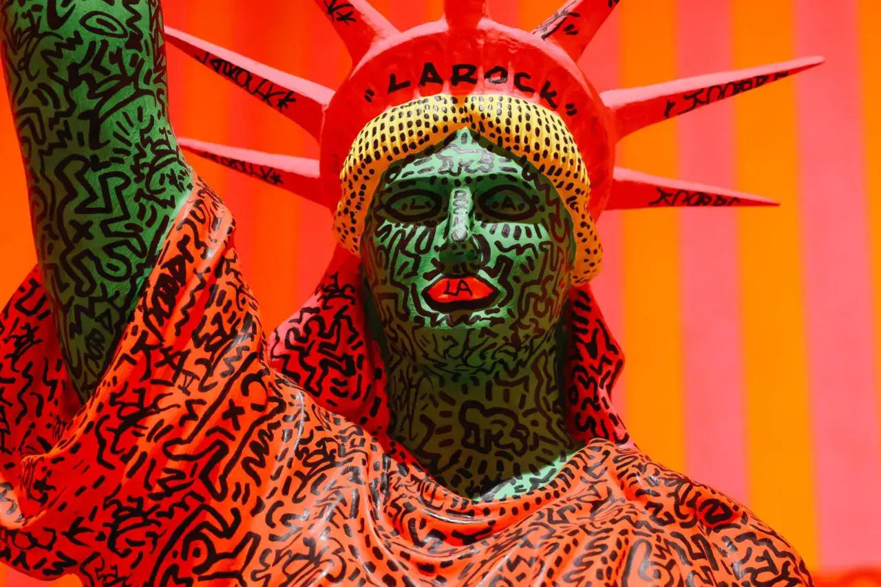
British audiences tend to read Haring with unusual clarity because the UK art world has long understood the tension between the street and the institution. Tate’s first UK institutional exhibition framed him as a socially engaged artist whose work speaks to AIDS, racism and urban culture, not just to the history of graffiti. That matters: it places his queer imagery inside a broader argument about public art and civic responsibility.
For readers in the UK, that framing is useful because it matches how Haring actually works on the wall. He is immediate without being shallow, graphic without being empty, and political without turning into a lecture. The best museum presentation of Haring does not sterilise him; it preserves the friction between play and seriousness. That friction is also what makes the work endure after the slogans have faded.
What stays with you after the slogans fade
What survives in Haring is not just the slogan or the outline. It is the stubborn insistence that queer life deserves public scale, visual confidence and collective memory. That is why his most famous works still feel less like relics of the 1980s than like usable images for the present.
If I had to distil the reading down to one practical point, it would be this: look for the moment when joy turns urgent. That is where Haring is strongest, and that is where his art still speaks most clearly.