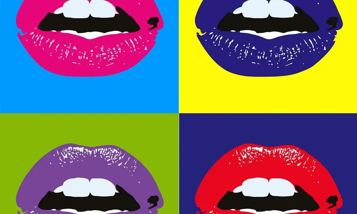
Pop art turned everyday mass culture into serious subject matter: soup cans, comic strips, celebrity portraits, shop packaging, and advertising all became fair game. The best-known pop art artists did not simply decorate with bright colours; they used repetition, irony, and borrowed imagery to show how modern life was already saturated with pictures. This article breaks down the main figures, the British and American strands, and the practical clues that help you read a Pop Art work without guessing.
The movement turned mass culture into art, and the artists explain how it works
- Pop Art emerged in the 1950s and flourished in the 1960s in Britain and the United States.
- British pioneers such as Richard Hamilton, Eduardo Paolozzi, Peter Blake, and Pauline Boty gave the movement its early language.
- American figures such as Andy Warhol, Roy Lichtenstein, Claes Oldenburg, James Rosenquist, and Tom Wesselmann made it globally recognisable.
- Repetition, commercial imagery, comic-book language, and consumer culture are the core visual signals.
- The British version often feels more analytical; the American version often feels bigger, cooler, and more serial.
- To read a Pop Art work well, I always check its source image, medium, and historical context.
The British pioneers who built the vocabulary
The British story matters because it gives Pop Art its first intellectual shape. In postwar Britain, artists were looking at American consumer culture from a distance, which made the subject feel both alluring and slightly strange. That distance produced some of the movement’s smartest early work.
| Artist | What they contributed | Why they matter |
|---|---|---|
| Richard Hamilton | Collage, consumer imagery, and a sharp eye for domestic fantasy | His 1956 collage is often treated as a blueprint for Pop’s mix of advertising, aspiration, and visual overload. |
| Eduardo Paolozzi | Magazine fragments, machine-age imagery, and rougher collage structures | He helped establish the movement’s early language and showed that mass media could be assembled into something analytical, not just decorative. |
| Peter Blake | Toys, badges, music, nostalgia, and a gentler use of popular culture | Blake made Pop feel affectionate as well as knowing, which is why his work still reads as both personal and public. |
| Pauline Boty | Celebrities, glamour, politics, and a clear critique of sexism | Boty gave British Pop a more explicit feminist edge and pushed it beyond simple playfulness. |
What I find most useful about these British figures is that they do not treat popular imagery as a joke. They ask what that imagery does to desire, identity, and taste. That makes British Pop feel less like a style package and more like a cultural argument, which is exactly why it leads so naturally into the American version.
The American names that made it iconic
Once Pop Art crossed the Atlantic, it became louder, larger, and more immediately recognisable. In the United States, artists leaned hard into serial repetition, commercial surfaces, and the visual logic of billboards, magazines, and television. The result is the version of Pop most readers picture first.
| Artist | Signature move | What to look for |
|---|---|---|
| Andy Warhol | Serial repetition and silkscreen methods | Campbell’s Soup Cans, Marilyn portraits, and a cool distance that makes celebrity look mechanical. |
| Roy Lichtenstein | Comic-book enlargement and Ben-Day dot language | Dramatic faces, clean outlines, and the feeling that a printed panel has been lifted straight into fine art. |
| Claes Oldenburg | Oversized or soft versions of ordinary objects | Hamburgers, tools, toilets, and other daily items turned into witty sculpture. |
| James Rosenquist | Billboard scale and fragmented consumer imagery | Advertising language stretched across huge surfaces, often with a political charge underneath. |
| Tom Wesselmann | Polished still lifes and nudes with advertising-like clarity | Flat colour, crisp edges, and bodies or objects presented with commercial precision. |
If I had to choose one practical lesson from the American side, it is this: scale changes meaning. Warhol’s repetition makes fame feel industrial, Lichtenstein’s comic enlargement turns melodrama into a kind of formal analysis, and Oldenburg’s giant objects force us to rethink how ordinary things occupy space. Robert Indiana belongs in the wider conversation too, especially for his text-based imagery, but the five names above are the ones I would start with.
Why British and American Pop Art feel different
I usually separate the movement into two related but distinct conversations. The British strand is more reflective and a little more critical about consumer culture; the American strand is more exuberant and more visibly entangled with the commercial world it depicts. That is a useful shortcut, even if the real history is messier.
| Feature | British Pop | American Pop |
|---|---|---|
| Historical mood | Postwar austerity mixed with fascination for American abundance | Consumer expansion, television culture, and brand saturation |
| Tone | Analytical, ironic, sometimes cheeky | Cool, bold, detached, and often more immediate |
| Common media | Collage, painting, print, mixed media | Silkscreen, painting, sculpture, large-scale installation |
| Typical subjects | Domestic interiors, magazines, music, celebrities, and advertising fragments | Soup cans, comics, celebrity faces, billboards, consumer products |
| Viewer effect | Makes you think about how images construct identity | Makes you confront how thoroughly images already shape desire |
I would not make those distinctions rigid. Warhol can feel conceptual, and Hamilton can feel playful. Still, the contrast helps readers avoid flattening the movement into one exportable aesthetic. Pop Art is not just bright colour and a comic-strip outline; it is a way of thinking about modern image culture.
How to recognise Pop Art in practice
When I assess whether a work belongs to Pop Art, I ask whether it does at least three of these things:
- Borrows from advertising, comics, packaging, television, newspapers, or film stills.
- Repeats the same image, motif, or phrase rather than treating the subject as singular.
- Uses hard outlines, flat colour, or print-like surfaces that echo commercial reproduction.
- Turns an ordinary object into the main event, often by enlarging or isolating it.
- Mixes glamour with critique, so the work feels both attractive and slightly detached.
- Makes the viewer aware of copying, reproduction, or serial production rather than hand-crafted uniqueness alone.
The most common mistake is to label any brightly coloured or comic-inspired image as Pop Art. That misses the point. If a work has no real relationship to mass culture, consumer language, or the logic of reproduction, it is probably only Pop-adjacent. The movement has a visual surface, yes, but it also has a recognisable structure underneath that surface.
What I would check before calling a work Pop Art today
For museum viewers and collectors alike, the useful questions are smaller and more concrete.
- Is the work from the original 1950s or 1960s Pop era, or is it a later revival?
- Was it made as a painting, print, collage, sculpture, or editioned object?
- What source image is being reused, and how directly is it being quoted?
- Does the work celebrate commercial culture, criticise it, or do both at once?
- Is the provenance and edition information clear, especially for prints and multiples?
That last point matters more than many people think. For anyone studying or buying Pop Art, period, medium, and edition status shape both meaning and value. Among the original pop art artists, the difference between an authentic period work and a later image copy is often the difference between art history and decoration. That is why I always start with context before I start with colour.