De Stijl art looks simple at first glance, but the simplicity is doing real work. This article breaks down what the movement stood for, how its visual language works, which artists and objects matter most, and how to recognise its influence in painting, furniture, and architecture. I’m also going to separate the movement itself from the looser modernist styles it is often confused with, because that distinction is where the subject becomes genuinely useful.
Key things to know before you look closer
- De Stijl began in the Netherlands in 1917 and became one of the clearest statements of early modernist abstraction.
- Its core language is strict: horizontal and vertical lines, flat planes, primary colours, plus black, white, and grey.
- The movement was not only about painting; it also shaped furniture, interiors, typography, and architecture.
- Piet Mondrian and Theo van Doesburg are the best-known figures, but Gerrit Rietveld is essential for understanding its spatial side.
- The style is often mistaken for generic minimalism, yet it carries a stronger utopian and structural logic than most later design trends.
- Its influence is still visible in contemporary visual identity, exhibition design, and pared-back interiors, especially when order and balance matter more than ornament.
What De Stijl really was
De Stijl was never meant to be just a decorative look. It was a modernist project built around the idea that art, design, and architecture could share one visual grammar, and that grammar should be stripped down to its most stable elements. The movement emerged in the Netherlands in 1917, around the magazine De Stijl, and it brought together artists who wanted a cleaner, more universal way of making images after the upheaval of World War I.
That is why the movement still matters. It did not simply reject ornament for the sake of looking modern; it treated abstraction as a system. The aim was order, balance, and clarity, not visual emptiness. Mondrian’s paintings, van Doesburg’s theory, and Rietveld’s furniture all point to the same ambition: reduce the noise and see whether structure can carry meaning on its own. Once you understand that, the style stops looking like a set of rigid rules and starts looking like a deliberate worldview, which is exactly what you need before reading the visual language itself.
The visual rules behind the movement
When people describe the movement too casually, they usually stop at “primary colours and straight lines.” That is only the surface. The more important point is how those lines and colours are arranged. De Stijl compositions rely on asymmetrical balance, which means the work feels stable without being mirrored or symmetrical. The empty space is not background filler; it is part of the composition’s structure.
If I were teaching someone to spot it quickly, I would tell them to look for these features first:
- Horizontal and vertical lines instead of diagonal movement.
- Rectangles and squares rather than curves or organic shapes.
- Primary colours used sparingly and deliberately, usually with black, white, or grey.
- Flat colour fields with little or no modelling, shading, or illusionistic depth.
- A sense that each element has been placed to create tension and balance, not decoration.
There is one important nuance, though. The movement was not perfectly uniform. Theo van Doesburg later introduced diagonals in some work, which pushed beyond Mondrian’s stricter version of the style and created real friction between them. That disagreement matters because it shows De Stijl was a living argument, not a frozen formula. With that in mind, the next step is to look at the works that made those principles visible.
Signature works that show the idea in three dimensions
The easiest way to understand the movement is to move from theory to objects. Some works are so useful because they show how the same principles can operate on a canvas, a chair, and a house without losing coherence.
| Work | Why it matters | What to notice |
|---|---|---|
| Piet Mondrian’s compositions | They are the clearest statement of the movement’s painting logic. | Grids, primary colours, black linework, and very controlled asymmetry. |
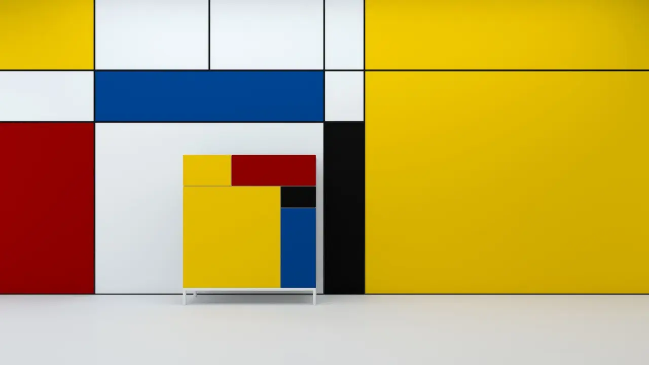
| Gerrit Rietveld’s Red Blue Chair | It translates the style into furniture without softening the geometry. | Planar construction, exposed structure, and colour used to separate parts rather than decorate them. |
| Rietveld Schröder House | It is the strongest architectural expression of the style. | Floating planes, open transitions, movable interior divisions, and a refusal of heavy mass. |
| Theo van Doesburg’s design and typographic work | It shows how the movement could extend into communication and layout. | Typography treated as structure, not ornament, with careful alignment and spacing. |
What I find most revealing is that none of these works depends on a single effect. The chair is not interesting because it is colourful; it is interesting because it turns construction into composition. The Schröder House is not interesting because it looks abstract; it is interesting because it behaves like a spatial manifesto. That shift from image to object is where De Stijl becomes more than an art-history label and starts functioning as a design method.
How the style moved from paintings into buildings and furniture
De Stijl is one of the few modern movements that genuinely travelled across disciplines. In painting, it used the flat surface as a controlled field of tensions. In furniture and architecture, it had to solve real spatial problems, which made the style more demanding and more interesting. A chair cannot just look geometric; it still has to support weight. A house cannot just appear balanced; it has to handle light, movement, privacy, and circulation.
That is why Rietveld’s work is so important. His pieces show that the style was never about making objects merely look abstract. It was about making structure visible. In the Schröder House, for example, the interior is not divided like a conventional domestic plan. Panels and planes create flexibility instead of fixed hierarchy, and that is a direct continuation of the movement’s visual thinking. The exterior reads almost like a Mondrian composition pulled into space.
For a UK reader, that matters because much of the style’s later influence shows up in modern interiors, gallery architecture, and exhibition graphics rather than only in museum paintings. Even when the reference is indirect, the logic is familiar: reduce clutter, clarify the grid, and let proportion do the work. That is also the point where people start confusing it with other modernist movements, so a comparison helps.
How it differs from Bauhaus, Constructivism and minimalism
De Stijl is often grouped together with other 20th-century movements that also preferred simplicity, but they are not interchangeable. The easiest way to sort them out is to ask what each movement thinks simplicity is for.
| Movement | Primary goal | Visual signature | How it differs from De Stijl |
|---|---|---|---|
| De Stijl | Universal order through pure abstraction | Verticals, horizontals, primary colours, black and white | More rigidly geometric and spiritually idealistic than most of its peers |
| Bauhaus | Unite art, craft, and industry | Functional forms, industrial materials, practical clarity | Broader in materials and purpose, less visually narrow than De Stijl |
| Constructivism | Serve a social or political modernity | Dynamic diagonals, industrial aesthetics, bold structure | Often more energetic and ideological, with a stronger sense of motion |
| Minimalism | Reduce form to essentials | Clean lines, repetition, restraint | Later and usually less programmatic; it often borrows the look without the De Stijl philosophy |
The practical takeaway is simple: if a work uses geometry, that does not automatically make it De Stijl. I look for the whole package, not one visual clue. If the piece has a grid, but also soft curves, rich texture, or a strong industrial function, it may belong closer to Bauhaus or a later minimalist language. If it feels political, mechanical, or aggressively dynamic, Constructivism is often the better fit. That distinction is especially useful when you want to understand why the style still shows up today without being copied literally.
What still travels well from De Stijl in 2026
The reason the movement still feels current is not that designers keep recycling red, blue, and yellow. It is that the movement offers a disciplined way to manage attention. In a visual environment crowded with noise, the De Stijl approach is still persuasive because it separates structure from decoration. That principle survives in exhibition design, editorial grids, interface layouts, and interiors that want calm without becoming bland.
The mistake I see most often is treating the style as a mood board rather than a system. A few hard-edged rectangles and a primary colour palette do not produce the movement’s effect on their own. The stronger lesson is more exacting: remove what is unnecessary, keep the balance visible, and let spacing carry as much meaning as colour. In that sense, the movement is less a look than a method for making clarity feel intentional.
If I had to reduce the whole subject to one useful idea, it would be this: De Stijl is not about making art look simple, but about making structure readable. That is why it still feels relevant in 2026, and why it remains one of the cleanest entry points into modern art, design, and architecture.