Hip hop culture art is most compelling when it carries rhythm, identity and public energy into a visual form that still holds up as contemporary art. It can be a tagged wall, a mural, a flyer, a portrait series, a fashion reference or a mixed-media piece built like a sample. This article breaks down the main styles, explains how the language works, and shows why it reads differently in the UK than it does elsewhere.
The visual language is broader than graffiti alone
- It is a system, not a single style. Graffiti, photography, typography, fashion cues and installation all belong in the conversation.
- Strong work balances energy and control. The surface can feel raw, but the composition still needs discipline.
- Street and gallery settings change meaning. What feels confrontational outdoors can become reflective indoors.
- In the UK, place matters. Local histories, sound-system aesthetics and neighbourhood identity shape the look.
- The best pieces avoid cliches. They use the culture's codes without turning them into decoration.
What this visual culture really includes
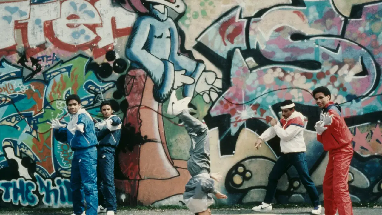
I usually treat this field as a visual system rather than a single genre. The roots are in the Bronx in the 1970s, but the image side quickly expanded beyond writing on walls: flyers, record sleeves, portraits, body language, fashion styling and later installation work all became part of the same conversation.
The simplest way to read it is through the culture's own logic. MCing and DJing gave it sound, breaking gave it motion, graffiti gave it public authorship, and fashion gave it identity. The visual work sits between those elements, which is why it often feels fast, layered and socially specific rather than polished in a traditional fine-art sense.
- Graffiti marks presence, ownership and style.
- Murals turn that presence into public storytelling.
- Photography preserves performance, neighbourhood detail and social scene.
- Typography and flyers carry rhythm, hierarchy and urgency.
- Mixed media mirrors sampling by combining fragments from different visual sources.
I think the fastest mistake is to reduce everything to spray paint. Spray paint is one tool; the real subject is how a community makes itself visible and legible under pressure. Once that scope is clear, the next step is to look at the visual languages that do the heavy lifting.
The visual languages that give it its edge
The styles below show up again and again because each one solves a different problem: how to claim space, how to archive a scene, how to turn movement into image, or how to make a local story travel. The strongest work often borrows more than one.
| Style | What it does | Where it works best | Main risk |
|---|---|---|---|
| Graffiti writing | Turns letters into identity, speed and visual pressure | Walls, shutters, trains, canvases, digital prints | It can become repetitive if the letterform is never pushed further |
| Wildstyle | Uses interlocked, highly stylised lettering to create density and movement | Pieces that want intensity and insider fluency | Hard to read if there is no structure underneath the complexity |
| Muralism | Scales the culture up for public visibility | Community walls, festivals, civic projects | Can flatten the edge if it becomes too illustrative |
| Documentary photography | Freezes pose, crowd energy, dress and place | Editorial work, archives, exhibition prints | Can drift into nostalgia or cliche if the framing is too obvious |
| Typography and poster design | Uses hierarchy, rhythm and punchy text to carry attitude | Flyers, album art, exhibition graphics, street posters | Can look generic if it imitates the style without the underlying scene |
| Mixed-media collage | Builds a sampled surface out of fragments, scans and paint | Gallery work, book covers, experimental commissions | Can feel like a scrapbook unless the layers are edited hard |
| Afrofuturist and conceptual work | Pushes the culture beyond straight reportage into imagined futures | Museum contexts, large-scale installations, ambitious commissions | Can become too abstract if the link to lived culture disappears |
What ties these approaches together is a sampling mindset. The artist is rarely inventing from zero; they are reordering signs, colours, type and social memory so the result feels charged rather than borrowed. Wildstyle, for example, is not just "messy lettering" - it is a dense alphabet built to perform speed, rhythm and control at once.
That formal range is exactly why the jump from street to gallery changes the reading so much.
Why the street-to-gallery shift matters
Street-level work and gallery work are not opposites, but they ask different things of the viewer. Outdoors, the image has to survive weather, movement, surveillance and distance; indoors, it has time, preservation and a slower kind of attention. A strong work can function in both spaces, but it usually needs a clear formal idea to do that.
| Setting | What it does well | Main limitation | Best use |
|---|---|---|---|
| Street wall | Immediacy, risk, local dialogue | Ephemeral, exposed to removal or damage | Public statements, community visibility |
| Gallery | Preservation, close reading, market support | Can soften the friction that made the work meaningful | Series, editions, large-format painting, archival presentation |
| Editorial or digital | Reach, circulation, accessibility | Texture and scale can be flattened | Photography, poster art, cover design, campaign work |
What matters here is context. Once a mural is photographed, sold or archived, its meaning shifts from confrontation to reflection. That is not a downgrade; it is a different contract with the viewer. I think the best curators, editors and collectors understand that the wall is not just a surface, it is part of the content.
That distinction becomes especially important when you start judging individual works, whether you are looking at a gallery piece or planning a commission.
How to judge strong work without getting lost in the style
If I were reading a new piece quickly, I would ask five questions before I cared about the backstory:
- Does it have a point of view? Familiar symbols alone are not enough; the work needs an argument.
- Is the surface controlled? Even deliberately rough work should show command over line, colour and spacing.
- Does it feel specific? The best pieces point to a place, a scene or a memory rather than a vague idea of "street energy".
- Can it survive without explanation? If the image only works when you know the caption, it is probably underdeveloped.
- Would a commission honour the artist's method? Scale, materials, wall condition and viewing distance all matter before the first sketch.
The worst work is usually the most over-explained. It leans on recognisable markers - crowns, dollar signs, spray drips, neon outlines - and assumes that attitude is enough. Better work feels edited. It knows when to stop, which is often what separates a serious visual language from a decorative one.
That same standard applies in Britain, but the local references give the work a different accent.
Why the UK gives the scene its own accent
In the UK, the strongest work usually feels tied to place rather than mythology. London matters, of course, but so do Bristol, Manchester, Birmingham and Glasgow, where urban art sits beside sound-system heritage, club graphics, photography, public mural projects and a sharp sense of local identity.
British hip-hop-adjacent work often borrows from grime-era design, carnival colour, transport signage, photocopy aesthetics and independent magazine culture. That mix gives it a slightly different rhythm from the US tradition: less about repeating a New York origin story, more about translating the culture into a local visual vocabulary.
- Typography often carries more weight because flyer culture and editorial design have been so influential.
- Humour and political bite often sit together rather than being separated into different works.
- Neighbourhood identity is usually explicit instead of hidden behind abstract street language.
- Small-format print and photography matter as much as walls and large murals.
If a piece could belong anywhere, it usually says less than a piece that could only belong there. That is the real strength of the UK context: it forces the artist to make the local visible without turning it into a slogan.
By 2026, that pressure is what keeps the best work fresh while the weaker stuff starts to feel recycled.
What still feels fresh in 2026 and what already feels tired
The work that lasts right now usually does three things at once: it remembers where it comes from, it respects the surface it is built on, and it avoids turning rebellion into costume.
- Still fresh: local storytelling, archive-based collage, precise lettering, restrained colour decisions, and collaborations between painters, photographers, designers and musicians.
- Still fresh: portrait work that shows status without hero worship, especially when the faces are tied to a real community or scene.
- Already tired: generic crowns, dollar signs, anonymous "street" shorthand, overdone neon effects and pieces that use hip hop only as a style filter.
- Already tired: work that copies the surface of the culture but ignores its politics, humour and social tension.
If I were advising a curator, editor or collector, I would keep one rule in mind: the strongest pieces do not just reference the culture, they translate its energy into a form with enough discipline to hold up over time. That is where this work stops being a trend and becomes a serious part of contemporary visual art.