Graffiti becomes memorable when it combines a sharp visual identity, a strong location, and a message that still lands after the wall has been photographed and painted over. The most compelling famous graffiti works do more than decorate a surface: they shape how people think about street art, protest, authorship, and even the contemporary art market. In the UK, that tension is especially visible because cities like London and Bristol treat public art as both cultural signal and urban problem.
Key facts at a glance
- Most readers want examples first, not a theory lesson, so the best response is to name the landmark works and explain why they lasted.
- Graffiti and street art overlap, but they are not identical; tags, wildstyle lettering, stencils, and murals each do different work.
- Banksy, Keith Haring, Jean-Michel Basquiat, and Blek le Rat are the clearest reference points for public art built from spray paint, markers, and stencil logic.
- The UK matters because Bristol and London turned graffiti from a subcultural code into a citywide visual language.
- The strongest pieces are usually readable in seconds, but layered enough to reward a second look.
- Documentation matters because many landmark walls are temporary, so the photograph often becomes part of the work’s afterlife.
What readers usually mean by iconic graffiti
I find it helpful to separate the label from the expectation. When people ask about iconic graffiti, they usually want a mix of definition, examples, and visual logic, not a dry history lesson. They want to know which works shaped the style, what makes them instantly recognisable, and why some walls become reference points while others disappear without much trace.
That matters because graffiti is not one thing. A quick tag, a highly engineered wildstyle piece, a stencil portrait, and a large mural can all sit under the same broad public-art umbrella, but they communicate differently. Some are about reputation and presence; others are about politics, irony, or image-making. Once you separate those functions, the field becomes much easier to read.
In practical terms, that is why the best-known pieces keep coming back in conversations about street art: they do something clear, memorable, and culturally specific at once. That is also why the examples matter more than the label itself, and the next step is to look at the works people return to first.
The works that turned street walls into reference points
Some names appear again and again because they helped define how public art looks, feels, and circulates. I do not think of these as museum-only icons; most started as street interventions, then acquired a second life through photography, press coverage, and reproduction.
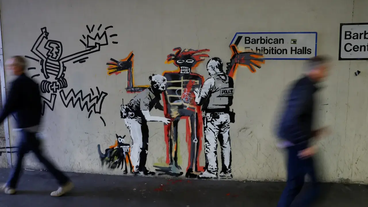
Banksy’s stencil images
Banksy is the obvious reference point for many readers, and for good reason. Works such as Girl with Balloon and Flower Thrower show how a simple stencil can carry irony, sentiment, and political charge without losing visual punch. The power of those images lies in their speed: you understand them almost immediately, but they still leave room for interpretation.
Keith Haring’s subway drawings
Haring’s chalk figures are not graffiti in the narrowest lettering sense, but they are essential to any discussion of public mark-making. He used clean outlines, bright energy, and simplified bodies to make art that read in motion, on the street, and in transit spaces. What I take from Haring is that accessibility is not a downgrade; it can be a deliberate visual strategy.
Jean-Michel Basquiat’s SAMO era
Basquiat’s early SAMO tags are important because they show how text, repetition, and attitude can become conceptual art before the work ever enters a gallery. The writing feels like a private code and a public statement at the same time. That duality matters: a tag can be more than a signature when it starts behaving like a manifesto.
Blek le Rat’s stencil figures
Blek le Rat is widely credited with helping establish the stencil as a serious street-art tool in Europe. The method is deceptively simple: cut the image once, then repeat it fast and cleanly. That repeatability gives the work reach, but it also creates a discipline that many later artists borrowed for political portraits, animal figures, and social commentary.
Dondi White’s letter-based compositions
Dondi reminds us that traditional graffiti can be painterly even when it is hard for outsiders to read. His letter structures, rhythm, and colour balance are part design problem and part territorial statement. If you want to understand why graffiti writers care so much about line control and flow, Dondi is one of the names I would start with.
Read Also: Art Form Explained - See Beyond the Surface
UK figures that keep the conversation local
For a British audience, Banksy is only the beginning. Stik’s stick-figure murals show how a reduced visual language can still feel human and public, while older UK graffiti culture has always valued handstyle, crew identity, and local reputation. That mix of wit, restraint, and place-based identity is one reason the UK scene remains so distinctive.
Once you know these landmark names, it becomes easier to see how technique changes the message rather than just the surface treatment.
How style changes the message on the wall
Technique is not a side issue in graffiti; it is the meaning. The difference between a tag, a throw-up, a stencil, and a full mural is not only visual scale. It affects speed, risk, readability, audience, and whether the work feels like a private code or a public invitation.
| Style | Visual signature | What it does well | Main limitation | Best-known use |
|---|---|---|---|---|
| Tag | Quick handwritten signature | Identity, repetition, territorial presence | Often unreadable to outsiders | Writer recognition and scene status |
| Throw-up | Rounded bubble letters, usually two colours | Speed and visibility | Can feel repetitive if the fill is weak | Fast coverage on trains, shutters, and walls |
| Wildstyle | Interlocking, arrowed, compressed lettering | Technical skill and crew identity | Hard to decode without context | Advanced graffiti culture and letter painting |
| Stencil | Sharp edges, repeatable cut-out forms | Fast execution, strong symbolism | Can look rigid if the image lacks nuance | Political images, portraits, icon-like figures |
| Mural | Large figurative or narrative composition | Broad readability and storytelling | Requires more time and permission in many settings | Commissioned walls and public-facing projects |
| Paste-up or sticker | Paper or vinyl applied to a surface | Very fast placement and repeatability | Fragile, easy to remove, weather-sensitive | Street campaigns and modular visual branding |
The important point is that style is never neutral. A stencil says something different from a hand-painted letterform, even when the subject is the same. One can feel confrontational, one can feel playful, and one can feel almost ceremonial. If you read the wall carefully, the method tells you as much as the image does, and that becomes especially clear in the UK scene.
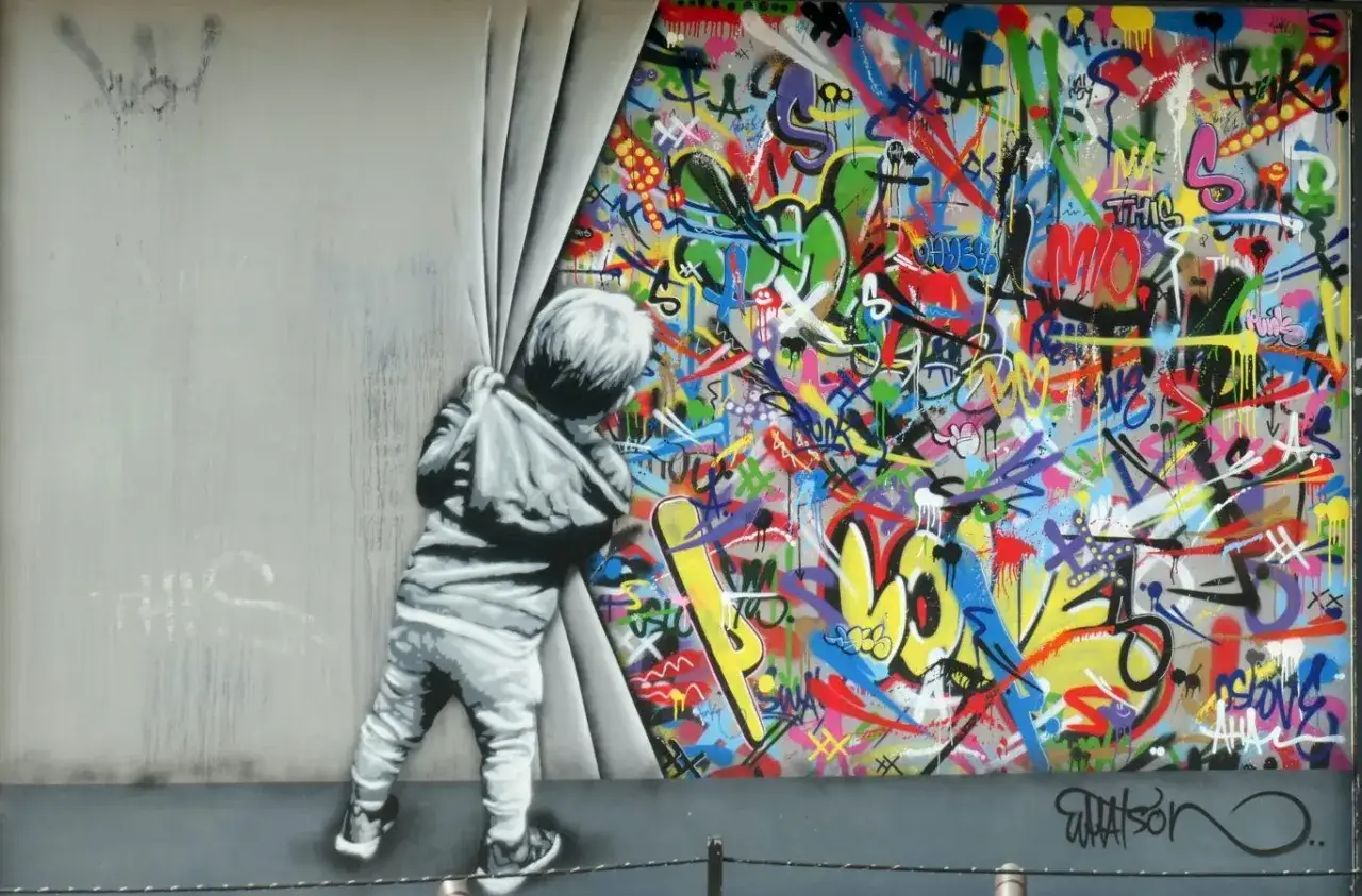
Why the UK keeps producing memorable public art
Britain matters here because it keeps collapsing the line between counterculture and city identity. In Bristol, the Banksy story still shapes how visitors read walls, while London gives you a much broader field: Shoreditch, Camden, and the Leake Street Tunnel all carry different ideas of what public art is allowed to be. Some spaces invite experimentation; others turn it into a tourist landmark almost overnight.
That shift changes meaning. A wall that begins as an unsanctioned intervention can become protected, photographed, commodified, or quietly erased depending on who notices it first. Once a piece is wrapped in plexiglass or widely shared online, it stops being only a street event and starts behaving like an art object with an afterlife. That is why the same wall can be read as vandalism, local culture, and heritage all at once.
I think the UK scene is strongest when it keeps that tension alive. The best walls are usually not the ones that look most polished; they are the ones that still feel in dialogue with the street, the neighbourhood, and the politics of who gets to speak in public. With that context in place, the next question is how to read and document a wall before it disappears.
How I read and photograph a wall before it disappears
When I judge a wall, I look at three things first: readability, placement, and timing. A strong piece works from a distance, makes sense against its surface, and feels right for the moment in which it appears. If it only works when someone explains it, the wall is probably carrying more concept than visual force.
- Start with the silhouette. Can you understand the image in a few seconds, even if you do not know the artist?
- Check the surface. The best graffiti uses the wall, shutter, tunnel, or brick texture rather than fighting it.
- Look at the edges. Crisp stencil cuts, loose fills, and layered overspray all tell you how fast the work was made and what kind of risk it carried.
- Read the context. A piece near a transport hub, a school, a museum, or a derelict site will be interpreted differently.
- Photograph three layers. I try to capture the artwork itself, a detail, and one wider image that shows the street around it.
There is also a practical side to this. If you are documenting street work, do not stand so close that you flatten the composition, and do not ignore the ethics of the space. Respect private property, local residents, and wet paint. The best documentation does not just record the image; it preserves the feeling of how the piece sat in the city at that moment.
What survives when the paint is gone
The walls that become memorable usually combine three things: visual clarity, cultural timing, and a point of view that feels hard to fake. That is why a simple balloon, a stencil rat, a chalk figure, or a complex letter piece can outlast a much larger mural. The image stays because it is easy to recognise, but also because it carries an attitude that people remember.
By 2026, the line between street intervention and collectible art is thinner than ever, yet the strongest public work still depends on the street for its energy. Documentation, provenance, and critical attention matter, but they do not replace the original event. If you want to understand the field properly, look beyond the viral image and ask where the piece sits, who sees it, and what changes after the first photograph.
That is the real lesson of iconic graffiti: the paint fades, the wall changes, and the city keeps moving, but the best work leaves behind a visual memory strong enough to keep reappearing in conversations, books, galleries, and side streets long after the original surface is gone.