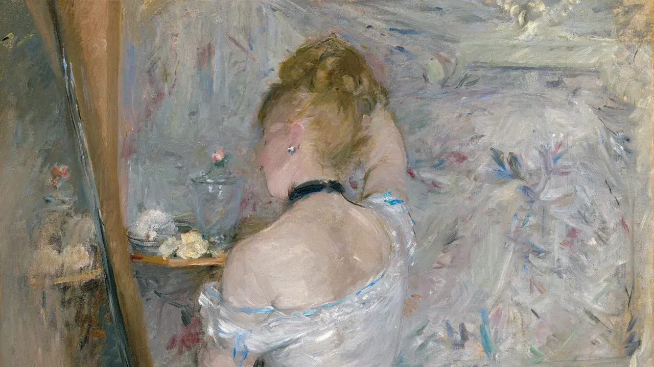
Key points to keep in mind before judging an Impressionist work
- Impressionism privileges light, weather, and fleeting sensation over sharp finish.
- The movement’s label began as an insult after the 1874 Paris exhibition, which helps explain its early shock value.
- Monet is essential, but the canon is broader: Renoir, Degas, Pissarro, Morisot, Cassatt, and Sisley all matter.
- The strongest works often show water, gardens, stations, cafés, theatres, or domestic interiors rather than grand history scenes.
- For UK viewers, London collections offer a practical way into the movement, especially through the National Gallery and Tate.
What makes Impressionist painting feel so immediate
The first thing I look for is not subject matter but speed of perception. Impressionists painted plein air when they could, meaning outdoors and in front of the motif, so the picture keeps some trace of shifting weather, changing light, and unfinished thought. The National Gallery notes that the label itself started as an insult after the 1874 Paris exhibition, which is a useful reminder that the movement initially looked loose, even provocative, to viewers used to polished academic surfaces.
- Light replaces outline - edges soften so the eye reads volume and atmosphere together.
- Colour carries shadow - dark passages are often built from blues, violets, greens, and warm greys rather than flat black.
- Composition stays selective - cropping, tilted viewpoints, and off-centre subjects make the scene feel encountered rather than staged.
- Brushwork remains visible - the surface keeps evidence of the painter’s hand instead of hiding it.
The Met describes the movement’s colour logic well: shadows and highlights are often rendered in colour rather than in neutral greys and blacks. That is why these canvases can seem airy but never empty. The best ones are carefully judged, just less concerned with finish than with the sensation of seeing something alive in a specific instant. Once that becomes clear, the famous works stop looking alike and start revealing different strategies for handling modern life.
The landmark works that still define the movement
When people talk about the canon, they usually mean a handful of paintings that are both technically revealing and culturally unforgettable. I think that is fair, as long as we do not let the headline names flatten the movement into a single style. These works differ in subject, scale, and mood, but each shows a different answer to the same question: how do you paint the look of a moment, not just the object inside it?
| Work | Why it matters | What to notice first |
|---|---|---|
| Impression, Sunrise by Claude Monet | The title that helped name the movement and a pure study of atmosphere, harbour light, and abbreviated form. | Look at the orange sun, the haze, and the way the boats barely separate from the water. |
| Dance at Le Moulin de la Galette by Pierre-Auguste Renoir | One of the best depictions of social life under broken daylight; it turns a Paris crowd into rhythm and vibration. | Notice the dappling on clothing, faces, and the ground. |
| The Ballet Class by Edgar Degas | Degas brought an almost cinematic crop to the studio and backstage world, making movement feel observed rather than posed. | Watch how the off-balance arrangement creates tension. |
| The Cradle by Berthe Morisot | A quiet but decisive work that proves Impressionism was not only about public leisure; it could be intimate and psychologically sharp. | Study the veil, the pale palette, and the economy of touch. |
| The Child’s Bath by Mary Cassatt | A modern domestic scene with bold patterning and compressed space, showing how the movement handled interiors with real sophistication. | Notice the graphic shapes and the closeness of the viewpoint. |
| Boulevard Montmartre, Spring by Camille Pissarro | A strong example of the urban series, where changing weather and traffic become the real subject. | Look for repetition, movement, and the way the avenue seems to breathe. |
| The Water-Lily Pond by Claude Monet | Later Monet, but still essential: it turns reflection, surface and garden design into a complete visual field. | Pay attention to the bridge, the water’s broken surface, and the way colour holds the composition together. |
If I had to compress the whole movement into one sentence, I would say Monet gives you the optical breakthrough, Degas the compositional nerve, Morisot the intimate scale, and Cassatt the modern interior. That spread matters, because it shows why the movement is broader than garden scenes and lily ponds, and why its best works still feel like different kinds of observation rather than one formula.
How to read light, colour and brushwork like an expert
Once you know the landmark works, the next step is to look the way the painters did. Impressionist technique is easiest to understand when you stop asking, “What is the subject?” and start asking, “What is the light doing to the subject?” That shift changes almost everything.
- Start with the brightest passage - in a strong Impressionist canvas, the lightest area usually controls the rest of the picture.
- Check the shadows - if they lean blue, violet, green, or warm grey, you are seeing the movement’s colour thinking at work.
- Look for repeated marks - the brushstroke often builds rhythm more than detail, especially in water, foliage, and fabric.
- Move close, then back away - up close you should see paint handling; from a distance, those marks should resolve into atmosphere.
- Notice what is left out - the best painters suggest more than they describe, and that restraint is part of the effect.
This is also where many viewers misread the movement. The loose surface can look casual from a distance, but up close it often depends on disciplined decisions about colour temperature, spacing, and repetition. The apparent spontaneity is the effect, not the whole method. When that clicks, the picture stops feeling merely pretty and starts feeling built.
Where to see the best examples in the UK
For a UK reader, the smartest starting point is London, because the national collections make the movement easy to compare rather than simply admire. The National Gallery and Tate are the obvious anchors here, and a good day in London lets you move from one painter’s approach to another without losing the thread. If you are only planning one visit, I would prioritise rooms and displays where you can compare different artists side by side instead of chasing a single famous canvas.
- The National Gallery - best for seeing French Impressionism in a canonical, museum-grade setting.
- Tate - useful for the movement’s afterlife and for understanding how British art absorbed some of its ideas.
- Smaller regional museums - often better for drawings, prints, and related works than for headline oils.
In practical terms, the UK advantage is access: you do not need to fly to Paris to study the movement well, and that makes it easier to compare the big names with the subtler voices. From there, the next question becomes less about access and more about why these paintings still matter so much now.
Why these canvases still matter in 2026
Impressionism still shapes how we think about modern seeing. In contemporary art, photography, and visual culture more broadly, the movement’s lasting gift is the idea that a scene can be truthful without being exact, and emotionally convincing without being overdescribed. That is one reason the style keeps returning in exhibitions, reference books, and market conversations.
There is also a collecting reality that matters. The finest originals are usually museum-held or tightly controlled in private collections, so the market for true headline works is thin. For collectors, that means condition, provenance, scale, and exhibition history matter more than the movement label itself. If the work is a drawing, print, or later related piece, the entry point is far more realistic; if it is a major oil by a canonical name, scarcity drives the value conversation almost immediately.This is where the style’s reputation becomes practical rather than nostalgic. The same qualities that made the paintings radical - visible brushwork, unusual angles, colour as structure - are the qualities that keep them useful as reference points for painters and image-makers now. That is why the movement still feels current without needing to be updated.
The quickest test I use before calling a painting Impressionist
When I am looking at a work and deciding whether it genuinely belongs to the movement, I use a very simple filter. It is not a rigid rulebook, but it keeps me from mistaking soft colour or casual subject matter for real Impressionist thinking.
- Does light do more work than outline?
- Is the scene anchored in a fleeting moment rather than a timeless pose?
- Do the colours describe atmosphere, not just objects?
- Is the brushwork visible enough to remind you of the painter’s hand?
- Does the composition feel like a slice of lived experience?
If the answer is yes to most of those, the painting is probably doing the right kind of work, even if it is not by one of the famous names. That is the useful test, because the movement is at its best when it feels specific, observational, and slightly unstable - exactly the qualities that made it modern in the first place. Start with Monet, Renoir, Degas, Morisot, and Cassatt, and the movement opens up much faster than if you treat it as a single style of pretty light.