Andy Warhol made repetition feel both mechanical and strangely intimate. This is what andy warhol repetition art is really about: repeated soup cans, Marilyn portraits, and disaster images that shift meaning every time they reappear. In the sections below, I break down the technique, the best-known works, and the specific details that make the images feel more complex than simple duplication.
The main idea behind Warhol's repeats
- Warhol used repetition to turn ordinary images into symbols of consumer culture, fame, and media overload.
- Works such as Campbell's Soup Cans and the Marilyn portraits are not just repeated pictures; they are studies in sameness and small variation.
- The silkscreen process let Warhol work fast, multiply images, and keep the artist's hand at a slight distance.
- Repetition can make an image feel flatter, more iconic, or more unsettling depending on the subject.
- His repeated imagery still feels current because modern life is built on feeds, brands, and endless image circulation.
How repetition became Warhol's visual language
Warhol did not use repetition as decoration. He used it as a way to make mechanical reproduction and seriality - a sequence of related images rather than one isolated picture - part of the subject itself. Once he moved into silkscreen, the printing process that pushes ink through a mesh screen, a single source image could be pushed across canvas after canvas, and the slight misregistrations, fades, and colour shifts became evidence that the work was about systems, not just surfaces.
The Warhol Museum notes that he embraced screenprinting as the ideal vehicle for image repetition, and the scale of his output helps explain why the method mattered so much: he generated nearly 20,000 prints across his career. That volume is not just a production fact; it is a clue to how seriously he took seriality as an artistic logic. I think that is the point many viewers miss. The repetition is not a side effect of Warhol's style - it is the style.
By repeating a face or a can, Warhol also pushed against the older idea that a painting should broadcast the artist's unique inner life. The clearest examples are the works themselves, especially the ones that are built from rows, grids, and repeated photographic fragments.
The famous works that define the idea
Warhol's repeated imagery is easiest to understand when you place the major works side by side. MoMA's collection notes are especially useful here because they show how different kinds of repetition serve different ends: consumer packaging, celebrity portraiture, and disaster imagery are all treated with the same cool eye.
| Work | What repeats | What the repetition does | Why it matters |
|---|---|---|---|
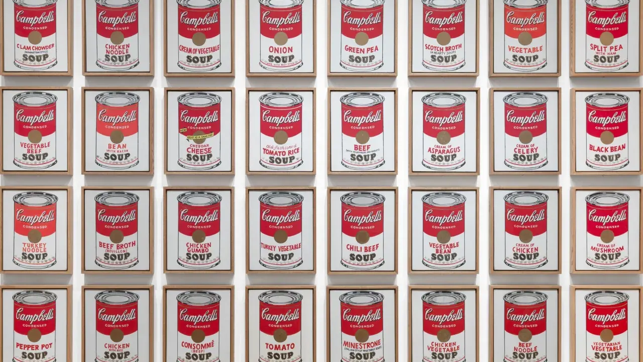
| Campbell's Soup Cans (1962) | 32 nearly identical soup-can paintings | Turns a supermarket product into a wall of visual rhythm | Challenges the idea that painting must prove originality through invention alone |
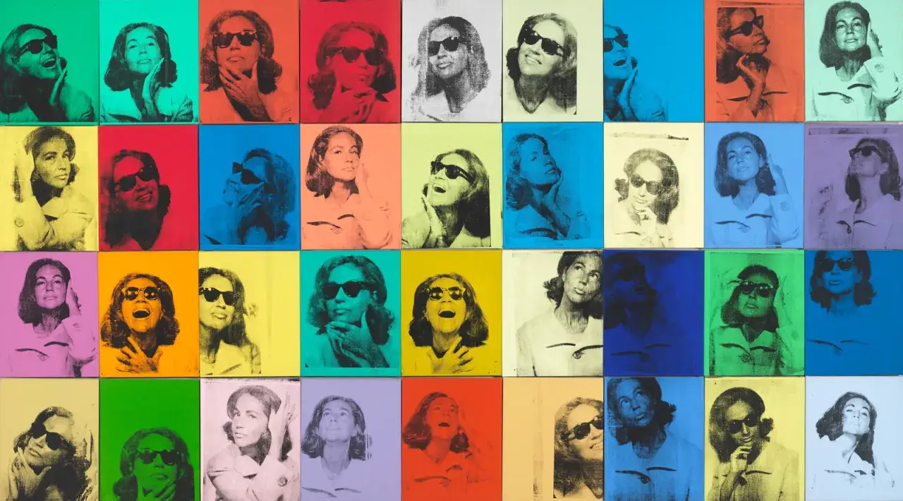
| Marilyn Diptych and related Marilyn portraits | The same publicity still, repeated and recoloured | Makes celebrity feel both iconic and manufactured | Shows how fame works as image circulation rather than intimate presence |
| Orange Car Crash Fourteen Times (1963) | The crash image repeated 14 times | Creates a brutal mix of spectacle, numbness, and distance | Warhol turns tragedy into a comment on how news images are consumed |
| Electric Chair (1963) | Multiple electric-chair images in a repeated format | Makes violence feel eerily still and strangely abstract | Shows that repetition can drain emotion even while making the subject harder to ignore |
What ties these works together is not the subject but the method. A soup can, a movie star, and a car crash are very different things, yet Warhol treats them as if they all belong to the same visual economy. That is why his repetition still reads so cleanly: it collapses high and low, glamour and catastrophe, into the same visual register. From there, the next question is not what repeats, but what repetition does to meaning and feeling.
What repetition does to meaning and emotion
Repetition does three things at once in Warhol's art. First, it flattens hierarchy: the soup can is not presented as inferior to the portrait of Marilyn, because both are treated as images that travel through culture. Second, it introduces distance: screenprinting softens the sense that the artist's hand is directly expressive, so the work feels more like a circulated object than a private confession. Third, it creates emotional pressure, because the image does not disappear when repeated; instead, it can start to feel colder, stranger, or more haunting.
That tension is what gives Warhol's repeated images their staying power. Campbell's soup cans can feel almost cheerful at first glance, but the uniformity also hints at industrial routine and the boredom built into modern consumption. The Marilyn Diptych, a two-panel work, can feel glamorous, but the multiplication of her face also makes her seem trapped inside a public mask. And the disaster pictures are the most unsettling of all, because repetition does not neutralise their violence - it makes the violence feel more systemic, as if the news cycle itself were part of the image.
I would describe the result as controlled emotional drift. The image is still there, but it no longer behaves the way a single, unique painting is supposed to behave. That shift is what keeps Warhol's work from becoming merely decorative, and it is also why the method still feels current in 2026.
Why the method still feels current in 2026
Warhol's logic now looks uncannily familiar because modern visual culture is built on repeats. We scroll past the same face, the same logo, the same clipped headline, the same meme, until the image becomes both recognisable and strangely depleted. Warhol understood that condition early. He did not invent mass repetition, but he made it visible as an artistic subject.
That is one reason the work remains fresh in the UK art conversation and beyond. The relationship between art, commerce, and media has only become tighter, and Warhol's best pictures still expose how quickly a private feeling can turn into a public image. In a gallery, the effect is different from a phone screen, but the underlying mechanism is similar: repeated exposure changes the emotional weight of what we see.
The more I look at these works, the less I read them as jokes about consumer culture and the more I see them as precise observations about attention. Repetition is not just sameness; it is what happens when an image has to survive being seen again and again. That brings us to the more practical part of the question: how should you actually read a Warhol repeat when you are standing in front of it?
How I read a Warhol repeat without overcomplicating it
When I look at a Warhol work built from repeated imagery, I start with four checks rather than a theory. First, I ask what the source image is - a product, a celebrity still, a press photograph, or something more anonymous. Second, I look for what changes between repeats: colour, spacing, registration, cropping, or scale. Third, I ask whether the repetition feels celebratory, indifferent, or unsettling. Fourth, I pay attention to the support itself, because a row, a grid, or a diptych changes the way repetition is felt.
- Source image tells you whether Warhol is dealing with commerce, fame, or disaster.
- Variation tells you whether the work is about sameness or about small disruptions inside sameness.
- Structure tells you whether the image is meant to read as a sequence, a wall, or a mirrored pair.
- Surface tells you whether the print feels crisp, off-register, faded, or deliberately flattened.
This is also where beginners often make the wrong call. They assume repetition means empty repetition, as if Warhol were only copying himself. In practice, the repeats are where the work gets sharpest. A slight blur or a shift in colour can matter more than the subject itself, because it exposes the image as something manufactured, circulated, and never fully stable. That is the real payoff of reading the works closely, and it leads directly to the final question of what the repeats leave behind.
The real lesson hidden in the repeats
Warhol's repeated imagery teaches a simple but uncomfortable lesson: modern images rarely arrive as singular truths. They arrive as versions, reruns, fragments, and reproductions. Once you see that, the famous works stop looking like isolated icons and start reading as a disciplined study of how culture moves.
If I were writing one sentence to keep in mind, it would be this: Warhol did not repeat images because he ran out of ideas; he repeated them because repetition was the idea. That insight is enough to reframe the soup cans, the Marilyns, the crash pictures, and the chairs as more than pop-art landmarks. They are visual arguments about how much meaning survives when an image is seen again and again.
For a viewer, the most useful habit is simple: do not stop at recognition. Ask what the repetition changes, what it cools down, and what it intensifies. That is where Warhol becomes more than an icon of pop art and starts looking like one of the clearest interpreters of image culture we still have.