Mark making is the visible trace of a hand, a tool, and a decision. The strongest mark making examples show how a simple line, dot, scrape, or splash can change the mood of a drawing or painting far more than people expect. In this article, I break down the main techniques, what each one looks like, how artists use them to build style, and how you can practise them without turning the page into a random test sheet.
The practical takeaway in one view
- Mark making is not just “line work”; it includes pressure, texture, rhythm, layering, and accident.
- The same tool can produce very different results depending on speed, angle, surface, and pressure.
- Hatching, stippling, dry brush, impasto, sgraffito, frottage, stamping, and drips are some of the most useful techniques to know.
- Strong marks do more than fill space: they control tone, movement, atmosphere, and visual hierarchy.
- Good practice comes from small, focused exercises rather than trying to invent everything in one sitting.
- The best results usually come from choosing marks with a clear purpose, not from using every technique at once.
What mark making means in practice
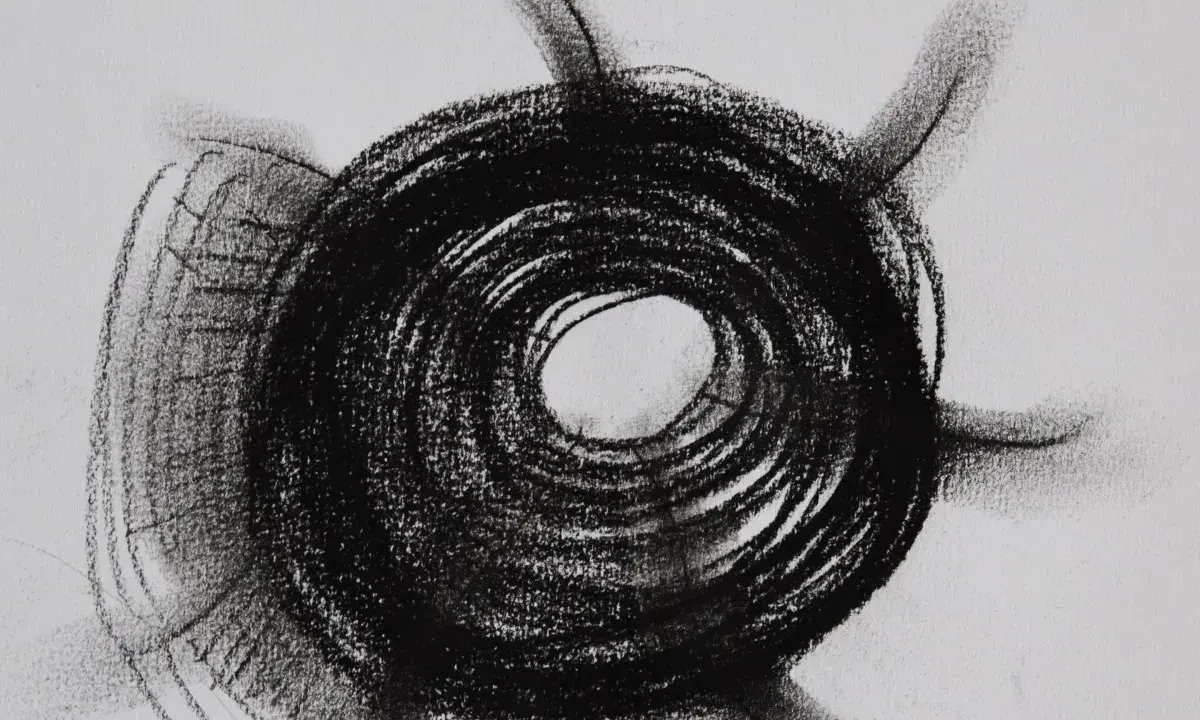
In art, mark making is the language of visible action. It can be neat or messy, tight or loose, delicate or aggressive, but it always leaves evidence of process. I think of it as the difference between a drawing that merely describes something and one that also tells you how it was made.
That matters because marks do more than outline a subject. They create tone, build texture, suggest movement, and set the emotional register of a piece. A soft pencil line feels different from a sharp ink stroke, and a dragged brush behaves very differently from a dotted pen. Once you start looking at art this way, you stop seeing “marks” as filler and start seeing them as structure. That leads naturally to the question most readers really want answered: which techniques count as the clearest examples?
The main mark-making techniques and what each one does
When I explain this topic, I prefer to separate technique from effect. A mark is not interesting just because it exists; it is useful because of what it does to the image. The table below groups the most recognisable techniques with the visual result they tend to produce.
| Technique | What it looks like | What it is good for | Typical limitation |
|---|---|---|---|
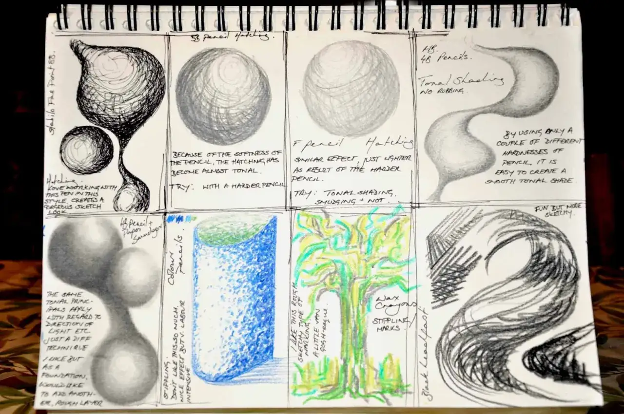
| Hatching | Parallel lines laid side by side | Light shading, structure, controlled tone | Can look flat if the line direction never changes |
| Cross-hatching | Layered lines crossing at angles | Shadow, depth, darker values | Easy to overwork if every layer has the same weight |
| Stippling | Dots spaced tightly or loosely | Soft tonal build, detail, measured texture | Slow to build and can feel static if the spacing is too even |
| Scribbling | Loose, looping, overlapping lines | Energy, movement, a quick expressive base | Needs hierarchy, or it just reads as clutter |
| Dry brush | Broken, scratchy paint dragged across a surface | Weathered textures, atmosphere, rough edges | Works best on the right surface; too smooth and it loses bite |
| Impasto | Thick ridges of paint that hold physical shape | Bold texture, light-catching surfaces, presence | Slower drying and more material demand |
| Sgraffito | Scratched lines that reveal a layer beneath | Contrast, visual tension, line inside colour | Only works if the underlayer and top layer are built deliberately |
| Frottage | Transferred texture from a rubbed surface | Found patterns, surface memory, unexpected detail | Can become repetitive if every rubbing comes from the same texture |
| Stamping and printing | Repeated shapes or repeated lifted marks | Rhythm, pattern, repetition, layering | Can feel mechanical unless the repeats are varied |
| Drips and splashes | Marks made by gravity, flicking, or pouring | Chance, movement, spontaneous energy | Hard to control if the surface or medium is not prepared |
What connects these techniques is not the tool itself but the decision behind it. A pencil line can be as expressive as a brushstroke if the pressure, speed, and direction are used deliberately. Once that becomes clear, the next layer is style: how artists use these marks to create a recognisable visual voice.
How artists turn marks into style and atmosphere
Some artists use mark making to describe form. Others use it to make the work feel alive. In contemporary practice, the mark itself often becomes the subject, which is why this topic matters beyond sketching exercises or classroom prompts. A surface covered in repeated gestures can feel anxious, lyrical, violent, quiet, or meditative depending on how those marks are handled.
Gesture and movement
Loose brushwork, sweeping charcoal, and fast painted strokes create a sense of motion even when the image is still. I read these marks as the equivalent of a strong accent in speech: they make the artist’s presence hard to ignore. In the right context, that energy becomes the point of the work rather than a side effect.
Control and structure
At the other end of the spectrum are disciplined marks such as hatching, measured linework, and repeated tonal dots. These are not less expressive; they are simply more controlled. They are especially effective when an artist wants to emphasise observation, precision, or a sense of built structure.
Read Also: Andy Warhol Pop Art - How to Read His Iconic Paintings
Accident and chance
Drips, blots, rubbed surfaces, and scratched passages introduce unpredictability. That does not mean the work is careless. It means the artist has allowed chance to become part of the composition. I find this especially useful in abstract work, where the viewer is not waiting for a literal subject and can focus instead on rhythm, texture, and tension.
Seen this way, the mark is not just a technique. It is a choice about voice, pace, and restraint. From there, the next practical question is less about style and more about the materials that make the effect possible.
The tools and surfaces that change everything
People often talk about mark making as if the technique alone creates the result, but the surface matters just as much. A mark that looks crisp on smooth Bristol board may disappear into textured cartridge paper, while a dry brush stroke that feels weak on paper may suddenly become compelling on canvas or primed board.
| Surface or material | Marks it suits best | Why it works |
|---|---|---|
| A4 cartridge paper | Pencil, charcoal, light ink, rubbing | Enough tooth to hold dry media, but still flexible for sketchbook work |
| Smooth Bristol or marker paper | Fineliner, pen, controlled line, clean hatching | Supports crisp edges and even flow |
| Toned paper | White pencil, charcoal, pastel, layered tone | Lets both dark and light marks read clearly |
| Canvas or primed board | Brushwork, knife marks, impasto, scraping | Handles built-up layers and thick material |
| Mixed-media paper | Collage, wet and dry layering, sgraffito, print-based marks | Supports experiments that combine different processes |
This is where many beginners get tripped up. They blame the tool for weak results when the real issue is the surface. If a mark is too faint, too scratchy, or too noisy, the fix is often not “use a different style” but “use a more suitable support.” Once you understand that, practice becomes much more efficient.
Simple exercises that build confidence fast
I would rather see ten focused studies than one ambitious page with no clarity. The point is to learn how marks behave, not to prove that you can use every material in the drawer. A good session can be short, especially if you keep the brief narrow.
- Choose three tools only, such as a graphite pencil, a charcoal stick, and a fineliner.
- Divide an A4 page into small boxes and spend 2 minutes in each box testing one variable at a time.
- Change pressure first, then speed, then angle. That gives you a cleaner read on what each variable actually does.
- Make one box entirely about texture, one about tone, one about movement, and one about repetition.
- Layer a second mark over the first instead of starting fresh every time. That is where many useful discoveries happen.
- Stop when you have 12 to 16 distinct marks. Past that point, the page often becomes less useful as a reference.
If you want a stronger studio habit, repeat the same exercise with different materials on different days. A page of ink marks teaches something different from a page of pastel or graphite marks, and that contrast helps you build a visual vocabulary instead of a bag of random effects. From there, it becomes easier to spot the mistakes that flatten a piece before they take over.
The mistakes I see most often
The most common problem is not a lack of skill; it is a lack of editing. Many mark-making studies fail because they try to be interesting everywhere at once. The result is visual noise rather than clarity.
- Every mark has the same weight, so nothing stands out.
- Different techniques are mixed together before any one of them has been explored properly.
- The artist keeps the same pressure across the whole page, which makes the work feel mechanical.
- The surface is ignored, so the chosen tool cannot perform properly.
- Texture is added for decoration instead of purpose.
- Accidental marks are either overcorrected or left without any relation to the rest of the image.
The easiest fix is usually to simplify. Pick one visual job for the marks to do, then let everything else serve that decision. If the goal is shadow, commit to tonal range. If the goal is energy, commit to movement. If the goal is surface interest, vary the mark without losing control of the structure. That mindset leads to a better final use for the work itself, which is the last thing worth thinking about here.
What to keep from a mark-making study
Once a practice sheet starts working, I do not treat it as disposable. I look for the marks that actually solved a visual problem, not just the ones that looked dramatic in isolation. A useful study usually gives you a small set of repeatable decisions you can carry into a finished piece.
- Keep the marks that create a clear contrast in tone.
- Keep the marks that suggest the right mood without overwhelming the subject.
- Keep the marks that work at different scales, not just in close-up.
- Keep the combinations that feel natural for the material you are using.
- Discard anything that only works because it is novel.
That is the real value of studying marks: you build a vocabulary you can reuse deliberately. In practice, the best work rarely comes from one perfect technique; it comes from knowing which kind of mark belongs where, and why. When you can make that choice quickly, the page stops being a test and starts becoming a tool.