Monochrome art can look simple from a distance, but the best examples reward slow looking. This article breaks down what it actually means, why artists keep returning to a single colour or tonal family, how to read the surface properly, and what to check if you are choosing a piece for a home, collection, or gallery wall in the UK. The useful part is not the definition alone; it is understanding why some one-colour works feel alive while others feel flat.
The essentials in a nutshell
- Monochrome usually means a work built around one colour and its tones, tints, or shades.
- It is not always the same as black-and-white, which is narrower and more specific.
- The strongest pieces rely on texture, light, scale, and surface variation rather than obvious imagery.
- Artists use the format to intensify mood, strip away distraction, and test how far a single visual decision can go.
- For viewers and buyers, lighting and finish matter as much as the colour itself.
What monochrome means in art
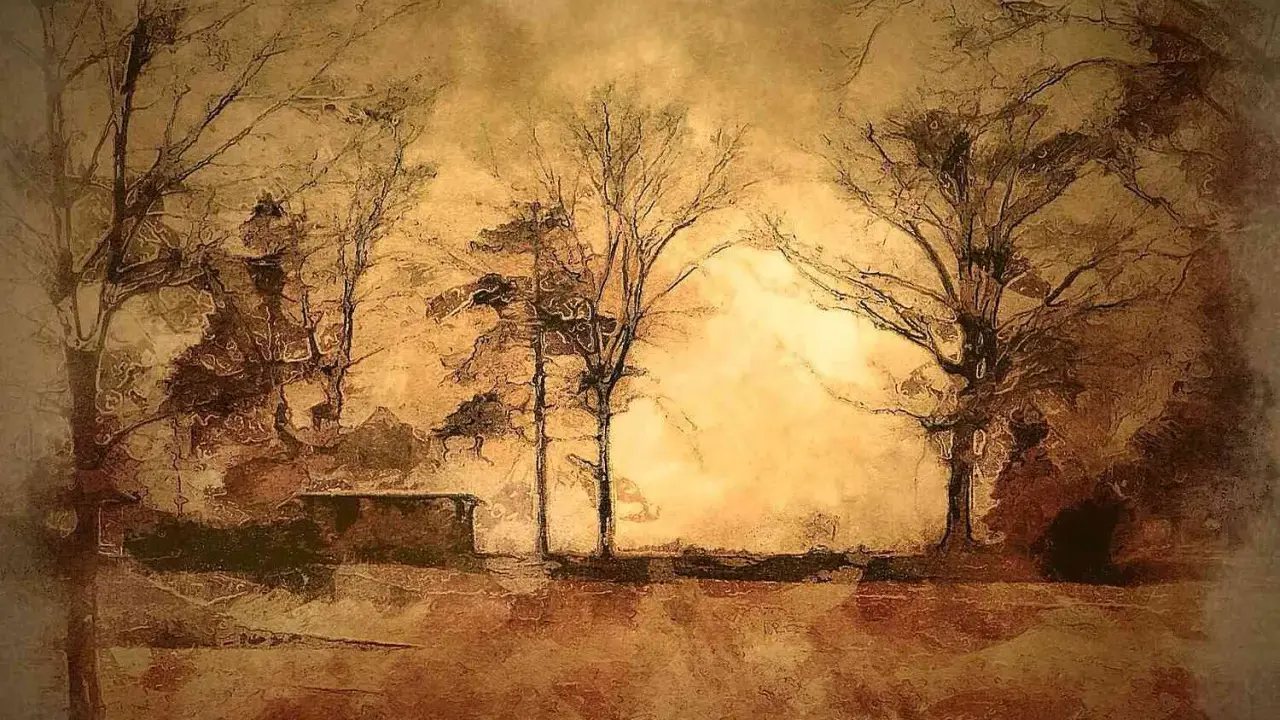
At its core, monochrome is a disciplined visual language: one hue, or a tightly controlled family of related tones, carries the whole composition. In practice, that can mean a painting in one saturated blue, a photograph built from greys, a print in sepia, or a work that explores a single colour through subtle shifts in density and surface.
The distinction matters. Black-and-white is only one version of the broader idea, while grayscale usually describes a tonal range rather than a conceptual choice. Grisaille, by contrast, is a painting technique built from greys, often used as an underpainting or as a finished work in its own right. Once that difference is clear, the next question is why artists choose to work this way at all.
| Term | What it usually means | Why it matters |
|---|---|---|
| Monochrome | One colour and its tonal variations | Emphasis on restraint, surface, and visual concentration |
| Black-and-white | Images built from black, white, and greys | Common in photography, drawing, and printmaking |
| Grayscale | A tonal range without colour | More descriptive than conceptual |
| Grisaille | Painting in greys, often in a painterly tradition | Historically linked to underpainting and tonal study |
Historically, single-colour thinking shows up in very different places, from ink traditions in East Asian painting to modern abstraction in Europe. What matters in contemporary work is less the label and more the intention behind the constraint.
Why artists keep returning to one colour
I think the real appeal is not minimalism for its own sake. It is control. When an artist removes most of the colour range, every remaining decision becomes more visible: the thickness of paint, the pressure of a brush, the edge of a print, the way light catches a glossy surface, the weight of a shadow.
That is why a single hue can feel surprisingly expressive. A red field may read as urgent, ceremonial, or bodily. A blue surface can feel distant, meditative, or atmospheric. A black piece may look severe in one light and almost reflective in another. The colour is doing the obvious work, but the real meaning comes from what the material does around it. Good monochrome art is rarely about emptiness; it is about precision.
Artists also use the format to resist easy interpretation. Without figures, scenes, or a busy palette, viewers cannot settle into narrative too quickly. They have to stay with the object a little longer, which is often where the work becomes interesting. That pressure on attention is one reason the format has remained relevant in contemporary galleries and photography.
How to read the surface rather than just the hue
When I stand in front of a single-colour work, I do not start with the colour name. I start with the surface. A monochromatic piece can look flat in a thumbnail and surprisingly layered in person, because the real action often sits in the material rather than in the palette.
- Step back first and read the overall shape, balance, and scale. Some works only resolve from a distance.
- Move in close and look for brush marks, abrasion, layering, or pressure in the paper or canvas.
- Check the edges because they often reveal whether the artist wanted softness, containment, or friction.
- Watch the light as you shift position. Matte paint, satin varnish, and gloss each behave differently.
- Notice the context around it. Wall colour, frame choice, and room light can change the reading more than many people expect.
This is especially relevant in the UK, where daylight changes quickly and north-facing rooms can flatten certain tones while making others feel cooler and sharper. A work that looks calm at noon may feel denser in the evening, and that change is often part of the appeal. Once you know how to look, the format stops being a trick and starts becoming a method.
How the main variants differ
Not every one-colour piece creates the same effect. A strong visual discipline can feel solemn, intimate, architectural, or graphic depending on the tone, finish, and medium. I usually separate the main approaches like this:
| Variant | Typical effect | Best used when | Main risk |
|---|---|---|---|
| Black-and-white | High contrast, clarity, formal strength | The image depends on structure, shadow, and gesture | Can feel over-familiar if the composition is weak |
| Greyscale | Subtle, tonal, reflective | You want nuance without colour distraction | Can lose force if the range is too narrow |
| Sepia or warm monochrome | Soft, archival, intimate | You want memory, warmth, or an aged atmosphere | Can slide into nostalgia very quickly |
| Single saturated hue | Immersive, concentrated, often bold | You want the colour itself to become the subject | Can feel decorative unless the surface carries real depth |
| Near-monochrome | Restrained but not rigid | You want a limited palette with breathing room | May be mistaken for simple muting rather than a deliberate choice |
The important point is that a piece does not need to be mathematically pure to work. In real practice, the strongest examples are often slightly untidy in the best sense: layered, human, and responsive to light. That is what separates a living surface from a merely neat one.
What makes a single-colour work feel complete
If I am judging whether a monochromatic piece is resolved, I look for five things: tonal range, texture, control of edges, scale, and a clear reason for being restricted in the first place. A work can be very quiet and still feel complete if those elements are doing real work.
- Tonal range so the eye has somewhere to travel, even without multiple colours.
- Texture that gives the surface a tactile life instead of a blank, sealed finish.
- Edges that are considered rather than accidental, especially in painting and print.
- Scale that matches the ambition of the surface. Too small, and the piece can feel timid; too large, and weak decisions become obvious.
- Intent so the restriction reads as a choice, not a limitation.
The common mistakes are predictable. Artists sometimes rely on the concept of one colour to carry work that has no compositional spine. Buyers sometimes assume a quiet surface is easy to live with, when in fact it may be very demanding in a room with strong light. And curators sometimes discover that a piece only works when it is given enough surrounding space to breathe.
When the format succeeds, it is usually because it asks more of the viewer, not less. That is why the simplest-looking works are often the hardest to make convincingly. From here, the next question is why this approach still feels current rather than historical.
Why the format still matters in contemporary art and photography
Monochrome remains relevant because it solves a problem that never really goes away: how to make a viewer pay attention without relying on visual clutter. In contemporary painting, that often means stressing objecthood, surface, and serial thinking. In photography, it can mean shifting emphasis from scene description to tonal structure, mood, and form.
It also fits the way art is seen now. Works are increasingly encountered first on screens, then in galleries, then in homes. A disciplined single-colour image can travel well across those settings because its structure is easy to read quickly, yet it still has enough depth to reward a slower look later. That is one reason collectors and designers continue to return to the format.
In the UK market, this is especially practical. A monochromatic piece can sit beside period architecture, clean contemporary interiors, or mixed collections without fighting the room. It can calm a space, sharpen it, or give it a focal point, depending on the finish and scale. The same work may feel formal in a gallery and intimate above a mantelpiece, which is part of its usefulness.
For me, the strongest contemporary examples are the ones that treat limitation as a way to sharpen meaning. They do not hide behind simplicity. They use it to make one decision feel unavoidable.
What to check before you buy or hang one
If you are choosing a piece for a room or a collection, I would check the following before anything else:
- Natural light in the room, especially if it is north-facing or changes sharply through the day.
- Finish on the surface, because matte can feel meditative while gloss can create glare and drama.
- Size relative to the wall, because a restrained palette needs enough presence to avoid looking tentative.
- Framing and edge treatment, since these can either support the work or overcomplicate it.
- Medium and stability if you are collecting, particularly for works on paper or pieces where pigment sensitivity matters.
- Edition or provenance for photography, so you know how limited the work really is and how it has been handled.
If the work is being commissioned, ask to see a mock-up or reference image under the kind of light it will actually live in. That single step prevents a lot of disappointment. When monochrome art feels weak, the problem is usually not the absence of colour but the absence of decision. If it still holds together from a distance, up close, and in changing light, it is probably doing exactly what it should.