Textual art sits where language becomes image, object, and argument. In the strongest examples, the words are not labels attached to an artwork after the fact; they are the structure, the tension, and often the whole point. This article looks at the main forms, how to read them, what to check before buying or exhibiting them in the UK, and why they still feel sharp in 2026.
What matters most before you go further
- Words can function as image, structure, critique, or instruction, not just as captions.
- Typography, scale, placement, and material change the meaning as much as the sentence itself.
- The strongest examples often sit close to conceptual art, concrete poetry, and installation.
- For collectors and galleries, editioning, condition, and installation requirements matter early.
- In the UK market, smaller editioned works are far easier to place than large, site-specific pieces.
What language-led art is really doing
At a basic level, this kind of work uses words as a visual and intellectual material. That sounds straightforward until you realise how many jobs text can perform at once. It can describe, command, confess, quote, provoke, or simply occupy space with a tone that feels neutral on the surface and loaded underneath.
I usually separate these works from ordinary captions or wall labels by asking one question: does the text change the work’s identity, or does it merely explain it? If the sentence can be removed without damaging the piece, it is probably not operating as a true text-based work. When the wording is essential, the artwork starts to behave more like a proposition, a poem, or a public statement than a picture with commentary.
That is why the form overlaps with conceptual art so often. The idea matters, but the material expression of the idea matters too, because the viewer reads the work before they fully “see” it. Once you separate those roles, the next step is to look at the forms this work actually takes.
The main forms you will encounter
There is no single visual formula here. Some works are loud and immediate, others are slow and meditative, and a few sit uncomfortably between art, design, and public signage. The table below shows the most common formats and what they tend to do in practice.
| Form | Typical effect | What I check first |
|---|---|---|
| Neon or LED text | Feels public, urgent, and impossible to ignore | Power supply, maintenance, installation, and whether the glow supports the meaning or overwhelms it |
| Wall vinyl or painted slogans | Reads quickly and can feel direct, political, or institutional | Wall condition, removal plan, and whether the spacing and line breaks carry enough tension |
| Collage and photomontage | Lets text collide with image, which often produces irony or critique | How legible the text remains once it shares space with photographs, fragments, or found material |
| Instruction pieces | Turns language into an event the viewer imagines or enacts | Whether the instructions are clear enough to matter but open enough to stay interesting |
| Concrete poetry and typographic works | Makes layout, spacing, and rhythm part of the meaning | Whether the visual structure adds a second layer, not just decorative formatting |
| Digital or scrolling text | Feels contemporary, unstable, and often tied to media flow | Screen quality, file format, playback loop, and whether the pacing helps or flattens the message |
What matters is not simply the medium, but the tempo of reading. A short slogan can feel like a shout in one setting and a whisper in another. A line of poetry can become a monument if it is blown up across a wall, or a private thought if it sits in a small print. I find that contrast especially useful in British gallery contexts, where the same piece may behave very differently in a white cube, a historic building, or a street-facing window.
The formats are flexible, but they do not all age in the same way. That is why context becomes the next issue, not an afterthought.
Why context changes the reading
Text rarely stays neutral once it enters a space. In a gallery, a sentence can feel reflective or refined. On a billboard, it can feel accusatory. In a museum, it may read as historically distant. On a shopfront or station wall, it may suddenly become public speech. The same words can move from poetry to protest just because the surrounding space has changed.
I pay close attention to four variables:
- Scale, because large lettering turns reading into an encounter rather than a glance.
- Typography, because the choice of font can sound bureaucratic, intimate, playful, or aggressive.
- Placement, because a line at eye level invites direct reading, while a line above or behind the viewer feels more positional.
- Repetition, because repeated wording can become rhythm, persuasion, or pressure depending on how it is spaced.
Context also decides how much ambiguity a work can afford. A joke that feels sharp in a gallery can look thin on a social feed. A political statement that seems bold in one country may feel obvious in another. That sensitivity to placement is not a weakness. It is one of the reasons the medium stays interesting.
Once you see how much the room changes the sentence, it becomes easier to understand the artists and movements that made this approach central in the first place.
The artists and movements that made it central
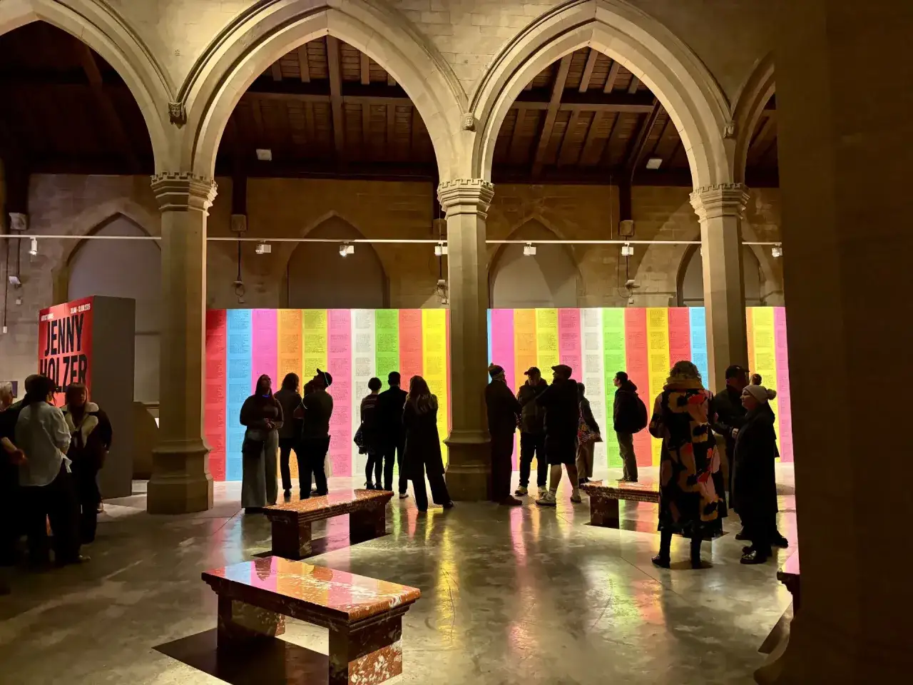
The history here runs through several overlapping traditions. Dada and later conceptual practices pushed language away from illustration and toward interruption. Concrete poetry showed that the arrangement of letters on a page could carry as much meaning as the line itself. Later, artists such as Yoko Ono turned instruction into participation, Lawrence Weiner reduced the work to a proposition, Barbara Kruger used magazine-style language to expose power, and Jenny Holzer took short statements into public space until they felt unavoidable.
What connects these artists is not just the use of words, but the refusal to let words behave politely. The text is often clipped, declarative, or open-ended because that tension forces the viewer to complete the work mentally. I think that is why these pieces still feel fresh when they are done well. They do not merely communicate; they make the act of reading part of the encounter.
In the UK, this lineage often appears inside wider conversations about conceptual art, design culture, print, and public intervention. That crossover is useful. It reminds us that a work does not need to be conventional painting or sculpture to be rigorous. It only needs a structure that earns the viewer’s attention.
That leads naturally to the practical question I get most often: how do you tell whether a piece is actually strong, especially if you are buying or showing it?
How I judge a piece before buying or showing it
When I assess a text-based work, I start with five checks. They are simple, but they save a lot of disappointment later.
- Is the language doing real work? If the line could appear on a poster, t-shirt, or meme without changing, I become cautious.
- Does the form support the sentence? A fierce statement in a delicate handwritten script can create productive tension, but only if that tension is intentional.
- Is the piece unique or editioned? This matters for pricing, display, and resale, especially in the UK market.
- What does installation demand? Power, wiring, wall fixing, lighting, and climate conditions can all affect the final result.
- Will it still hold up if the viewer reads it twice? A good work deepens; a weak one repeats itself.
On pricing, I prefer rough working bands rather than false precision. In the UK, editioned pieces by emerging artists may start below £1,000. Stronger mid-career works often sit somewhere between £1,000 and £10,000. Major names, rare originals, and installation-scale pieces can move into five figures and well beyond that. For illuminated or heavily fabricated works, I would also budget an extra 10% to 20% for production, shipping, framing, and installation, because the real cost rarely stops at the listed price.
There are also practical traps that collectors and smaller galleries sometimes miss. Paper works can be damaged by light if they are left unframed too long. Vinyl text can lift at the edges if the wall surface is poor. Neon and LED works may need servicing, replacement parts, or a clear agreement about who handles repairs. These are not glamorous issues, but they decide whether the piece remains convincing after the opening night.
That is exactly why the format rewards seriousness. It looks simple, but it is rarely cheap to execute well, and it punishes vague thinking very quickly.
Why this format still feels urgent in 2026
The reason I keep seeing this field reappear is that we are surrounded by language already. Interfaces, headlines, captions, signage, notifications, and automated prompts fill the day. In that environment, a well-made text work can feel strangely direct because it cuts through the noise without pretending to be innocent. It knows it is language, and it uses that fact with discipline.
That is also why textual art still works best when it avoids easy slogans. A work that only repeats what a viewer already believes usually fades fast. A stronger piece creates a small resistance: the line is clear, but the meaning is not exhausted by a single reading. That balance is difficult, which is exactly why it lasts.
If I were curating, buying, or simply trying to understand the field right now, I would look for works that are readable in a few seconds but rewarding over time. That combination holds up better than novelty. It also explains why this medium keeps renewing itself across galleries, public commissions, print, and digital formats. Text remains one of the simplest materials in art, but it is still capable of carrying the most pressure.