
Roy Lichtenstein's best-known Pop Art paintings are easy to recognise, but they reward a closer look. This article looks at the famous Roy Lichtenstein pop art works that most clearly define his style, explains why they mattered in the 1960s, and shows what to notice in the imagery, technique, and collecting side of the story. I have written it for readers who want more than a name-check: the point is to help you understand which works matter most and how to read them properly.
What matters most when you look at Lichtenstein's iconic Pop Art
- The early paintings mark the moment he turned commercial imagery into a new artistic language.
- Look Mickey, Whaam!, and Drowning Girl are the fastest route into his style.
- Ben-Day dots, hard outlines, and flat colour are conceptually important, not just decorative.
- The strongest readings focus on the tension between mass-produced source material and carefully controlled painting.
- In the UK, museum access is often the most practical way to study the key works up close.
Why these paintings became recognisable so quickly
Lichtenstein's reputation rests on a simple but radical move: he took images already circulating in comics, ads, and popular publishing, then enlarged and simplified them until they looked unmistakably art-historical. That mattered because it challenged the idea that originality had to mean inventing a subject from scratch. Instead, he showed that the way an image is framed, cropped, and repeated can be as revealing as the subject itself.
I think that is why his work still cuts through so cleanly. You recognise the visual language almost instantly, but the emotional distance is doing a lot of the work. The paintings look mechanically cool and emotionally noisy at the same time, which is a very durable combination. The easiest way to see that logic is to look at the individual works people keep returning to.
The essential paintings to know first
If I were building a short list for someone new to Lichtenstein, I would start with these five works. They show the artist's transition from experiment to signature style, and each one isolates a different part of the Pop Art idea.
| Work | Year | Why it matters | What I look for |
|---|---|---|---|
| Look Mickey | 1961 | Often treated as the first clear step into his mature Pop language, it turns a cartoon scene into a tightly staged painting. | The simplified colour bands, the frozen gesture, and the way humour becomes formal structure. |
| Girl with Ball | 1961 | Based on an advertisement, it shows how quickly he could convert commercial imagery into something sharper and stranger. | The flattened beach scene and the almost toy-like treatment of the figure. |
| Masterpiece | 1962 | The work turns ambition and authorship into part of the joke, which is why it remains so often discussed. | How the text and image work together, and how the painting comments on fame as much as it depicts it. |
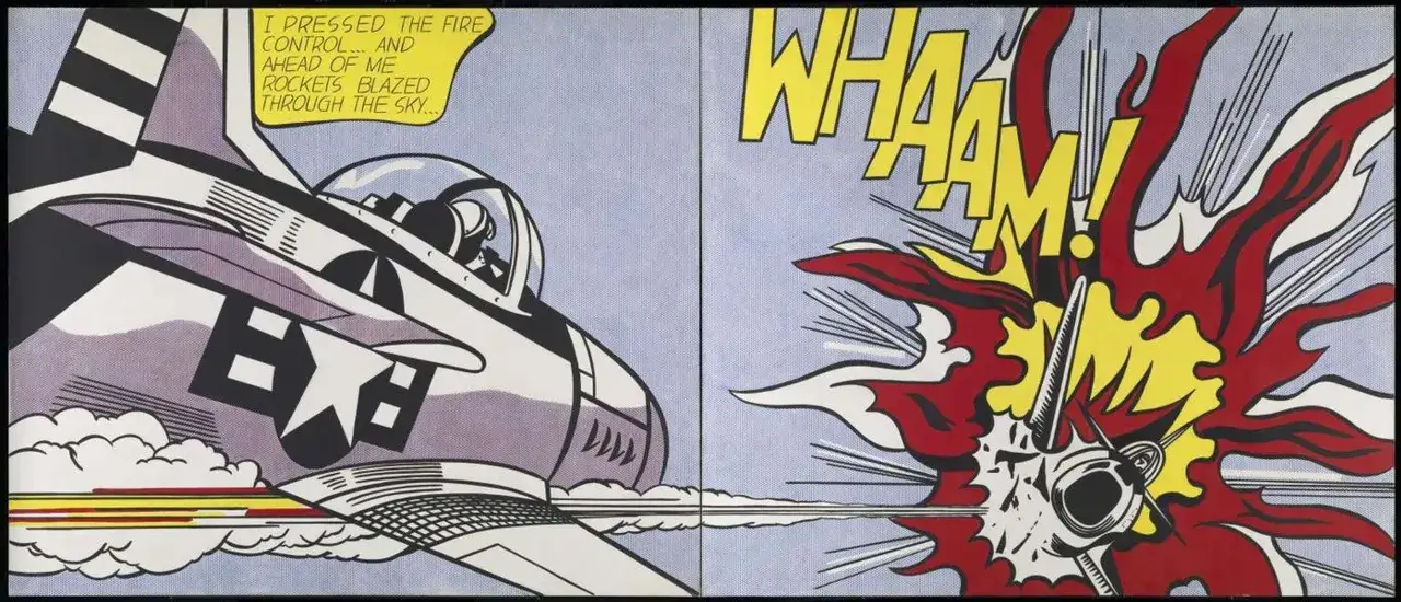
| Whaam! | 1963 | This two-panel war image is one of the clearest statements of his graphic power and remains the work many viewers remember first. | The split composition, the exaggerated explosion, and the way violence is rendered as pure visual impact. |
| Drowning Girl | 1963 | Borrowed from a romance comic, it is a near-perfect example of Lichtenstein's ability to turn melodrama into an icon. | The emotional intensity, the compression of the source image, and the precision of the linework. |
If you only have time for three, I would choose Look Mickey, Whaam!, and Drowning Girl. Together they show the beginning, the peak, and the emotional range of his most famous period. Once those are familiar, the rest of his Pop output starts to look less repetitive and more deliberate. The next step is understanding the visual machinery that makes the works click.
What makes the style unmistakably Lichtenstein
The style is famous, but it is not accidental. Lichtenstein built it from a small number of repeated devices, and each device changes the meaning of the image.
Ben-Day dots do more than mimic printing
Ben-Day dots are the tiny dots associated with commercial printing. Lichtenstein used them to make paint look like mass reproduction, which creates a smart contradiction: the image feels industrial, yet the effect is handcrafted and exacting. That contradiction is part of the point.
Hard outlines lock the scene in place
The heavy black contour lines flatten expression into clear shapes. They strip away the soft modelling you would expect from traditional painting, so faces, objects, and bursts of action become almost schematic. The result is speed and clarity, but also a slight emotional freeze.
Text becomes part of the composition
Words such as WHAAM! or the fragments in his romance paintings are not captions stuck on top of the image. They are graphic elements with their own rhythm, weight, and colour balance. In practice, that means reading and seeing happen together, which is one reason his canvases feel so immediate from a distance.
Scale changes the joke
Comic panels were made to be small and disposable. Lichtenstein enlarges them into monumental canvases, which makes the source material feel both important and faintly absurd. I read that scale shift as one of his sharpest ideas: the content stays familiar, but the format gives it authority.
Once you can spot these devices, the next question is not what the paintings copy, but what they are really saying about media, emotion, and taste.
How to read the images beyond the comic-book surface
The common mistake is to treat the paintings as literal comic-book enlargements. That misses the edit. Lichtenstein crops, simplifies, and stages the source until the image becomes a comment on how modern culture packages feeling.
Romance turns into stylised emotion
In works like Drowning Girl, the emotional drama is the subject, but the image is intentionally too polished to feel spontaneous. The point is not sincerity in the traditional sense. The point is to show how romance itself arrives to us already formatted by cliché.
War becomes spectacle
Whaam! is a war image, but it does not behave like documentary painting. The violence is condensed into a burst of sound, colour, and geometry. I find that structure important because it makes the viewer aware of distance: we are looking at conflict mediated by print culture, not at conflict in the raw.
Read Also: Hip Hop Art - Visual Language, Styles & UK Accent Explained
Self-awareness runs through the work
Paintings such as Masterpiece make status and authorship part of the subject. That is one reason Lichtenstein still feels contemporary. He understood that the art object is never just an image; it is also a claim about taste, value, and visibility.
- Do not confuse the source image with the finished artwork.
- Do not read the humour as a side effect; it is often central.
- Do not miss how tightly the compositions control your eye movement.
That reading habit matters whether you are standing in front of a canvas or looking at a reproduction online. It also matters when the conversation turns to viewing access and the market, because authenticity is where the practical side starts to bite.
Seeing or collecting him in the UK
For UK readers, the practical question is usually access. Very few people will encounter one of the headline canvases in a private setting, so museum collections, loans, and retrospectives do most of the heavy lifting. If you get the chance to see a major Lichtenstein in person, take it: his work depends on scale, surface, and the small shifts in colour that are easy to miss on a screen.
| Type | What it is | Typical access level | What to check |
|---|---|---|---|
| Original painting | A one-off canvas or panel from the artist's hand. | Rarely available outside major collections or top-tier sales. | Provenance, exhibition history, condition, and authenticity documentation. |
| Editioned print | A limited print made as part of an authorised edition. | More realistic for private collectors. | Edition number, publisher, paper condition, signature, and catalogue reference. |
| Poster or reproduction | A decorative object, not the same thing as an art-market edition. | Widely available and much cheaper. | Licensing, print quality, and whether the seller is describing it honestly. |
When I talk to collectors about artists like Lichtenstein, I always make the same point: the image is only half the decision. The other half is paperwork. A strong edition with clean provenance can hold its place far better than a pretty reproduction that only borrows the look. If you are buying, the safer route is to verify the edition details first and treat anything vague as a warning sign.
That is also why the UK market context matters. A famous name can attract attention quickly, but serious buyers still care about the difference between an authorised work and a decorative echo. The next section pulls those practical lessons back into the bigger picture of why these works still matter.
What his most famous works still teach us
Lichtenstein remains useful because he understood something that still shapes visual culture now: images travel faster than explanations. He built paintings out of that fact. The line between high art and commercial art is not erased in his work; it is stressed until you can see how thin it already was.
- Look Mickey shows the moment Pop Art stopped being a theory and started becoming a visual language.
- Whaam! proves that scale and composition can turn a familiar image into something iconic.
- Drowning Girl shows how melodrama can be sharpened instead of softened.
- The later works remind us that repetition, variation, and citation are not weaknesses when the structure is strong.
If I had to give one practical takeaway, it would be this: do not approach Lichtenstein as a painter who merely borrowed comics. Approach him as an artist who understood how modern images are built, packaged, and believed. That is why his most famous Pop Art pieces still feel immediate, and why they still deserve to be studied closely rather than filed away as easy visual shorthand.