Street art sits at the point where painting, design, protest, and public life overlap. The street art style is not defined by one technique alone; it is a visual language built from bold contrast, quick readability, layered surfaces, and images that feel alive in the city rather than sealed inside a frame. In this article, I break down the features that define it, how it differs from graffiti and mural painting, which techniques shape the look, and why it still carries so much weight in contemporary art, especially in the UK.
What matters most when you read the style quickly
- It is built for public space, so clarity, scale, and immediate impact matter more than polish.
- Bold outlines, saturated colour, texture, and strong symbols are more important than decorative detail.
- The look often blends graffiti, illustration, poster design, and political messaging.
- Technique changes the mood fast: stencil work feels sharp, paste-ups feel temporary, freehand spray feels raw.
- The strongest pieces respond to the wall, the neighbourhood, and the audience, not just the artist’s signature.
What makes it instantly recognisable
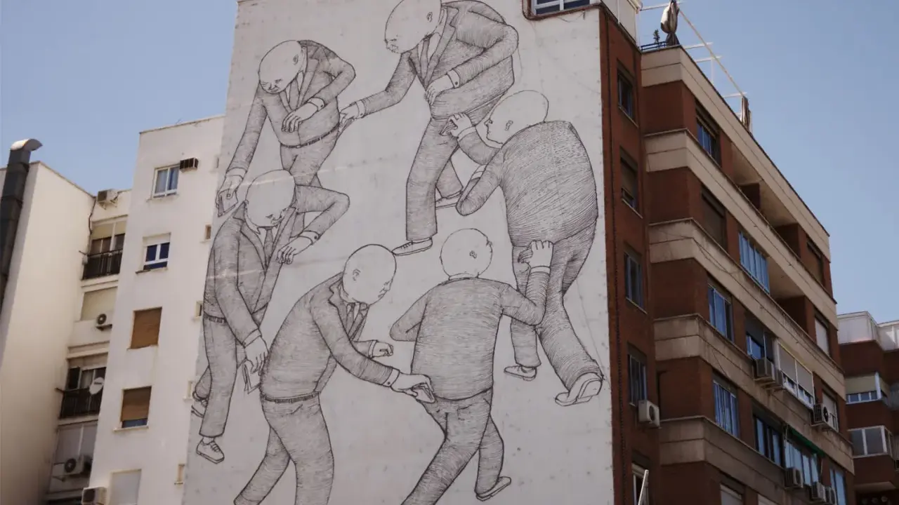
When I look at a strong wall piece, I do not start with subject matter. I start with impact. Street-based work is designed to be read quickly, often from a distance, and that changes everything: composition becomes tighter, outlines get harder, and the message has to land before the viewer walks past. Tate’s glossary keeps the category broad, but the common thread is clear enough for anyone who spends time around city walls: it belongs to public space, it often arrives without permission, and it uses a wider range of media than classic graffiti.
The style also has a built-in tension. It can feel rebellious and playful at the same time. A piece may carry social commentary, but it may also rely on humour, irony, or a deliberately graphic punch. That mix is part of why it holds attention. It is not just about decoration on a wall; it is about making the wall feel like an argument, a joke, a headline, or a public interruption.
- Immediate legibility - shapes and symbols are usually simplified so the work reads fast.
- High contrast - dark outlines, bright fills, and sharp edges help the image stand out in busy streets.
- Layered surfaces - posters, drips, tags, paint traces, and weathering often remain visible.
- Public energy - the work feels connected to the street, traffic, noise, and local mood.
- Message with attitude - even when the piece is abstract, it usually has a point of view.
That combination of speed, contrast, and attitude is what separates a convincing urban piece from a generic decorative mural, and it leads directly to the visual ingredients underneath the surface.
The visual ingredients that do the heavy lifting
For me, the style lives or dies on a handful of choices. Colour, line, texture, and scale carry more weight than most beginners expect. A piece can be technically simple and still feel powerful if those choices are disciplined. A piece can also be overloaded with effects and still collapse if the structure is weak. The street-art language is visually loud, but the best work is rarely random.
Here is the breakdown I use when reading a wall piece:
| Ingredient | What you usually see | Why it matters |
|---|---|---|
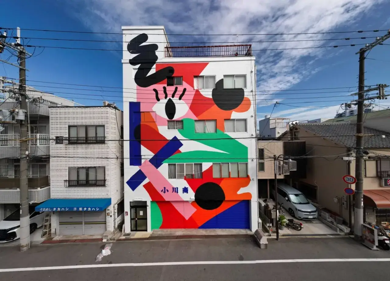
| Colour | Bright primaries, acidic accents, black-and-white contrast, or tightly controlled palettes | Colour creates distance read and emotional temperature immediately |
| Line | Thick contours, quick sketch marks, sharp stencil edges, or letter-based outlines | Line gives the work structure and keeps it readable on rough surfaces |
| Texture | Spray mist, paint runs, pasted paper edges, cracks, weather stains, and old tags underneath | Texture makes the piece feel embedded in the city instead of pasted on top of it |
| Scale | Anything from tiny stickers to full-building murals | Scale determines whether the work feels covert, confrontational, or monumental |
| Iconography | Faces, hands, animals, masks, symbols, slogans, arrows, crowns, and cartoon-like figures | Icons are fast to recognise and easy to repeat across locations |
| Typography | Tags, block lettering, hand-painted slogans, or poster-type headlines | Lettering adds urgency and often anchors the message politically or culturally |
What makes this interesting is the way the ingredients combine. A cartoon face with a hard black outline feels very different from a weathered stencil with a torn paper edge, even if both are technically simple. I always advise reading the image first, then the surface, because the surface often tells you how the work was made and how long it was expected to survive.
How it differs from graffiti and mural painting
This is where a lot of people blur the categories, and I think that confusion is understandable. These practices overlap in public space, but they are not identical. Tate describes street art as public, usually unsanctioned, and broader in media than graffiti art. The British Council’s teaching material captures the same tension by framing it as something that can still be argued over as vandalism or contemporary art. That debate is not a side issue; it is part of the culture around the work.
| Form | Main goal | Typical look | What usually sets it apart |
|---|---|---|---|
| Graffiti | Name, presence, repetition, territory, style | Tags, throw-ups, wildstyle lettering, sharp letter-based composition | Identity and lettering are often central |
| Street art | Visual statement, satire, symbolism, interruption | Stencils, paste-ups, characters, slogans, hybrids of image and text | It often reaches beyond lettering into narrative or imagery |
| Mural painting | Large-scale image making, decoration, storytelling, place-making | Commissioned or planned imagery with a finished, cohesive surface | It is usually more formally resolved and often sanctioned |
The overlap matters because many artists move between these zones. A mural can borrow the energy of graffiti, and street art can borrow the composition of a mural. Still, the difference is useful: graffiti often prioritises the writer’s mark, while street art tends to prioritise the image’s public message or visual joke. Once that becomes clear, the techniques behind the finish make much more sense.
The techniques that create the finish
The medium is not just a technical detail here; it shapes the mood of the work. I can usually tell a lot about an artist’s intent from the way the image sits on the wall. Crisp stencil edges suggest control and repeatability. Loose spray strokes suggest speed and improvisation. Paper paste-ups suggest impermanence. Each method brings a different kind of authority, and each one has limits.
| Technique | What it gives the work | Where it can fail |
|---|---|---|
| Stencil | Sharp repeatable forms, strong silhouettes, fast visual impact | Can look rigid if the image relies only on cut-out precision |
| Freehand spray | Movement, energy, spontaneity, visible handwork | Can become messy if the structure is not strong |
| Paste-up or wheatpaste | Illustrative detail, layered poster texture, quick installation | Paper degrades fast in rain, sun, and abrasion |
| Sticker and label work | Portability, repetition, subcultural identity, small-scale visibility | Reads as minor if the design is not instantly clear |
| Roller and brush painting | Large lettering, bold fills, visible gesture, broad coverage | Needs confident composition or it becomes clumsy at scale |
| Mixed media | Depth, collage, visual surprise, richer storytelling | Can become overworked if every effect competes for attention |
The practical trade-off is simple: the more complex the surface language, the more fragile the result can be in the street. Weather, wall texture, and time all push back. That is one reason the strongest pieces often look deceptively simple. They are engineered for an environment that is hostile to polish, which is exactly why the style can feel so alive.
Why it resonates so strongly in the UK
In the UK, the appeal of this visual language has a lot to do with context. British cities are visually dense, politically charged, and full of competing signage, so a direct image on a wall has to fight for attention. That makes the style unusually effective here. It can be satirical, civic-minded, or sharply local without needing a long explanation. Banksy remains the obvious reference point, but the larger lesson is broader: British street-based art often balances wit with critique, and that combination travels well from alleyway to gallery.
I also think the UK scene shows how porous the boundary has become between public intervention and institutional validation. A work that starts as an unsanctioned image can end up discussed in museums, magazines, and commercial campaigns. That does not automatically weaken it, but it does change the stakes. Once the look becomes a brand language, the challenge is to keep the work from turning into empty attitude.
- It suits urban density because the image has to work quickly in a crowded visual field.
- It rewards irony because British audiences often respond well to blunt humour and social critique.
- It moves easily between street and gallery because the imagery is already highly visual and public-facing.
- It can be commercialised fast which is useful for exposure, but risky if the work loses its edge.
That tension between raw public energy and polished cultural packaging is one of the reasons the style still feels current rather than nostalgic, and it leads naturally to the last question: how do you tell the difference between a strong wall piece and one that is only borrowing the look?
How I judge whether a wall piece has real force
My quick test is straightforward. I ask whether the image works at a glance, whether it still makes sense once I slow down, and whether the wall itself feels like part of the composition rather than a neutral backdrop. Good street-based work usually survives all three checks. It does not merely copy the signs of the genre; it uses them with intent.
The pieces that stay with me usually do four things well. They make a clean first impression from a distance, they use surface texture deliberately, they keep one idea dominant instead of scattering attention, and they make the location feel meaningful. When those parts line up, the result is more than decoration. It becomes a visual event shaped by its surroundings, and that is the real strength of the form.